


Regional Bike Analysis
Planners want to know where to add cycling infrastructure, and whether or not it works once it’s in place. They also want to ensure safe travel for cyclists and pedestrians, which means identifying risky spots and learning how to lower that risk.
Combining StreetLight’s detailed cycling metrics with your local data can create a richer perspective on bike safety— and help prioritize where to invest first. Using the LBS data-based metrics in StreetLight InSight®, we conducted a deeper analysis on the most improved region in our bike safety report: the District of Columbia.
Start With Key Cycling Metrics
Planners have the local knowledge on safety, but collecting bicycle metrics can be challenging. Self-reported bike data is incomplete, and it can skew heavily toward certain demographics, fitness cycling activity, and strategic bias. Sensors only capture information for the roads where they are placed, making them prohibitively expensive to deploy across an entire region.
Location-based services data (LBS) captures bicycle travel more comprehensively. StreetLight InSight® provides planners with key metrics, including:
- Bicycle Miles Traveled
- Top cycling origins and destinations
- Zones with the most cycling activity
- Before-and-after bike travel studies
- Demographic information for bike travel
We used many of these metrics in our deeper dive to study the D.C. Metro area.
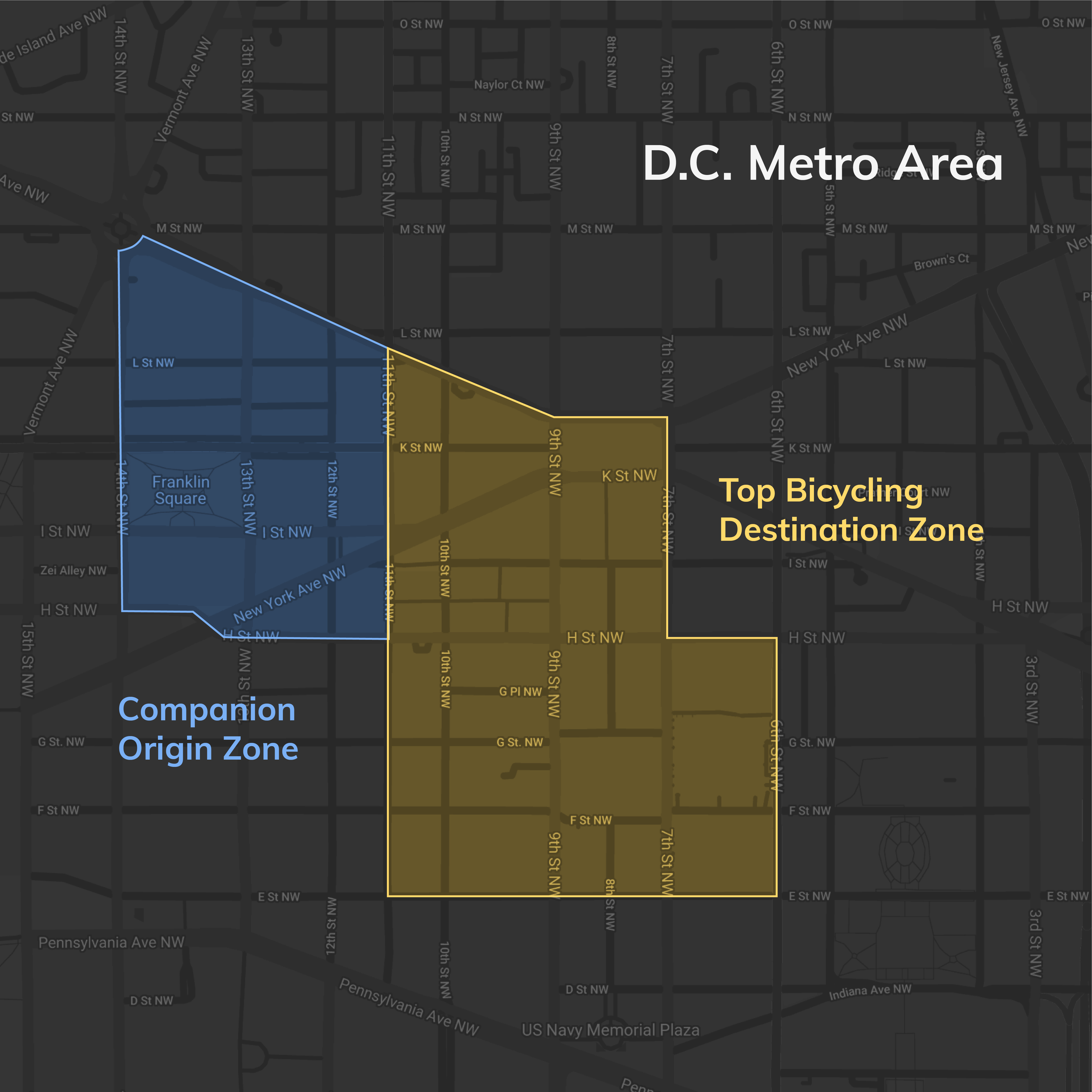
The most-traveled bike zone is also the top bicycling destination zone (yellow) and its top origin zone (blue) in the D.C. Metro area, accessed via StreetLight InSight® .
First, identified the top Origin-Destination (O-D) pair in D.C. We validated the top cycling destination TAZ, or transportation analysis zone, by comparing bike travel metrics to publicly available bike-share data. This zone also “feels right” since it is the location of a major transit hub used by bike commuters.
After selecting the destination, we highlighted the top origin zone (in blue) for that destination zone. In other words, of all the bike trips that end in the yellow zone, the majority begin in the adjacent blue zone.
For further analysis, we also looked at what zone has the most cycling activity in D.C. Studying zones in which bike trips begin, end, or pass through, we found that the “most bicycled” zone in the area was the same as the destination zone from our O-D analysis. Several nearby zones had high cycling activity, confirming the general area for heavy bike travel.
Using StreetLight InSight® we could drill even deeper, counting bike travel along certain corridors in these zones to identify key routes. We could analyze vehicle trips along those corridors — including vehicle speed — to identify areas with the highest-risk speed differentials.
Overlaying StreetLight’s demographic data could steer us in an equitable direction for planning. And historical data allows analysts to travel “back in time” to measure changes in volume and speeds from adding bike lanes and other traffic calming measures.
Add Local Safety Data
We were able to use state-level crash numbers for this special report, but we found that regional safety data is often a matter for local expertise. Planners familiar with their area’s ultra-local safety statistics can combine that local knowledge with bike travel metrics for insights.
For example, StreetLight’s BMT metric allowed us to study fatal cycling crash rates, and we were able to layer those over our bike Zone Activity analysis for a visualization. Local transportation experts can go further to determine causality. For example, are the crash areas hazardous because vehicle speeds are higher, or because the areas lack infrastructure and clear markings?
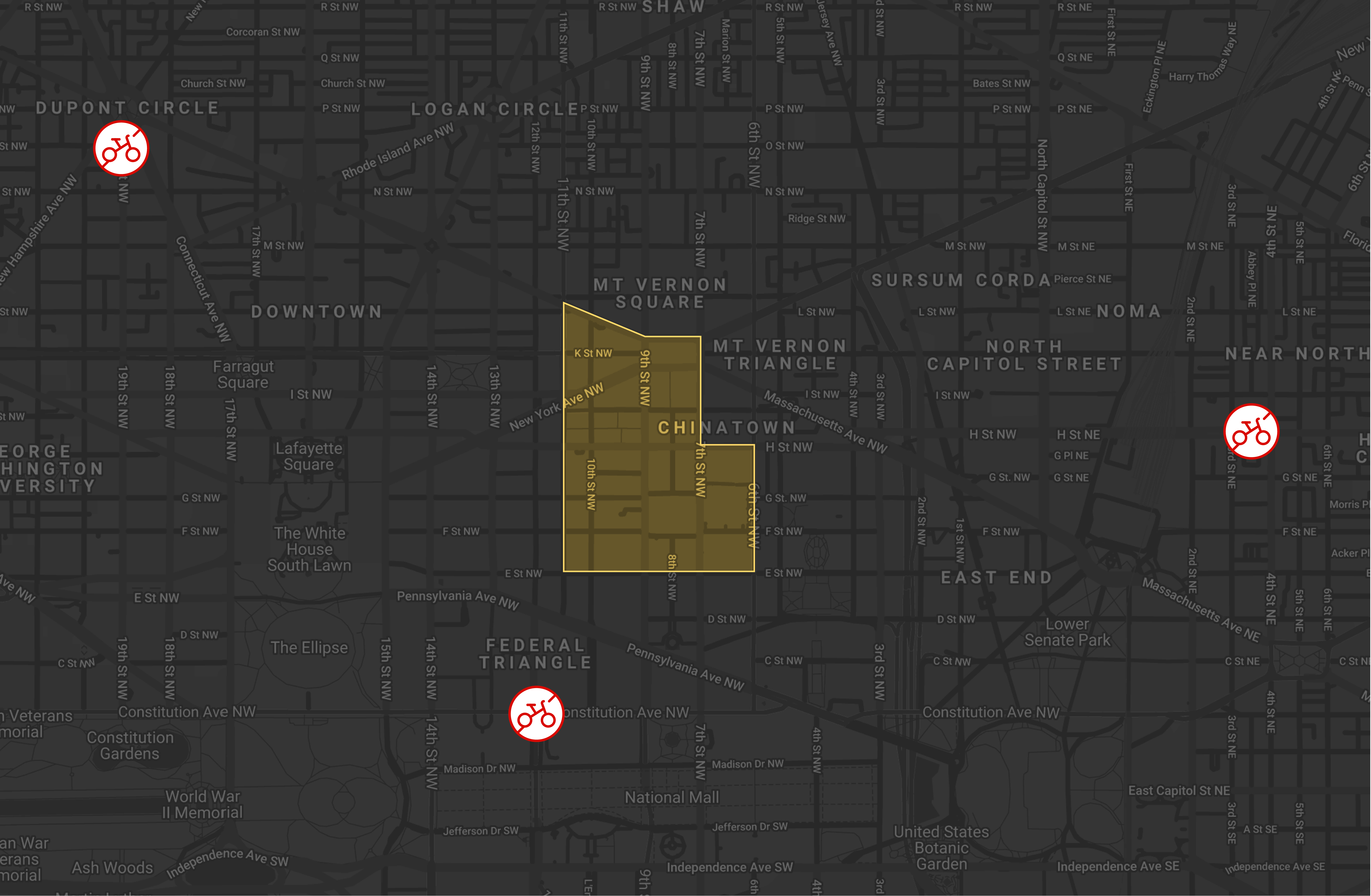
D.C.’s top cycling zone (yellow) marked with 2018 cycling fatal crash sites in red. The crash sites to the west and east are in the 3rd and 5th most-traveled bike zones.
If we were planners, we could combine the O-D or Zone Activity metrics with our own safety data to analyze potential infrastructure locations, similar to this San Francisco-based study. We could identify heavily traveled cycling areas that lack existing infrastructure, like this analysis of the D.C. area.
Analysts and planners in D.C. may also know locations of non-fatal/injury collisions, and perhaps even near-misses, all highly valuable information. Clustering those crash sites and overlaying them on popular cycling zones or corridors can reveal exposure risk, point to further study areas, or confirm instructure investments.
Local experts will also know which corridors can be widened, which have neighborhood support for cycling, and where high-speed or high-volume vehicle traffic could be shifted. That local knowledge will help analysts form safety hypotheses that can be vetted with accurate cycling data.
To see top bike travel zones in your area, and learn how to apply your local insights, sign up for one of our upcoming regional webinars.
Learn more about the bike safety report

Full Report

Methodology