
Orlando Transportation Analysis: Where Pedestrian Risk Is Highest

Smart Growth America recently rated Orlando the most dangerous transportation city in the U.S. for pedestrians for the second consecutive year. The metro area saw 740 fatalities between 2010 and 2019, or about 74 each year. Other Florida metro areas listed in the Top 10 included Tampa, Daytona Beach, Melbourne, Sarasota, and Jacksonville. It’s no surprise that Florida’s state government has directed the Florida Department of Transportation to adopt a Complete Streets policy.
In fact, pedestrian deaths across the entire United States have been rising for the past decade, according to SGA’s annual report, Dangerous By Design 2021. Disturbingly, fatalities were up as much as 24% in 2020, even though vehicle travel fell significantly. While tracking crashes is important for building effective safety initiatives, what’s even more important is layering in more data to identify and prioritize the riskiest areas.
In our latest eBook, Walk This Way: New Data for Pedestrian Safety, we decided to dig into a sample transportation analysis in Orlando to see what the crash data plus additional analytics could reveal.
A Tale of Two Zones
We divided the Orlando metro area into one-kilometer hexagons and plotted the locations of crashes and the level of pedestrian activity in each section. We chose two zones with similar crash volume: downtown Orlando with six fatal pedestrian crashes and a neighborhood called Holden Heights with seven.
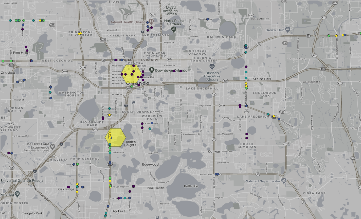
Figure 1: Florida’s Department of Transportation data shows similar numbers of crashes in Orlando’s downtown area (top) and Holden Heights (bottom).
On the surface, one would think the two areas would need equal attention. Or perhaps downtown would need more, because there is more pedestrian activity there.
We found the opposite to be true. The fact that there are 15x more pedestrian activity downtown than Holden Heights, but both had similar crash numbers, actually makes downtown safer. Pedestrians are 19 times more likely to be killed while walking in Holden Heights than downtown. This finding is particularly noteworthy, given that we also saw big increases in pedestrian travel over the past year.
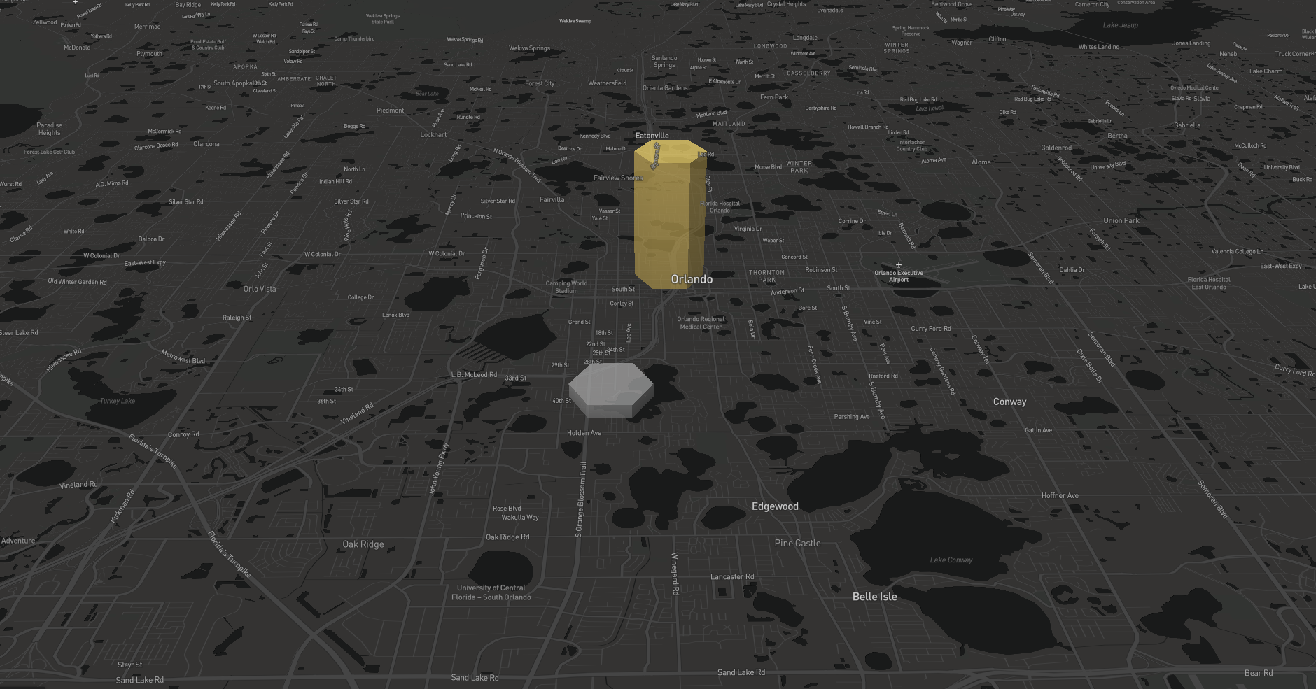
Figure 2: Orlando’s downtown (yellow) has 15x more pedestrian trip starts than the same-sized zone in nearby Holden Heights.
Crash data alone doesn’t capture the fact that pedestrian activity can differ significantly by neighborhood, and that activity fluctuated a lot in 2020. For example, downtown activity in Orlando stayed relatively constant from 2019 to 2020, but in some outer neighborhoods, it rose or fell by as much as 100% (download the full report to see the data).
Imagine the challenge if a high-risk neighborhood like Holden Heights sees a doubling in pedestrian trips.
Enhanced Metrics Expand the Safety Story
Pedestrian activity can be quite volatile from year to year, and walking activity in the city center doesn’t correlate with walking in the suburbs. Modeling based on old data won’t capture these changes. Combine those facts with the universal rising rates of pedestrian deaths, and it’s clear that risk is growing.
The deeper analyses available with transportation analytics can inform crash data in meaningful ways. Make sure your team can find and prioritize safety infrastructure investments in the places that need the most attention. Summarized from “Private Versus Shared, Automated Electric Vehicles for U.S. Personal Mobility: Energy Use, Greenhouse Gas Emissions, Grid Integration, and Cost Impact” by Colin J. R. Sheppard, Alan T. Jenn, Jeffery B. Greenblatt, Gordon S. Bauer, and Brian F. Gerke, Environmental Science & Technology 55, no. 5 (March 2, 2021): 3229–39.