
Big Data and Air Quality: Understanding Vehicle Emissions

This year, the Eastern Research Group (ERG), Coordinating Research Council (CRC), and StreetLight Data teamed up to validate one of the big as yet unmet promises for Big Data – the ability to better model and thus manage criteria pollutant air emissions from vehicles.
The results of our work show that using Big Data to model emissions at the county level is more accurate than industry-standard practices today. Of three different counties we analyzed, we found that:
- Two counties would have overestimated their emissions if they used the industry-standard approach, and
- One would have underestimated emissions by as much as 14% for a typical day and up to 110% in an individual hour.
Modeling emissions accurately matters: It allows air quality models to better predict concentrations of the regulated air pollutants ground-level ozone and particulate matter in different counties, which informs air quality planning and control strategies at the local level. In this blog post, we will walk you through the new methodology and some of our key findings.
Here’s how modeling vehicle emissions in the US works today. The Environmental Protection Agency developed a model named the MOtor Vehicle Emission Simulator (MOVES) that counties in all states except California use to estimate emissions from mobile sources. The input data for vehicle speed and distributions of vehicle-miles traveled (VMT) by hour, day type, and month for this model comes from one of two sources:
- National averages provided by the EPA via the MOVES model database, or
- Local survey work, which can be costly – particularly for vehicle speeds.
The distribution of VMT is automatically monitored by a nationwide network of under-road monitors known as the Highway Performance Monitoring System (HPMS). There is no such centralized monitoring system to capture speeds,and because of that, most vehicle emission inventories rely on the national average speeds contained in the MOVES model.
We wanted to see if Big Data could help capture the granularity and local elements of survey work but in a systemic, nationwide, and cost-effective manner. Simply put, we wanted to develop a new method for communities to get more accurate results without conducting their own expensive, time-consuming local data collection studies.

Study Justification and Set Up
First, a little more background on NEI. NEI is compiled by EPA every 3 years. It aims to provide the estimated volume of major pollutants at a local level in all sectors and counties of the US. In everywhere but California, NEI now relies solely on MOVES for on-road emissions estimates.
When NEI is updated, each state is given the option to submit its own complete mobile emissions estimates or to use the EPA’s default MOVES County Database (CDB) inputs. Default estimates are used in states that do not supply their own data. Historically, many defaults are simply uniform national averages – there is no geographic variation. These average values include average speed commonly, and less-commonly the VMT distribution by hour, day type, and month. The result is that many local areas have poor estimates of mobile source emissions because of the use of nationwide averages.
The goal for the CRC and ERG was to use Big Data derived from mobile devices such as connected cars and smart phones to develop new default average speed and VMT distribution inputs for the next version of the NEI. We wanted inputs with as much geographic detail as possible. In addition, we wanted to see if we could populate the very granular inputs that are used in the MOVES model, including:
- 16 average speed bins
- 4 road types
- 3,109 Counties (contiguous U.S.)
- 12 Months
- 7 Days of the Week (to support AQ modeling)
- 24 Hours of the Day
- 3 Vehicle Types (Light duty passenger vehicles, medium duty trucks, heavy duty trucks)
We note that with all these divisions, there were over 1 billion possible bins!
StreetLight Data provided average speed and VMT distributions data for all bins using navigation-GPS data. Of course, with over 1 billion possible bins, plenty were empty at particular speeds, so some bins were dropped or aggregated. For example, there are no trucks driving at 1 mph on a highway at 3am on most Tuesdays.
As part of mapping the individual vehicle trips to the 4 road type categories required by MOVES, StreetLight performed a GIS analysis to assign trips to the nearest road segment shown in Figure 1 below – nearly 19 million road segments. These road segments were overlaid with major urban clusters to further categorize the road types as Urban or Rural, to mesh with the MOVES model roadway classifications.
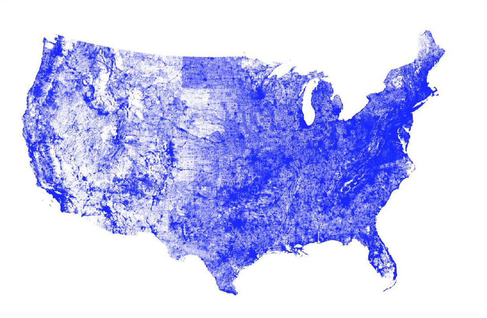
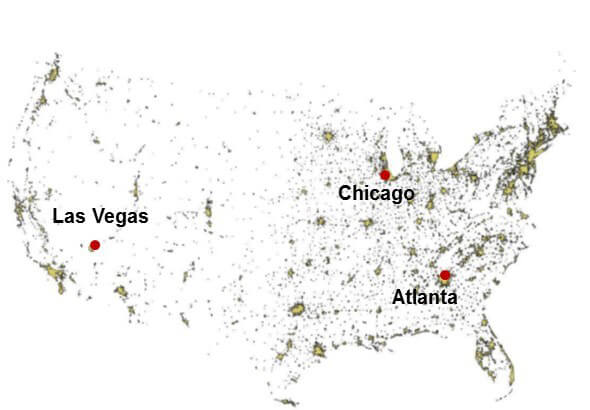
Figure 1: The maps above show the 18,644,352 road segments that were analyzed in continental US. This number includes partially as well as fully overlapping (i.e. duplicate) segments (left image). The team analyzed these segments and differentiated roads in 3,601 urban cluster areas from rural areas (right image).
In addition, the team did deep validation on three counties: Fulton County (contains Atlanta), Cook County (contains Chicago), and Clark County (contains Las Vegas).
Results
In general, the Big Data derived outputs were different than the MOVES defaults for all three types of vehicles (light duty, medium duty trucks, and heavy duty trucks). Overall, the medium and heavy duty trucks tended to move at faster speeds than the light duty vehicles. We hypothesize that this is because trucks tend to choose major roads with faster speeds more than personal light duty vehicles.
Differences between the EPA defaults and the three case study counties emerged in many different ways. For example, as shown in Figure 2, for Urban Restricted Roads (like highways), vehicles in Atlanta and Chicago move significantly slower than the national default. This is not surprising because these are congested locales. This result matters because emissions factors are higher at congested, slow speeds, and thus Atlanta and Chicago vehicle emission inventories would be underestimated if they used national defaults.
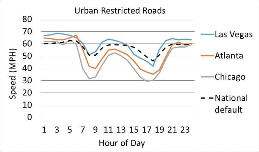
Figure 2: Average speed by hour of the day on weekdays for light duty vehicles on restricted urban roads.
In addition, we found interesting nuances when looking at different speed bins. Between 8:00am and 9:00am on restricted roads in Fulton County (Atlanta), the heavy duty vehicles are far more likely to be going at top speed bins than the medium and light duty vehicles. This also leads to different emissions factors per mile of travel.
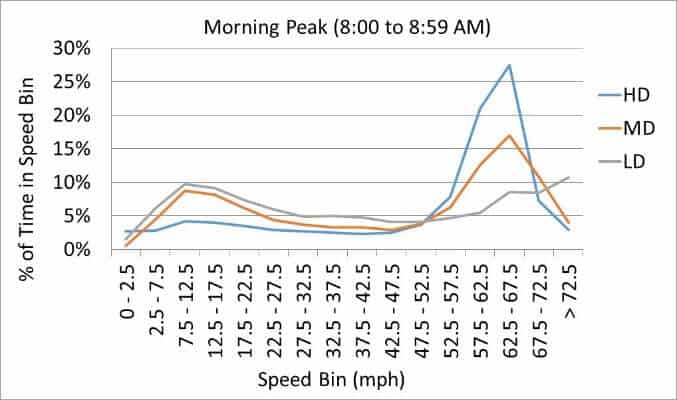
Figure 2: This graph shows the distribution of vehicle speeds by vehicle type in Atlanta between 8:00am and 8:59am. Heavy duty trucks spend more time traveling at higher speeds than medium duty trucks and light duty passenger vehicles.
Finding different VMT distributions across the day was also a key goal. Some health-damaging emissions have a variable impact on citizens depending on time of day because folks are out and about at different times. Furthermore, the overall concentration of certain pollutants in the atmosphere depends on timing emissions released due to interactions with sunlight, mixing and dispersion from wind, and interactions with other chemical species that have established diurnal patterns. As shown in Figure 3 (below), different vehicle types and days of the week have very different load curves in terms of VMT.
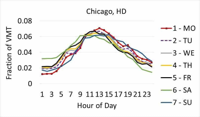
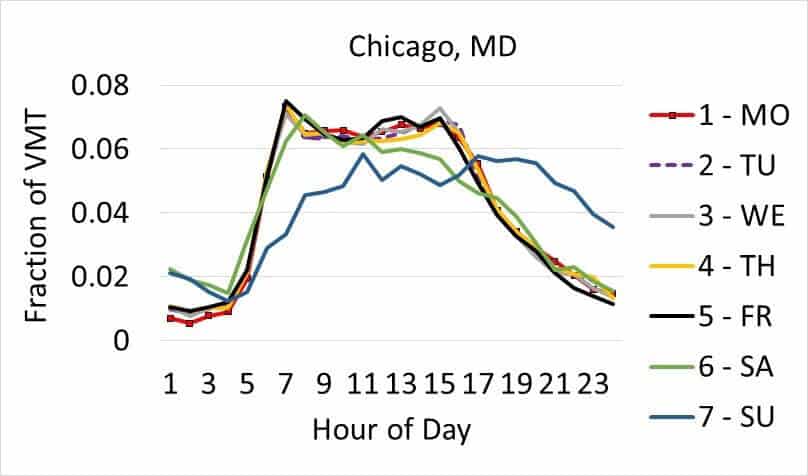
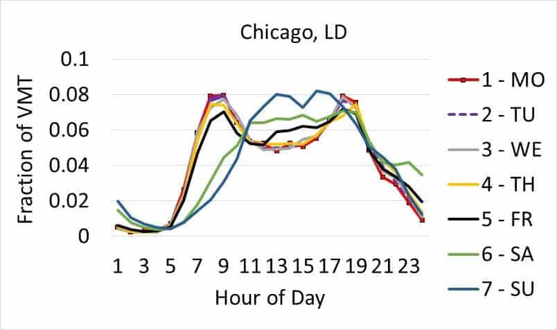
Figure 3: The graphs above show the relative distribution of VMT by hour of the day for three different vehicle types in Chicago. This nuance matters as some health-damaging emissions will have more impact if they occur when people are out and about.
Overall, using the more granular Big Data had a big impact when the full MOVES simulation was complete. As shown in Figure 4 (below), Cook County probably would underestimate emissions, especially of PM2.5, if they used national averages. The hourly differences were especially significant, as shown in Figures 4 and 5 below.
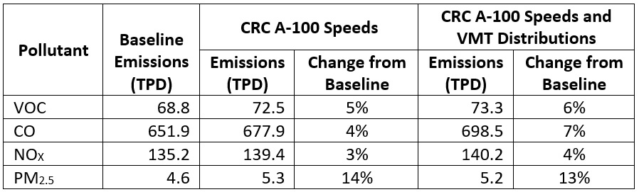
Figure 4: This chart shows the difference in overall Cook County emissions when using the national default for VMT and speed vs. using StreetLight-derived inputs.
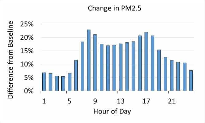
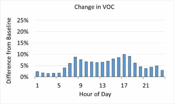
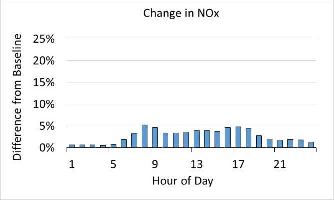
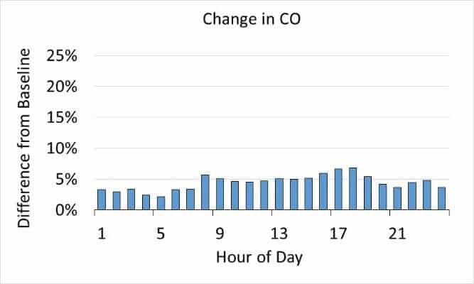
Figure 5: The graphs above show that hourly changes in emissions levels for Cook County changed more significantly than overall emissions when the improved inputs from Big Data were used in the MOVES.
Conclusions
NEI relies on MOVES inputs at the county level. However, national average defaults are used in many counties where data are lacking, especially for average speed. Using telematics data, such as that provided by StreetLight InSight, to obtain county-level inputs for average speed and VMT distributions in 2014 NEI v2 is an important step forward. This Big Data approach appears to be more robust in contrast to traditional sources of speed data (e.g., 4 Step Model), because of:
- Better spatial/temporal resolution
- Differences unique to individual cities
- Truck trends not seen in other datasets
This has a consequential impact on emissions for different counties, especially on hourly emissions trends.
How to Get the Data
Thanks to the CRC, these new and improved county level input data, as well as more detail from this report, are available for counties either individually (red counties in Figure 6) or as a regional group (non-red counties) to use in both the MOVES model and the air quality model pre-processor known as SMOKE. You can access them at www.crcao.org. Counties can also work with StreetLight to create their own cuts of the relevant VMT and vehicle speeds.
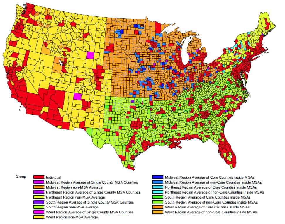
Figure 6: For red counties, data is available for each county. For other colors, data is available as an aggregated group.
Note: This blog summarizes the findings presented at the MJO MOVES working group in March. This work was funded by CRC. The full report can be found here. The navigation-GPS used for this analysis was provided by INRIX.