
Surprising Changes to Traffic Congestion in Urban Areas

Analyzing travel in major metropolitan areas throughout the U.S. shows surprising new patterns that only a granular analysis can decipher. Specifically, the data shows that while total miles driven are similar to February 2020, big changes have arisen in when and where trips occur in metropolitan areas.
Essentially, we see the same vehicle miles travelled (VMT) in metro areas, but without the same level of congestion, and in new locations. This decoupling of VMT and urban-area congestion shakes many of the foundations of our models and decision tools about transportation infrastructure, investment, funding, mode choice, and more.
Significant Shift in Rush-Hour Trips
In the past, when we have looked at trips by time of day (especially weekday trips), we have always seen a “bi-modal” trip distribution. These are our traditional peak AM and peak PM periods, coinciding with commuting to and from work for many employees.
Now, when we examine the hourly distribution of VMT in metro areas, we see a “smoothing” of peak AM travel time during what has traditionally been the morning commute period. These trips are shifting (or being replaced) with more trips happening during the midday hours.
For five separate MSAs, we looked at the distribution of VMT by time of day for average weekdays in June 2019 and January 2020 (pre-COVID), compared to June 2020 (post-COVID). In all cases, we see the bi-modal peaks in the pre-COVID periods, as well as the reduction of the morning commute peak in the post-COVID period across all five MSAs.
We still see peak PM travel behavior, along with more VMT in the afternoon than before.
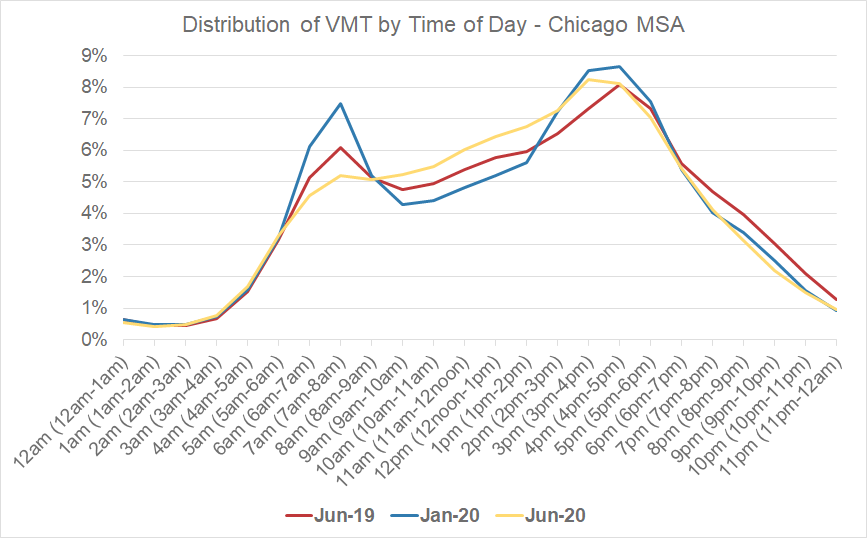
Figure 1: Hourly VMT analysis for the Chicago MSA.
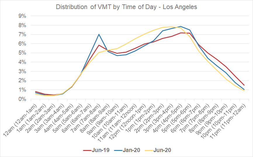
Figure 2: Hourly VMT analysis for the Los Angeles MSA.
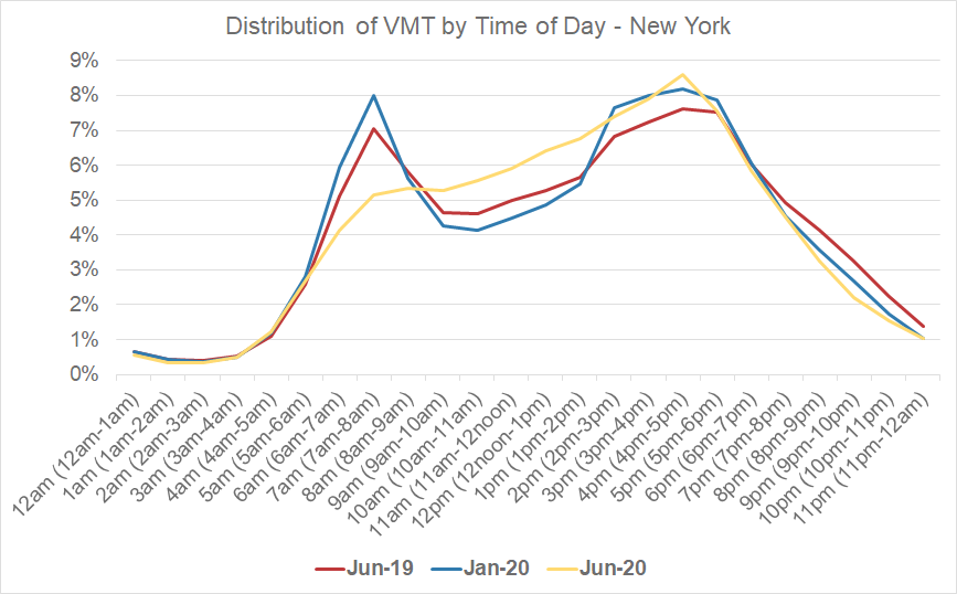
Figure 3: Hourly VMT analysis for the New York MSA.
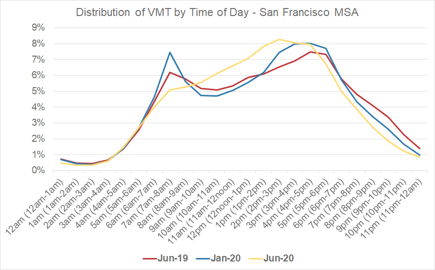
Figure 4: Hourly VMT analysis for the San Francisco MSA.
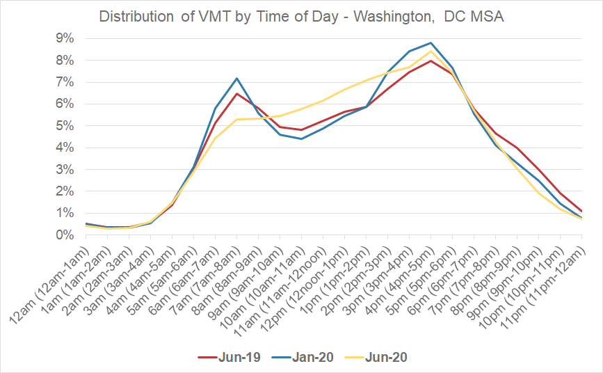
Figure 5: Hourly VMT analysis for the Washington, D.C. MSA.
Decentralized Urban Travel
When we examine where post-COVID trips originate, we see a decrease in metro area trips in city centers, and an increase in trips farther away from the traditional downtown/core urban areas.
Highlighting the Chicago and Washington, D.C. MSAs at a granular spatial level, we found that the areas with the largest decrease in trips between 2019 and 2020 were in the core urban/downtown/central business districts of the MSAs. Areas in the less densely populated outer regions of the MSAs saw actual increases in trips, year over year.
In the image below, we have plotted the percent change in trip starts throughout the Chicago MSAs, in 3km grids. The darker the shading, the higher the percent decrease in trip starts. The light-yellow represents increases in trip starts in June 2020 compared to June 2019.
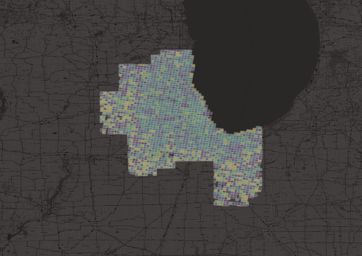
Figure 6: Overview of change in trip starts from June 2019 to June 2020 for the Chicago MSA.
When we plot just the grids where trip starts have increased year over year, we see there is a large concentration of this activity in the outer regions of the Chicago MSA.
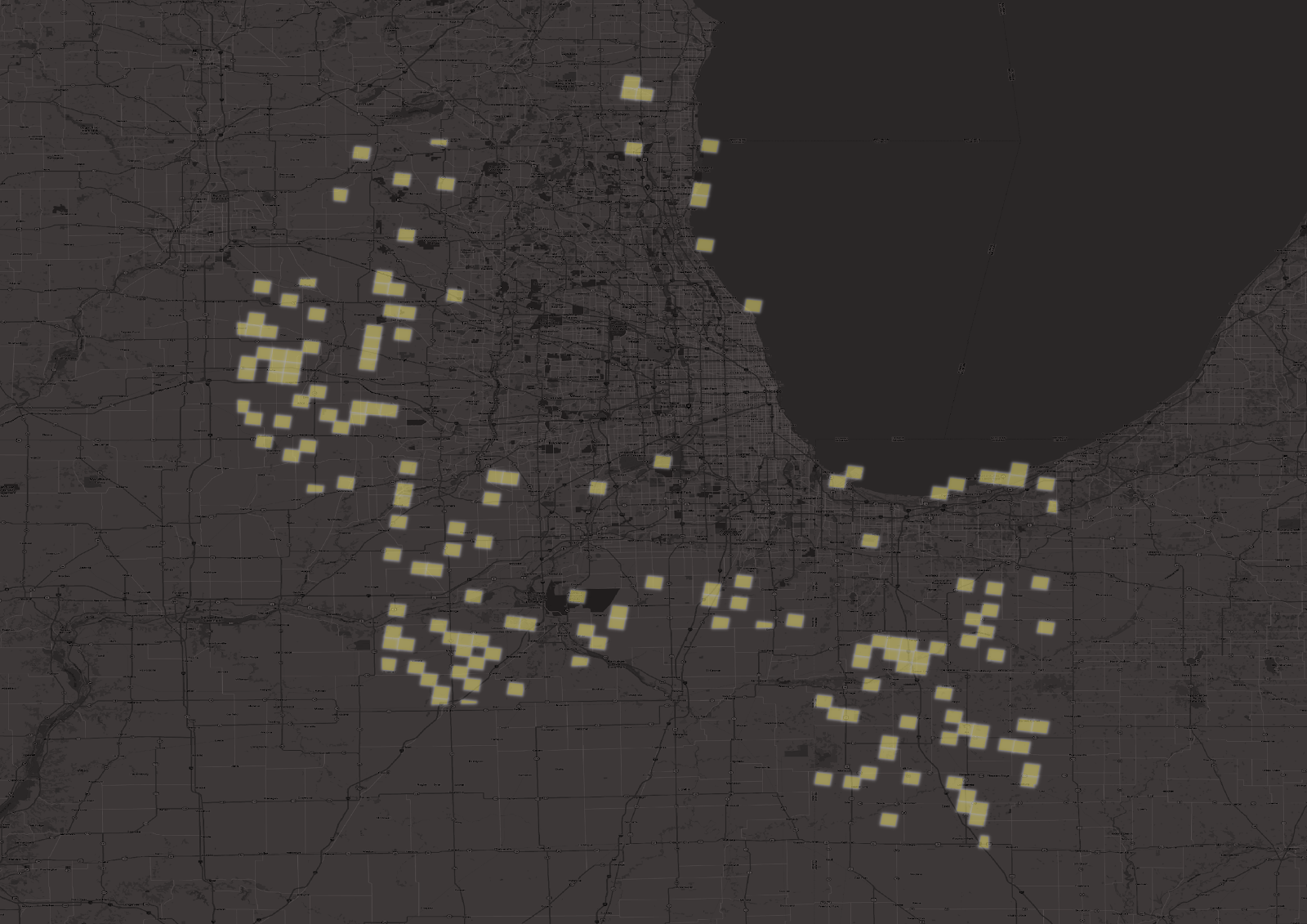
Figure 7: Chicago areas with trip increases from June 2019 to June 2020.
Conversely, when we plot the areas with the largest percent decreases in trip starts, we see locations closer to Chicago’s urban core.
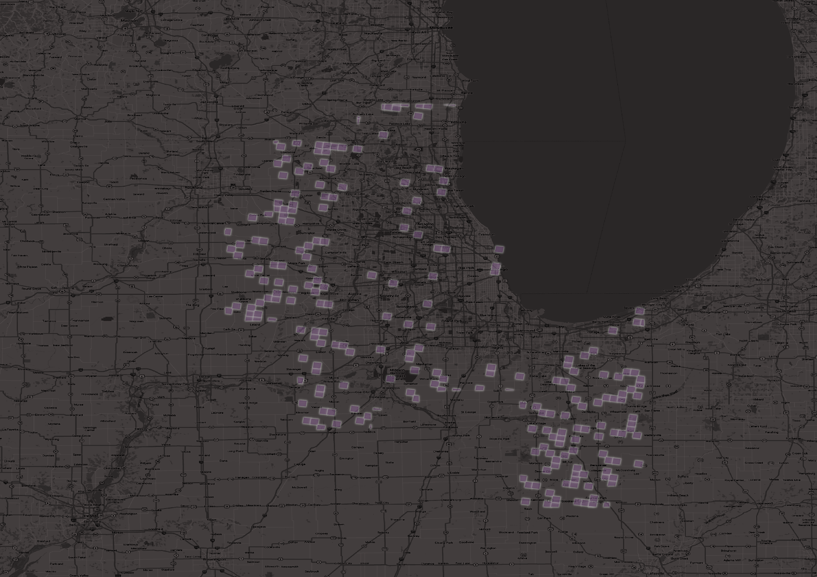
Figure 8: Chicago areas with the largest trip decreases from June 2019 to June 2020.
When we zoom in on Chicago’s urban core, we see it is included.
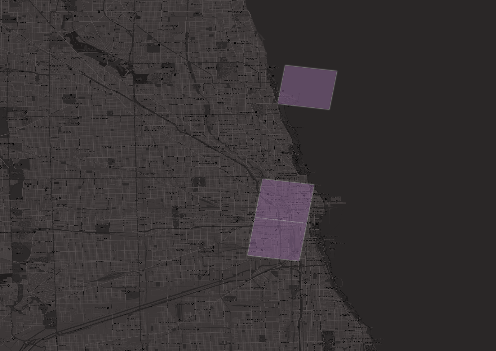
Figure 9: The Chicago MSA urban core shows significant decreases in trip activity from June 2019 to June 2020.
When we examine the Washington, D.C. area, we see a similar pattern as well.
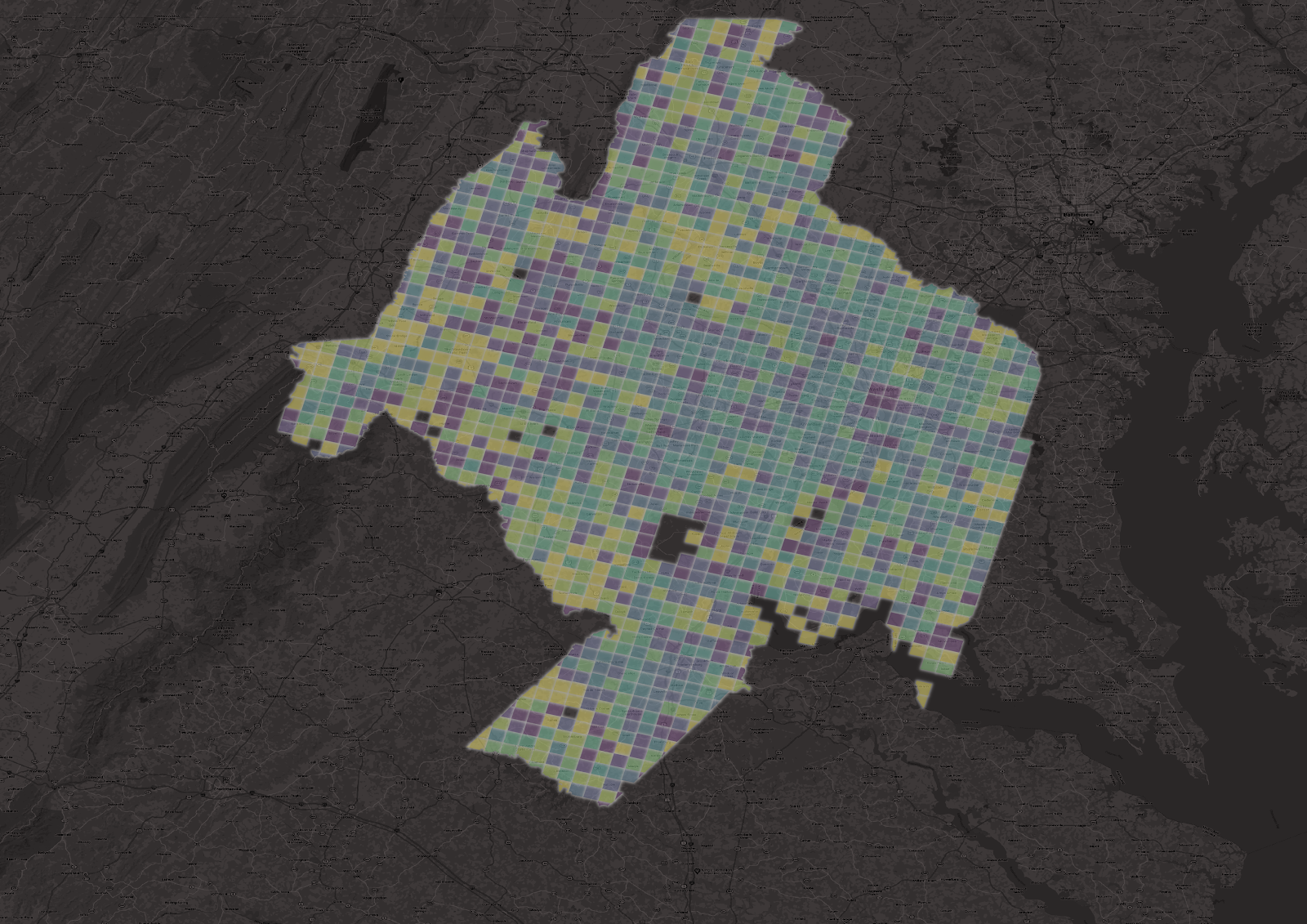
Figure 10: Overview of change in trip starts from June 2019 to June 2020 for the Washington, D.C. MSA.
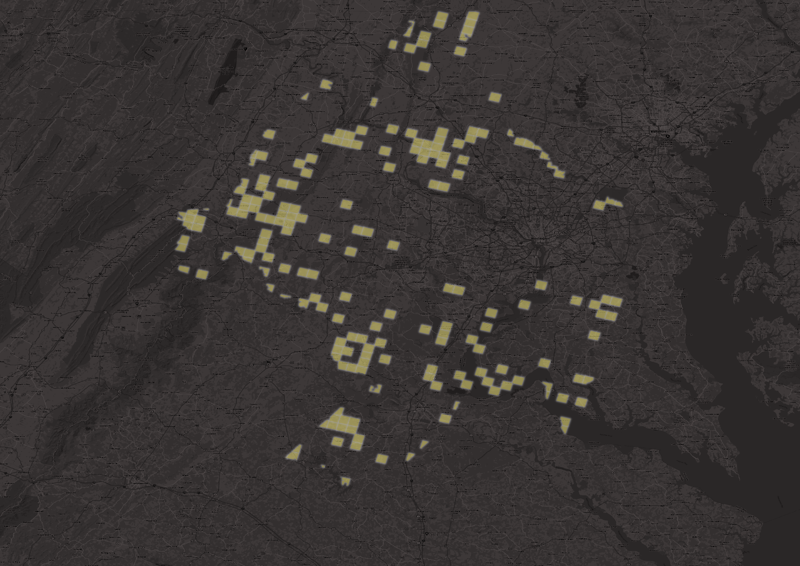
Figure 11: Washington, D.C. areas with trip increases from June 2019 to June 2020.
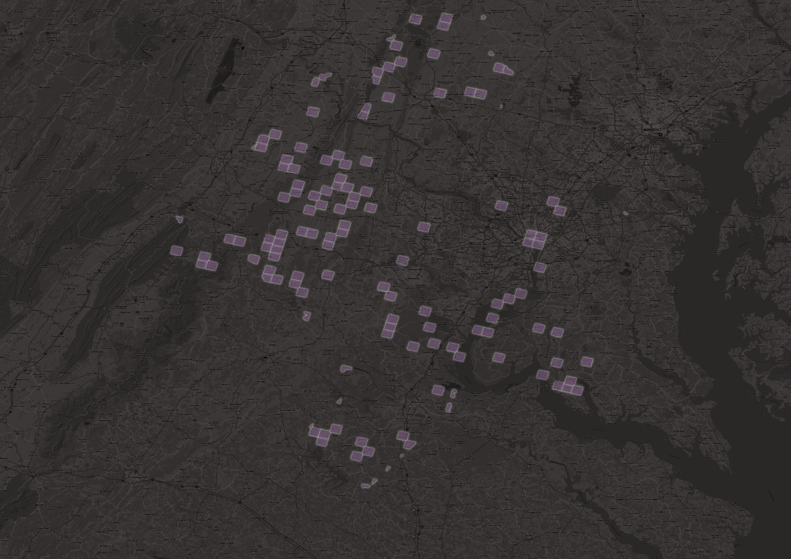
Figure 12: Washington, D.C. areas with largest trip decreases from June 2019 to June 2020.
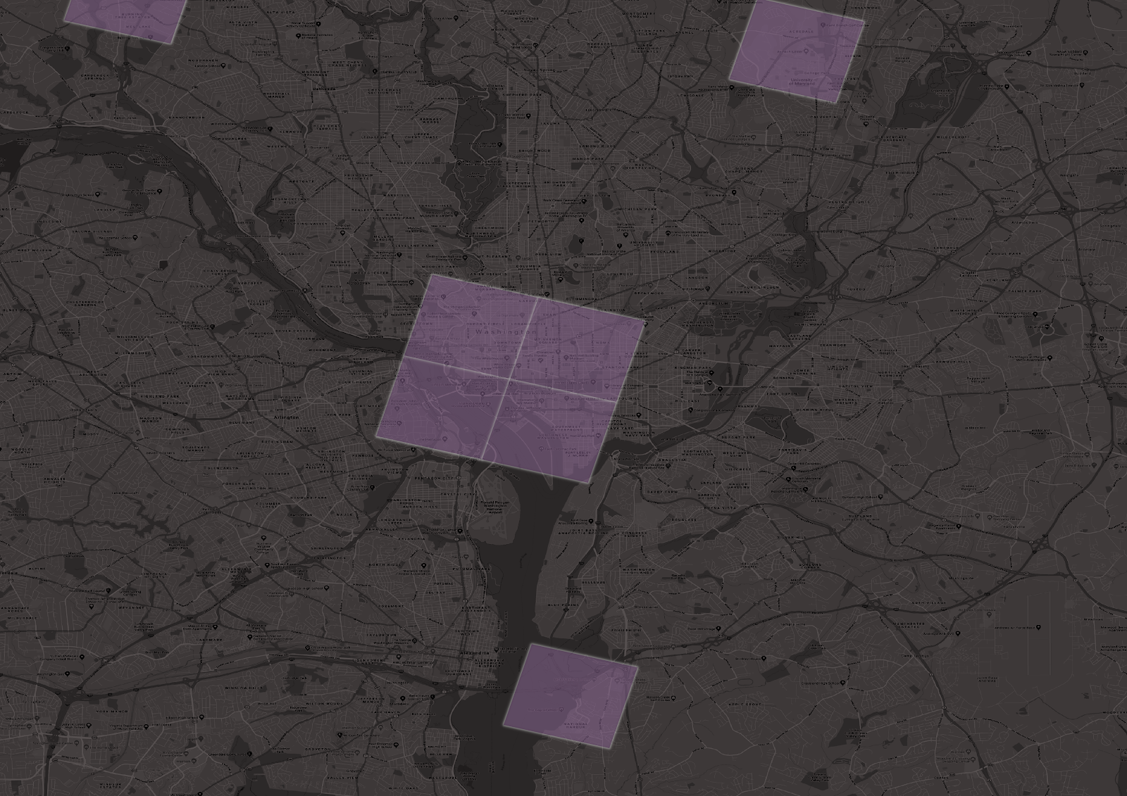
Figure 13: The Washington, D.C. MSA urban core shows significant decreases in trip activity from June 2019 to June 2020.
Monitoring Future Changes
Transportation models have relied on assumptions about established time-of-day trip patterns, but these patterns are changing. It is extremely important to monitor travel patterns and behaviors during these times — and to dig deeper with hourly and location-specific metrics. Even when our quarantines and work-from-home requirements relax, it’s possible that some of these behavior shifts will stick. Understanding the new and emerging behaviors will help transportation professionals plan for the future in a more effective manner.