Going Beyond Stationary Sensors to Understand Traffic in New York

The smart city movement’s first wave brought tons of stationary sensors to our cities, especially in the context of transportation. These sensors are passively collecting valuable travel pattern information at traffic lights, parking lots, bus stops, sidewalks, and more. But if we want cities that are truly smart – if we want to solve the challenges exposed by our stationary sensors – we have to go beyond them. In this blog post, I will use New York City as a case study to explain why.
I decided to write this post after attending a fantastic event hosted by the New York City Department of Transportation (NYC DOT) and C2SMART: The Smart Data Analytics Symposium/Hackathon. It was an exciting opportunity because New York City is arguably one of America’s “smartest” cities. But traffic there is on the rise, perhaps because New York City currently has the largest population, employment, and tourism in its history.
There are over 600 sensor cameras installed throughout New York City. The data analytics NYC DOT’s transportation engineers have amassed about their city’s travel patterns are extremely impressive. However, the city’s sensor network is primarily used for real-time operations such as signal timing and emergency management. These sensors are not providing the data required to design and implement effective, long-term congestion mitigation strategies. Without a long-term strategy, no amount of smart real-time moves can overcome the transportation challenges of the future.
What Sensors Can Tell You
Congestion problems notwithstanding, city officials know a lot about travel patterns in their city. For example, they shared that:
- 86% of personal trips into Manhattan are by transit, walking, or biking – that means only 13% are by taxi or car.
- From 2010 to 2015, bicycle trips went up 83% and subway trips went up 10%.
- 56,000 fewer vehicles entered Manhattan south of 60th Street on a daily basis in 2015 vs. 2010. Car ownership over the same time period hardly changed at all.
If we stop there, we have a pretty rosy picture of transportation in the Big Apple. Unfortunately, that is not the full story:
- Average weekday vehicle speeds in Manhattan below 60th have dropped from 9.4 miles per hour in 2010 to 8.1 miles per hour in 2015. In midtown, the average speeds are just 5.1 miles per hour.
- Bus speeds are impacted the most: They fell from about 7.8 miles per hour in 2010 to 5.5 miles per hour in 2015.
- Package deliveries to residences have increased by about 30% in 2015 vs. 2010.
These two sets of statistics reveal a major congestion problem that has deep ramifications. Traffic jams ultimately reduce the city’s economic output, waste money in the form of fuel and vehicle operating costs, and pollute the environment. It’s important to emphasize that traffic has a major impact on bus speeds in particular. Bus slowdowns unfairly harm low and moderate income travelers, who are more likely to use the bus system than more affluent travelers.

What Sensors Can’t Tell You
Despite this wealth of information, NYC DOT officials do not have all answers when it comes to travel patterns in their city. Prior to the hackathon, the organizers shared several of their questions with attendees:
- What causes congestion at the block level?
- Are commercial trucks double-parking causing congestion? If so, would curb management initiatives that improve curb access for deliveries be helpful?
- Are declining bus and taxi speeds caused by the same factors – or are they different?
- How many cyclists use bike lanes and streets?
- How many pedestrians use sidewalks, streets, and intersections?
- Do pedestrians impact the speed of motor vehicle traffic, and do they create road crash hazards?
The goal of the event was to come up with strategies to answer these questions, and I was there to present the ways that Big Data from mobile devices could be useful. Keep in mind that I am not suggesting Big Data can answer all of NYC DOT’s questions. No single data source can. With that said, Big Data can play a major role in diagnosing mobility challenges – especially when supplemented with information from stationary sensors. Big Data provides engineers and planners with more holistic transportation data, especially with regard to this key question: “What causes congestion at the block level?”
A New York City Case Study: 14th Street at 3rd Avenue
Let’s look at the intersection of 14th Street at 3rd Avenue in New York City to illustrate the concept of “going beyond the sensor.” We analyzed this intersection using StreetLight InSight®. (That’s StreetLight Data’s easy-to-use online platform for using Big Data to understand travel behavior).
This particular intersection was identified on NYC DOT’s website as an area of concern. The city already knew that traffic there was bad, and that a ton of trucks passed along the 14th Street corridor. But they didn’t have answers to big picture questions, such as:
- Do trucks generally use this intersection to access nearby destinations?
- How did the trucks passing through the intersection enter Manhattan?
- What types of traffic solutions would be effective?
Since the city already identified trucks as a problem, I analyzed medium-duty trucks’ travel patterns in StreetLight InSight.First, I looked at the intersection at a granular level to help answer this question: “Do the trucks that use this intersection access nearby destinations”?
As shown in Figure 1 below, StreetLight InSight Metrics revealed that nearly all of the medium-duty trucks that use this intersection are not accessing local destinations. This means that trucks are not circling the block looking for access to a curb for commercial deliveries. Instead, they’re moving beyond the neighborhood:
- Almost 60% of trips proceed down 14th Street towards Broadway and continue their trips.
- Nearly 36% of trips turn onto 3rd Avenue and continue their trips.
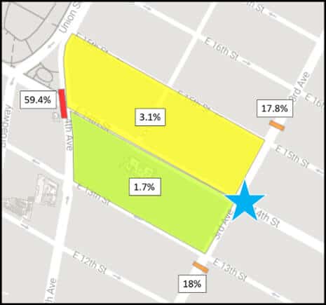
Figure 1: The blue star in the heat map above shows the intersection of 3rd Avenue and 14th Street: This is our origin Zone. Because we designated this origin Zone as “pass through”, StreetLight InSight analyzed all trips that passed through this Zone. The gates across 3rd Avenue after 13th Street and 15ths and across 14th Street are pass-through destination Zones. The two large rectangles capture the trips that end in those Zones.
Since these trucks are not stopping to complete deliveries on these blocks, it is unlikely that better curb management and strict double-parking enforcement will improve congestion at this intersection.
However, there are other options for the city to explore – especially considering the importance of bridges and tunnels in New York City’s traffic management. As a next step, I expanded the StreetLight InSight analysis to evaluate the routes that medium-trucks took to reach this intersection.
Using StreetLight InSight, I ran two larger origin-destination studies. For both studies, 13 of New York City’s bridges, tunnels, and access points were the origin Zones, and the intersection of 3rd Avenue at 14th Street was the destination Zone (see Figures 2 and 3 below). One study looked at the origins of trips traveling eastbound through the intersection, and the other looked at trips traveling westbound.
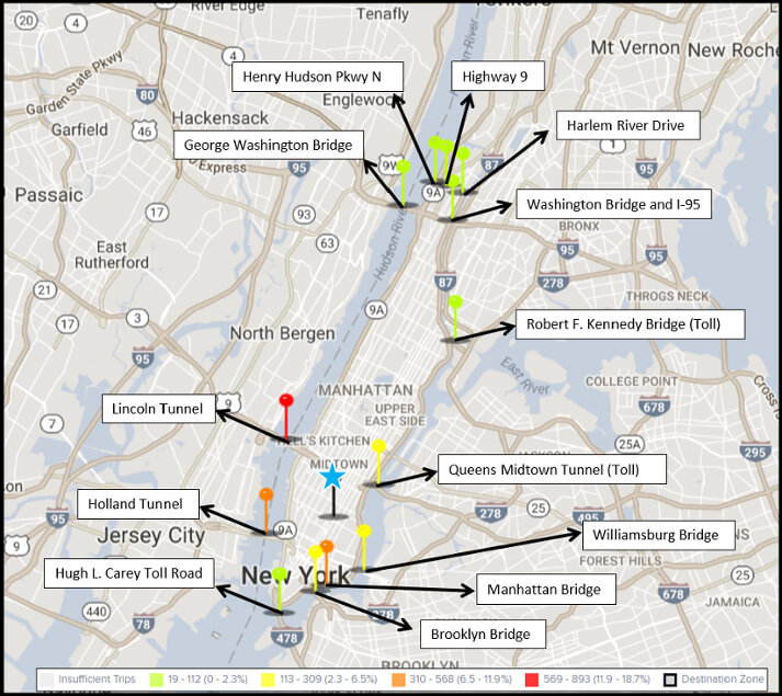
Figure 2: The heatmap above shows the expanded StreetLight InSight origin-destination analysis. Our origin Zones are 13 different access points, which are represented by the green, yellow, orange and red pins above. Our destination Zone is the intersection of 14th Street at 3rd Avenue, which is marked by the pin with a blue star. This heat map shows the relative volume of trips traveling eastbound through the intersection from each origin Zone. All origin and destination Zones were designated as pass-through Zones in StreetLight InSight.
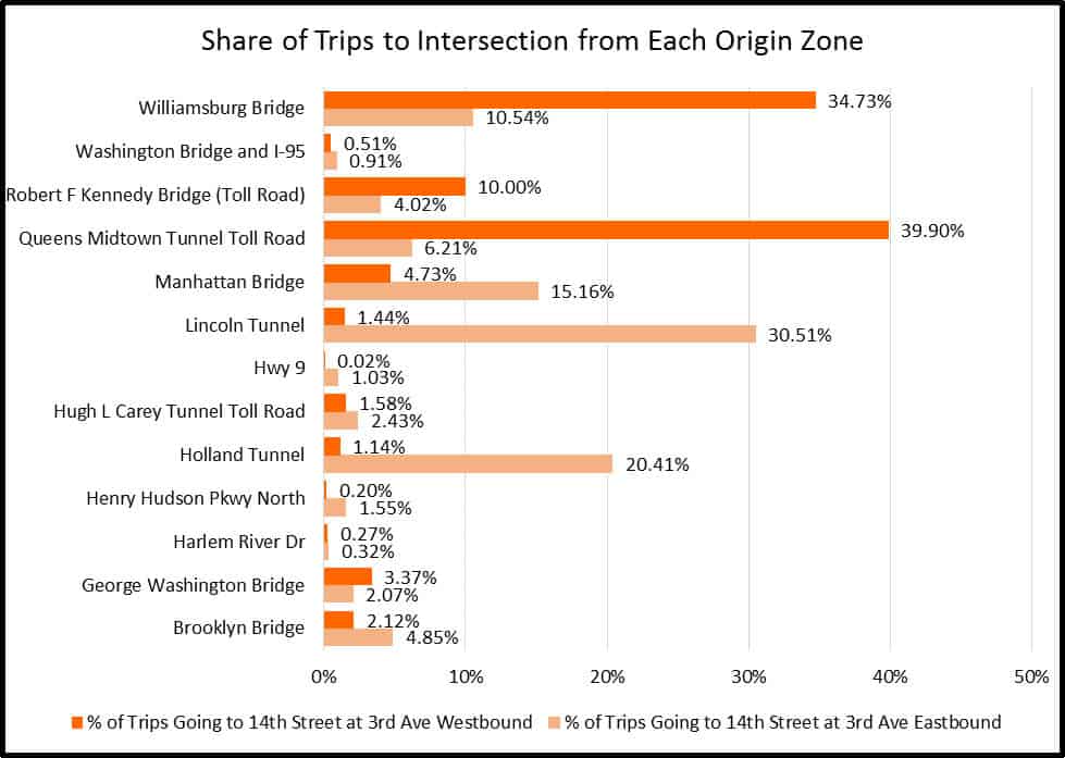
Figure 3: This chart show the percentage of trips using each access point to reach the intersection of 14th Street at 3rd Avenue. There are separate bars for trips going eastbound and westbound through the intersection.
Our analysis revealed the most popular access points into Manhattan for medium-duty trucks passing through this intersection. The Williamsburg Bridge, Queens Midtown Tunnel, Lincoln Tunnel, and Holland Tunnel were the most common; however, the direction of traffic was a major factor. For example, the Lincoln Tunnel was used by more than 30% of eastbound trips through the intersection, but just 1% of westbound trips.
By coupling these origin-destination and routing insights with the data generated by sensors, traffic engineers can gain a much fuller understanding of traffic flows throughout the city. With this type of information, NYC DOT traffic engineers and planners would be better positioned to evaluate potential congestion mitigation techniques. For example, they could conduct further analysis to investigate the impact of using tolls on specific bridges and tunnels. Tolls could incentivize travel during specific times of day or the use of different access points. By encouraging truck drivers to enter Manhattan via a different bridge or tunnel, they may be able to divert a significant volume of medium-duty traffic from this intersection.
Why It’s Important to Go Beyond Sensors
To engineer a long-term solution to the congestion, it is vital to know where the cars, trucks, and bicyclists in that block’s traffic jam begin and end their trips. That’s where Big Data can be especially valuable. By supplementing the data generated by stationary sensors with Big Data, we can find solutions to the thorniest problems – and we can rank them by expected effectiveness. That’s what it takes to make a city truly smart.