Before and After Congestion Pricing: From Staten Island to NJ to Manhattan, How Travel Times Are Changing
ANALYSIS
Before and After Congestion Pricing: From Staten Island to NJ to Manhattan, How Travel Times Are Changing
Is NYC’s congestion pricing working? StreetLight analyzed travel times on ten key routes to see how traffic conditions have changed during rush hour and beyond, including areas where the tolling program faced some resistance.
On January 5, 2025, New York’s MTA launched the Congestion Relief Zone tolling program, charging drivers a fee to enter the notoriously congested streets below 60th St. in Manhattan, excluding key highways and connector roads. The new toll, which includes peak and off-peak pricing, aims to reduce area congestion, air pollution, and safety risk, while raising revenue for the MTA. The tolling effort has implications not only for congestion in the immediate tolled zone but many surrounding areas, as well. (Federal administrators recently said they were rescinding approval of the tolling program, but as of this writing the tolls remain in effect.)
The MTA released initial data from week one of congestion pricing showing improved speeds on many of the bridges and tunnels entering the zone as well as on key bus routes.1 Overall, most of the routes studied by the MTA have seen travel times improve.
StreetLight is now using its Traffic Monitor product, which helps planners and engineers monitor recent speed and congestion changes, to deepen the picture on congestion tolling with more data since the fee went into effect.
For a bird eye’s view of how traffic looked on a single day three weeks into the launch of congestion pricing, StreetLight used Traffic Monitor to create the gif below, showing the change in atypical speeds over the course of the day on January 28th, as compared to similar days in January 2024. Green, thicker lines show improved speeds while red segments indicate decreased (i.e slower) speeds.
Year-over-Year speed changes on January 28th in Manhattan and the surrounding region.
Of course, no single day provides a perfect measurement of traffic, as any day can be affected by crashes, weather, tourist activity, construction, and other disruptions.
To further contribute to the public’s understanding, StreetLight analyzed change in travel times over a three-week study period in January on ten distinct routes in the NYC metro area. You can see the map of the routes studied below.
StreetLight studied north-south routes, crosstown routes, and routes traversing areas outside the toll zone, in places where some have raised concerns about increased congestion from rerouting vehicles. StreetLight also included trips ending at major hospitals, as improving emergency vehicle travel times has been a stated goal of the program.
StreetLight’s analysis finds that most routes studied did see travel times improve. Six of the ten routes saw travel times decrease during both peak and off-peak tolling hours, including routes through New Jersey and Queens where there has been some resistance to congestion tolling.
Both Manhattan-based hospital routes – from Times Square to NYU Langone and the West Village to Memorial Sloan Kettering – saw peak hour travel times decline by 10% and 6%, respectively, a positive indicator for emergency travel within the zone.
For the routes where travel times worsened, the effect was small. Even during peak hours, the increase in travel times was less than a minute on all negatively impacted routes. This may be expected regardless of policy change as vehicle miles traveled have been steadily rising since 2021.2
Routes from New Jersey to Columbus Circle saw an interesting trend. Travel over the George Washington Bridge from Ridgefield Park, NJ to the northern edge of the congestion tolling zone slowed down by a slight 30 seconds during peak hours, as compared to a year earlier. However, travel via the Lincoln Tunnel from East Rutherford, NJ to Columbus Circle improved significantly, by over 3 minutes during peak hours.
Analyzing Impact by Time of Day for Targeted Interventions
StreetLight allows planners and engineers to analyze travel at highly granular geographic and spatial scale. For example, if city planners are particularly focused on improving bottlenecks during the weekday AM or PM peak, that analysis is simple and straightforward. The impact of the MTA’s congestion charging will change over time as residents and visitors adjust, and as other trends impacting NYC arise. Many analyses will and should be done! StreetLight’s goal is to enable planners to understand and adapt to the complexities of managing congestion.
In the chart below, StreetLight compares the change in travel time on the Times Square to NYU Langone route by weekday only, looking at weekday all day vs. weekday peak AM and weekday peak PM. Peak AM travel times see the biggest improvement as compared to peak PM and all weekday.
Methodology
The analysis compares travel on select routes between January 5-25, 2025 and the same time of day and day of week for the month of January 2024. Travel times are based on sample count speed data.
Routes selected are not comprehensive of traffic in any one area. They represent travel between major destinations and aim to contribute to the picture of congestion pricing’s impact.
___
1. Metropolitan Transportation Authority (MTA). Congestion Relief Zone Tolling: Week One Update. January 13, 2025. https://www.mta.info/document/162396
2. U.S. Federal Highway Administration, Moving 12-Month Total Vehicle Miles Traveled [M12MTVUSM227NFWA], retrieved from FRED, Federal Reserve Bank of St. Louis; https://fred.stlouisfed.org/series/M12MTVUSM227NFWA, March 10, 2025.
Get traffic flowing with nine data-driven congestion solutions
Explore the resources listed above and don’t hesitate to reach out if you have any questions. We’re committed to fostering a collaborative community of transportation professionals dedicated to building a better future for our cities and communities.
Swift Streets? Complete Rankings for Traffic Management at Every Stadium in Taylor Swift’s U.S. Eras Tour
Swift Streets? Complete Rankings for Traffic Management at Every Stadium in Taylor Swift’s U.S. Eras Tour
In a study of traffic delays across the entire U.S. Eras Tour, StreetLight found delaysat least doubledat most of the 23 stadiums where Swift performed — but there were some notable outliers.At one venue, trafficactually improved.This reportupdates and expandsStreetLight’s prior analysis ofnine stadiumsthat hosted Eras Tour concertsin March–May 2023.
When Taylor Swift announced her first live tour since 2018, the rush on tickets by fans made national headlines (and earned a congressional hearing).
For transportation and transit agencies, and stadium operators, a very different challenge emerged: Managing traffic from the legions of fans who would descend on the stadiums for the Eras Tour.
Event operations pose a special challenge as they put a dramatic tax on roadway operations over a narrow time block, which local transportation infrastructure is not built to support during a typical day. As a result, stadium operations groups often work in close coordination with local transportation agencies to manage traffic, as well as ingress and egress from the stadium.
So when it comes to the Eras tour, how have the stadiums and agencies fared at managing fan traffic and keeping the roadways flowing? StreetLight ran the numbers to find out. Then, we look at how transportation and operations professionals can use analytics for more effective events traffic management.
Key Findings:
Vehicle Hours of Delay (VHD) on roadways adjacent to the concert venues at least doubled during most Eras Tour concerts. On average, vehicle delays were 277% higher across all stadiums compared to delay hours at comparable times on non-concert dates.
Only four out of 23 venues saw traffic delays increase by less than 100%: MetLife Stadium in East Rutherford, NJ ; Mercedez-Benz Stadium in Atlanta, GA; Empower Field at Mile High in Denver, CO; and Acrisure Stadium in Pittsburgh, PA.
Traffic around MetLife Stadium, which invested heavily in transit access, actually decreased compared to usual delays. This is the only venue where traffic decreased.
The worst venue for increased traffic delays (based on % change from typical conditions) was Gillette Stadium in Foxborough, MA. This is a location where typical VHD is relatively low compared to many of the other venues studied.
Eras Tour Traffic Winners & Losers
To understand the traffic impacts from the U.S. Eras Tour concerts, StreetLight analyzed Vehicle Hours of Delay (VHD) on all non-local roadway segments within a one-mile radius of each stadium during the peak arrival hour of 5-6 p.m. on each concert date. VHD measures the difference in vehicle travel time on a segment during congested versus free-flowing conditions, multiplied by the number of vehicles traveling on that roadway.
This same process was repeated for the same days of week within that month (concert dates and holidays excluded) to determine a baseline VHD for a typical travel day. You can read more about StreetLight’s data here.
Overall, across all 23 stadiums and 62 concerts, average delay hours were 277% higher than typical. In fact, all but four stadiums saw delay hours at least double on average over the course of the concerts.
Two major success stories emerged, however: Atlanta’s Mercedes-Benz Stadium and New Jersey’s MetLife Stadium saw average delays well under 100%.
Atlanta only saw a 32% increase in traffic delays. But NJ’s MetLife Stadium was the real standout.
VHD actually decreased during the concerts, by 27% on average over the course of the three nights. Notably, both Atlanta and New Jersey’s concert venues were given high marks for their emphasis on public transit options to the concert. Atlanta’s Metropolitan Rapid Transit Authority System (MARTA) reported seeing three times the usual ridership during the concert days at stations near the stadium, according to CBSNews. NJTransit, which ran extra service around the stadium, carried 80,000 riders via train and bus to the concert, according to NJ.com.
Of note, on a normal day, both MetLife Stadium and Mercedez-Benz Stadium see higher baseline congestion than most of the other stadiums studied here (with the sole exception of Vegas’ Allegiant Stadium).
Philadelphia also placed a big emphasis on public transit. This may have paid off for the stadium on two of the concert nights. The Friday and Sunday shows in May 2023 at Philadelphia’s Lincoln Financial Field saw below average increases in delays compared to the other stadiums, with VHD 200% and 186% higher than typical for streets around the stadium, respectively.
However, on Saturday night Philadelphia’s Lincoln Financial Field encountered huge snarls, with a 599% increase in hours of delay. This dragged down the stadium’s average across the three nights. It’s also a signal of how tenuous traffic management at an event like this can be, and how easy it is for delays to compound.
But by far the worst increase in traffic delays occurred at Gillette Stadium in Foxborough, MA, near Boston. It saw delays 1,270% higher than typical on average over three nights in May 2023. Typical VHD near the stadium is low compared to many of the other venues in this study, perhaps because Foxborough, MA is a small town of just over 18k residents as of 2022, though its stadium regularly hosts sold out football games as the home of the New England Patriots, and is the largest stadium in the Greater Boston metro area.
Next highest for percent increase in traffic delays, at 737% higher than typical, was Kansas City, MO’s Geha Field at Arrowhead Stadium. Like Gillette Stadium, this venue also sees relatively low typical VHD.
Like Philadelphia’s Lincoln Financial Field, several other venues also saw dramatic differences in excess VHD depending on the concert date, including AT&T Stadium in Arlington, TX, Gillette Stadium in Foxborough, MA, and Geha Field at Arrowhead Stadium in Kansas City, MO.
Among these venues, Saturdays and Sundays tended to see the worst increase in delays, with Fridays relatively lower. This could be influenced by commuter traffic on Friday evenings peaking between 5 and 6 p.m., driving up typical VHD on Friday evenings, resulting in lower increases comparatively.
How Transportation, Events, & Operations Professionals Can Manage Event Traffic Better
Events like the hotly anticipated concerts of Swift’s Eras Tour test the limits of everyday traffic operations, and often demand temporary strategies that reduce congestion, encourage shared transportation modes, and keep concert-goers safe.
But anticipating and mitigating traffic issues from special events is far from simple. To minimize delays, promote smooth traffic flow, and ensure safety, planners and operators need to know which routes attendees will travel, the modes they will use on the way, the intersections where they’ll be turning, and what alternate routes people may take as primary routes become congested.
Complicating these challenges is the time and financial cost of gathering the right data needed to understand all these factors. While certain major arterials may benefit from permanent traffic counters, many roadways lack these counters, such as residential or other local roads that may experience cut-through traffic when larger roadways become gridlocked.
This makes it impossible to get historical data with the granularity needed to understand past events or even average seasonal roadway conditions. Meanwhile, collecting data on complex roundabouts, intersections, or weaving segments can also be difficult, even if manual counts or surveys are deployed in advance of the event.
Big Data and Special Events Traffic Planning
A big data approach to special events planning can help fill crucial data gaps to anticipate their traffic impacts. Whether it’s used to inform broader travel demand models or applied for analysis of traffic operations during specific events, access to on-demand transportation analytics expedites special events planning without needing to put staff in harm’s way for manual counts and surveys that only capture a snapshot of traffic during a short period of time.
This expedited process allows planners and operators to proactively evaluate alternative traffic management strategies and communicate their decisions with the public in advance of special events.
Moreover, analyzing Origin-Destination of traffic, and routing to and from event venues can be particularly difficult when using traditional data collection methods, but it can also be one of the best starting points to understanding where and why congestion hotspots occur while also revealing underutilized road segments that could be used to free up traffic.
A StreetLight Top Routes analysis shows the most-used routes traveling to State Farm Stadium near Phoenix, AZ. Top-used road segments appear in red.
Big data makes analyzing top routes quick and simple so that traffic operations managers or planners have the best tools to ensure traffic flows smoothly.
When analyzing historical traffic data for special events planning, the following metrics can be helpful:
Origin-Destination (O-D) and Top Routes – to anticipate where attendees are coming from, which roadways can expect the largest increase in travelers, and which less-used segments could be candidates for traffic rerouting.
Turning Movements – to understand where and when people turn into and near the event venue during typical conditions and special events.
Traffic Volumes – to understand where roadways may reach capacity and identify potential detour routes.
VHD – to anticipate the impact and severity of traffic congestion during special events compared to average conditions.
Speed – to evaluate safety conditions and crash risk near the venue, especially for vulnerable road users like pedestrians and cyclists.
Travel Time – to understand how special events impact not just attendees but other road users and communicate expected delays to the public.
Bike and Pedestrian activity – to identify common walking and cycling routes to and from the venue.
Transit ridership – to understand available capacity for shared transportation modes that can help ease congestion.
A StreetLight Origin-Destination analysis shows where trips headed to Tampa’s Raymond James Stadium for the Eras Concert began, with darker blues representing higher concentrations of trip starts.
Planners and traffic engineers can use these metrics to anticipate how traffic conditions will change during special events and prioritize traffic management strategies that will keep traffic flowing and protect the safety of all road users.
For example, examining turning movements at key intersections leading to the event venue could inform temporary signal retiming on the day(s) of the event to offer more opportunities for attendees to make their turns toward the venue. Likewise, identifying increased traffic volumes on residential or other local streets not suited for high-volume traffic could signal the need for signage directing event attendees to preferred alternate routes toward the venue.
Traffic operations managers can now also leverage real-time or near real-time data to monitor traffic disruptions as they develop and compare current speed and volume conditions to historical data to diagnose slow-downs or safety concerns and how to deploy the best solution quickly. StreetLight’s Traffic Monitor product can equip agencies and firms with real-time insights for any road, even newly constructed roads and other roads without physical counters. The gif below shows an example of atypical volumes around Las Vegas’ Allegiant Stadium during the 2024 Super Bowl.
StreetLight Traffic Monitor product users can view a time lapse of traffic trends measured by atypical volume, speed, atypical speed, and atypical delay. This Super Bowl time lapse shows atypical volumes. Higher volumes appear in red while lower volumes are in blue.
If you read StreetLight’s original analysis, covering the first nine venues of the Eras Tour in March–May of 2023, you may have noticed some differences in the results from the original analysis.
To learn more about the methodological changes driving those differences and why the new data reflected in the above analysis improves upon the reliability of congestion insights, check out our new blog on Data and Methodology updates for February 2025. There you’ll find an in-depth explanation of how StreetLight’s new Network Performance analysis type compares to the Segment Analysis data we used for the original nine-venue analysis — and where stadium rankings differed slightly between the two methodologies. You’ll also find information on other recent reliability improvements to metrics like vehicle volumes and VMT.
Get traffic flowing with nine data-driven congestion solutions
Explore the resources listed above and don’t hesitate to reach out if you have any questions. We’re committed to fostering a collaborative community of transportation professionals dedicated to building a better future for our cities and communities.
Taylor’s Super Bowl vs. Taylor’s Concert: A Traffic Analysis
Taylor’s Super Bowl vs. Taylor’s Concert: A Traffic Analysis
It turns out Taylor Swift’s concert at Allegiant caused more traffic than the Super Bowl. We unpack why, look at how Super Bowl traffic trends compare to other recent events, and use near real-time data to visualize exactly how traffic played out at streets around the stadium.
Last weekend’s Super Bowl was the most watched television event in history. At Allegiant Stadium in Las Vegas, it was also one of the biggest in-person events of the year for the city. The stadium itself has an extended capacity to accommodate over 70,000 game-goers, but that doesn’t account for the tailgaters and partygoers who attended events throughout the city before, during, and after the game.
For event operators and transportation agencies that also means the Super Bowl was one of the biggest traffic bottlenecks of the year. (And that’s without factoring in Taylor Swift’s travel from private jet to stadium arena.)
To understand how traffic trends played out and compare the impact against other recent major events at Allegiant, StreetLight used its Traffic Monitor product, equipped with real-time and historical speed and traffic activity data. Understanding these traffic patterns — which roadways see the most congestion and when — can help event operators study and improve traffic plans for events and construction projects.
In the gif below, you can see a time lapse of Super Bowl traffic around Allegiant Stadium during the 12 hours around the game.
StreetLight Traffic Monitor product users can view a time lapse of traffic trends measured by atypical volume, speed, atypical speed, and atypical delay. This Super Bowl time lapse shows atypical volumes. Higher volumes appear in red while lower volumes are in blue.
You can see how roadways build up atypical vehicle volumes (shown in gradient from yellow to red) throughout the day, ahead of the game start. But then, the gradient becomes light blue during the game itself, indicating lower than normal vehicle volumes. This is because vehicle volumes on roadways surrounding the stadium actually fell below normal during the game, as people stayed put both at the stadium or at their Super Bowl parties to watch the action. Volumes rise again, well above the pre-game volumes, after the game ends.
This is visible in starker relief in the screenshots below. in the first image, we see atypical volumes at the peak egress vs. the second image, where the roads are clearer than usual during the game.
Atypical volumes at the peak egress hour of the Super Bowl.Atypical volumes during a low in traffic during the Super Bowl.
Of course, events don’t take place in a vacuum and there may be unforeseen circumstances that further impact congestion. Las Vegas’ Super Bowl traffic offers an example of this as well.
Nearly simultaneous with the end of the Super Bowl and peak egress, a pole fell on the Las Vegas strip within 3 miles of Allegiant Stadium. StreetLight captured the impact of the incident on speeds on nearby roadways in the gif below.
Change in speeds after a pole falls on the Las Vegas strip.
The pole incident further contributed to the Super Bowl traffic impact, as congestion moved away from the Stadium and towards post-game events throughout the city.
This is another important consideration for traffic planners and engineers: what will the impact look like should some an additional traffic incident occur, and where are the potential routes and detours that can help disgorge some of those impacts. This is why it is critical to pair near real-time data with historical data to dynamically adjust for typical vs. atypical circumstances.
Event Traffic Trends at Allegiant Stadium
Las Vegas is a town that regularly hosts major marquee national events. But traffic around the stadium still snarls from the impact of attendees. In fact, when StreetLight analyzed Taylor Swift’s Eras Tour, it found that Allegiant Stadium saw the greatest vehicle hours of delay of any of the stadiums studied.
To get a high-level view of how congestion and traffic typically operates during events at Allegiant Stadium, StreetLight first measured Vehicle Hours of Delay within one mile of the stadium during peak arrival and peak departure hours at some recent events prior to the Super Bowl.
It’s clear that the timing of the events has a major impact on delays. Delays are much higher in the hour before the event when the event occurs on weekdays, likely because on these days there is higher typical congestion. Otherwise, egress is typically when there is the most concentrated congestion.
In the graphs below, StreetLight further analyzed major roads within a 3.5-mile radius of Allegiant at each of these events to understand the trajectory of roadway congestion during the 12 hours surrounding the events. StreetLight also used near real-time data to see these trends during the Super Bowl itself. The analysis measures the percentage of roadways with average speeds below 75% of typical free-flow speeds mapped over the 12 hours surrounding the 9 events and normalized for event start times.
Again, it’s evident how weekday events create much more congestion leading up to the event. In particular, Taylor Swift’s Friday concert dwarfs the other events for peak pre-event congestion, including the Super Bowl. Of course, that is in part driven by event excitement and fans arriving early to buy merchandise, but it is also likely a function of the Friday event time. The single NFL game studied on a weekday, the Monday Oct 9 game, sees the second highest congestion ahead of the event start, ahead of even the Super Bowl.
In fact, pre-event traffic to the Super Bowl follows very similar patterns to the other weekend games, although the period of sustained congestion is slightly longer and earlier than the other events.
The Super Bowl is also not a complete outlier for egress congestion, though traffic did push slightly later, perhaps due to the game going into overtime. Congestion is also sustained for a somewhat longer period during egress compared to all the other events. This could be a reflection of Super Bowl-specific attendance trends, the impact of the downed pole on the strip, and even increased traffic throughout the city as people outside the stadium also got back in their cars following the games.
Major roadways and 3.5-mile radius of Allegiant Stadium with average speeds lower than 75% of free flow speed.
To disentangle normal traffic patterns from event-induced traffic, StreetLight’s tool allows users to compare empirical speeds to free-flow speeds and typical speeds for a given corridor.
In the two charts below, StreetLight shows the differences in these measures across three of the events studied: Taylor Swift’s Friday concert, the Super Bowl, and another Sunday NFL game. The scale in the free-flow chart is higher because the percentage of congested roadways is higher when empirical speed is compared to free-flow speeds.
Number of roadways within a 3.5-mile radius that are congested over the course of the day as compared to free-flow conditions (left) and typical conditions (right).
The spike in traffic from Taylor Swift’s Friday concert is more compressed when compared against normal speeds because this measure better accounts for existing weekday traffic. During egress, Swift’s concert and the Super Bowl look similar across both measures.
Access to on-demand transportation analytics can be used to inform broader travel demand models, analyze past events to inform future event operations, and monitor ongoing events as they unfold. These kinds of insights are critical for dynamically adjusting plans and identifying safety concerns. And because analytics are accessed online, this can expedite special events planning without putting staff in harm’s way for manual counts and surveys that only capture a snapshot of traffic during a short period of time.
This expedited process allows planners and operators to proactively evaluate alternative traffic management strategies and communicate their decisions with the public in advance of special events.
Meanwhile, near real-time traffic data can help operations managers monitor traffic during an event and react quickly to congestion or safety concerns as they develop. Using near real-time data to create a high-level view of congestion throughout the roadway network over time (i.e. viewing a time lapse of traffic conditions like vehicle speeds) can help spotlight where capacity is strained and where there may be potential to reroute traffic to underutilized roadways.
Historical Traffic Data for Special Events Planning
Analyzing historical traffic data can help proactively plan special events traffic management. In particular, these metrics may be helpful:
Traffic Volumes – to understand trends over time, identify when during the day traffic peaks, compare weekdays to weekends, and flag where road capacity may be insufficient and identify potential detours.
Origin-Destination (O-D) and Routing – to understand where attendees tend to travel from, which roadways may become congested, and where traffic could be rerouted to less-used segments to ease traffic flow.
Turning Movements – to pinpoint major intersections and road segments where people turn on their way into the event venue during typical conditions and special events.
VHD – (Vehicle Hours of Delay) to understand how past events have impacted traffic congestion on roads near the venue, and how these conditions affect the larger roadway network.
Travel Time – similar to VHD, travel time analyses can help planners understand how special events impact all road users (not just attendees) and inform public communications around expected delays.
Vehicle Speeds – to evaluate safety conditions and crash risk near the venue, especially for vulnerable road users like pedestrians and cyclists.
Bike and Pedestrian activity – to identify common historical walking and cycling routes to and from the venue.
A StreetLight Top Routes analysis shows the most-used routes traveling to State Farm Stadium near Phoenix, AZ during a Taylor Swift concert (see the full analysis here). Top-used road segments appear in red.
These metrics allow planners to anticipate how traffic conditions will change during special events and prioritize traffic management strategies such as detours, signage, and signal timing that will keep traffic flowing and protect the safety of all road users.
For example, analyzing turning movements by time of day can reveal key intersections leading to the event venue that are well-timed for normal conditions, but stall traffic flow during major events. Planners may use these insights to temporarily retime signals on the day(s) of the event, or specifically during the hours that turning movements peak, to offer more opportunities for attendees to make their turns into and out of the venue. Similarly, planners can flag where event signage could be necessary to direct traffic away from residential or other local streets not suited for high-volume traffic.
Near Real-Time Traffic Data for Special Events and Construction Planning
Near real-time traffic data can be used to respond quickly to road conditions as they change, giving operations managers more insights into the specific tactics that can help mitigate congestion or safety concerns during the atypical traffic patterns that accompany major events like the Super Bowl or during significant construction projects.
For example, operations managers might notice major delays on a specific corridor leading into or out of an event venue. They might then analyze recent vehicle traffic activity on adjacent streets to see where rerouting cars could unjam traffic, or pinpoint the most congested intersections to deploy temporary traffic control personnel or retime smart traffic signals to improve traffic flow.
Analyzing near real-time vehicle speed and traffic flow metrics can also help operations managers pinpoint where pedestrians may face dangerous conditions, allowing them to deploy traffic calming measures quickly if needed.
Near real-time data can also be useful ahead of an event or major construction to understand the most recent traffic trends and inform communications with the public regarding expected delays or detours. This can be especially impactful if there have been recent design changes to nearby roads or the venue itself that may impact traffic flow patterns.
Explore the resources listed above and don’t hesitate to reach out if you have any questions. We’re committed to fostering a collaborative community of transportation professionals dedicated to building a better future for our cities and communities.
Is Your Investment in Tourism Paying Off? Analyze the Impact.
Is Your Investment in Tourism Paying Off? Analyze the Impact.
Since its launch in 1993, Kansas sales tax and revenue bonds (STAR) have unlocked more than $1 billion in economic development financing. Each attraction financed through the program aims to bring job creation and improved quality of life to Kansas residents, yet the program’s primary goal is to create new spending in the Kansas economy by attracting tourists.
The Kansas Department of Commerce is responsible for selecting STAR bond attractions and districts, largely based on their feasibility to bring new tourism to the state.
However, the department lacks sufficient before-and-after data or consistent processes to evaluate if such attractions are actually boosting tourism. Without this information, it’s difficult to accurately determine if certain attractions will bring in the necessary revenues to pay off their bonds — and with billions of dollars at play, this absence of data could put Kansas’ economic welfare at risk.
To get a deeper understanding of the impact STAR bond attractions have on state tourism, the Kansas Legislative Division of Post Audit (LPA) conducted a performance audit of visitation data at 16 sites. With the help of StreetLight Data, LPA uncovered surprising insights on the efficacy of the attractions, and gained an in-depth understanding of how data-driven auditing can optimize the STAR bond program.
Tapping Into Tourism Trends
While the Department of Commerce received visitation projections of each selected STAR attraction amid feasibility assessments, it did not have the authority to require ongoing visitation data from attractions until 2021. As a result, LPA did not have access to any comprehensive or reliable visitation data to support its audit of the state’s completed STAR sites — leaving StreetLight to help fill in the gaps.
Using StreetLight’s Origin-Destination Metrics, LPA discovered that only three of the 16 evaluated attractions met the Department of Commerce’s tourism-related goals in 2018 and/or 2019. Interestingly, these three attractions — the Kansas Speedway, Topeka’s Heartland Park and the Hutchinson Underground Salt Museum — all shared one commonality: Unlike other STAR sites, these are unique attractions that are not otherwise available in the region.
With this data, LPA could identify a core problem with the state’s STAR attraction program: Officials may not be financing the right types of attractions for their intended goals. While some attractions like children’s parks or retail centers can improve local quality of life, the data shows they don’t necessarily draw in the intended audience of out-of-state-visitors, hindering the site’s ability to generate new revenue for the state.
Learning Hard Lessons With Hard Data
While the availability of travel data has exploded since the STAR bonds financing program was introduced, Kansas officials have not taken advantage of it to measure the impact of their investments — which is a common problem among government-funded investments. Using data to practice consistent, widespread before-and-after studies is becoming increasingly critical to measure goals and optimize spending, as LPA demonstrated in its audit.
To encourage this practice among officials, LPA drafted key recommendations to help the state better monitor the STAR bonds program. Such recommendations suggested the Department of Commerce collects consistent, comprehensive visitation data from STAR bond sites, and the Kansas Legislature considers amending the program’s goals to ensure attractions are generating the intended revenues.
The Department of Commerce questioned the methodologies and nuances of LPA and StreetLight’s assessment in response to these recommendations, though it did acknowledge the need for more comprehensive data and transparency within the STAR bonds program. Such data will soon be required under SB 124, signed into law by Kansas Gov. Kelly in April 2021.
Until then, LPA’s study remains a key lesson in the importance of data-driven decisions that are not based on optimistic projections or assumptions. It’s also a reminder for governments and agencies to remain consistent in their data assessments as time passes. By collecting and sharing relevant data, it’s possible to get ahead of challenges or reallocate resources to protect investments and economic prosperity. And when we replace our existing beliefs or political pressures with reliable data, we can unlock the opportunities that are proven to create a more prosperous economy.
Park Management: Data Captures Increased Visits to Secure More Resources
Park Management: Data Captures Increased Visits to Secure More Resources
At StreetLight we’ve noticed that it’s an exciting time for park managers, with increased usage of outdoor spaces and demand for additional resources. We talked with Taylor Emerson, Manager of Strategic Planning for the San Francisco Recreation and Park Department, about how she is using data to advocate for her park system.
StreetLight: What are you responsible for at the park?
Emerson: I do strategic planning, data analysis, and metric management for a system with more than 220 parks, the largest being Golden Gate Park. What that means is that, like all park managers, I am committed to making parks more accessible to more people. That’s the mission deep in the heart of every park manager.
How have your parks been affected by the pandemic?
San Francisco is operating under a Federal FEMA structure called the National Incident Command System. We act as one city, with one command center downtown telling us what they need.
Our city has responded quickly to the increased pressures on outdoor spaces. We have created spaces in our parks for food pantries, emergency childcare for healthcare workers, COVID testing sites, and remote learning support areas. And it’s not just parks, the city has also converted public spaces like parking spots into new spaces for outdoor dining, and created slow streets for more access to outdoor play space.
How have these changes affected park visitorship?
For Golden Gate Park, our data shows a 600% increase in park visits during the pandemic. Obviously a lot of new users are coming to our parks, and we have been so excited to embrace this silver lining of COVID. It goes back to our heartfelt goal — we want more people to enjoy our beautiful parks.
Normally we’d only know from anecdotes that our visitorship had increased, like staff saying that Mondays seem busier than usual. But the exciting thing is that we’ve been using StreetLight to capture actual data about park visits.
A couple enjoys strolling down the middle of John F Kennedy Blvd, in Golden Gate Park. The street closed as part of a recent Health Order to provide more outdoor open space for recreation. Download the full Golden Gate Park case study by clicking here.
What kind of visit data are you capturing?
When I came to the department in 2011, our website said that 13 million people visit Golden Gate Park each year, but nobody could remember where that number came from.
So we started to install counters for measuring visits. But Golden Gate Park has about 17 distinct entrances, and no perimeter fence, so they can only capture so much.
Fast forward to StreetLight, a tool that allows us to go back in time to capture baseline annual visit numbers no matter where they enter the park. It turned out to be 24 million visits, not 13 million people.
StreetLight brings so much more context and detail than just how many visitors are in the park that day. A number has much more meaning when you can compare it to that day the prior year, for example, or last month. You need context to tell a story.
What’s an example of a “story” the data has told you about the parks?
One finding was incredibly powerful. Using StreetLight’s Origin-Destination Metric, we analyzed Golden Gate Park’s 10 busiest entrances. The shocking finding was that at the busiest entrance, 85% of vehicles did not have a park purpose. They are using the park as a cut-through.
We’ve long wanted to close to traffic because parks are for people, not cars. This data supported it, so that’s the road we closed. Now someone can go basically from the middle of town all the way to the beach on a slow, safe street. We see people riding bikes, scootering, walking, even hoverboards. With street closures there’s so much more safe space for visitors to use our parks.
These ideas have been close to our heart for a long time, but now with data backing them we can put them out front.
The increase in visitorship must come with some challenges, how does data help?
Well, I can tell you there are a lot more trash issues! More people are coming, bringing picnics, and most want to leave their waste on site. We also need more custodial care for bathroom cleaning.
Using data, we’ve been able to redirect resources quickly to accommodate these new usage patterns. San Francisco has a park-loving mayoral administration that’s very responsive to the data we’ve shared, and that has helped us work through the bureaucracy to expedite resources.
What’s next for San Francisco’s parks?
In a post-COVID world I really look forward to being able to show that all these new users are still coming. We are investing more in the park right now and it would be great to show the long term benefits.
Comparing the present to the past is one of the most powerful things StreetLight gives us. We can show that an investment worked, that our money was well spent. If you don’t have data, what do you have? Only guesses and memories.
A report with pictures of families walking in the park isn’t going to cut it anymore, and that’s what we used to rely on all the time. Now my reports have pictures and numbers that are verifiable. Data can power advocacy in a way pictures alone just can’t.
The full Capturing Visitor Patterns for Golden Gate Park case study can be downloaded by clicking here.
Shopping Mall Statistics Reveal Secrets to Modern Retail Success
Shopping Mall Statistics Reveal Secrets to Modern Retail Success
From Amazon to Walmart, retail statistics tell us that American shopping habits have changed. Online shopping now accounts for more than 14% of total retail sales. But e-commerce will never replace the in-person experience that brick-and-mortar shopping malls can provide. To stay competitive, it’s time for modern malls to double down on their personalized advantage.
When malls and shopping centers close their doors, towns and cities don’t just lose a place to shop, but people lose a place to connect face-to-face, and communities lose employers. At StreetLight, we know how important shopping malls are for our communities, and we’re committed to collecting the statistics modern malls need to thrive.
The Makings of a Modern Mall
The initial inspiration for this blog began because I actually attended college near two malls: Victoria Gardens in Rancho Cucamonga, CA and Montclair Place in Montclair, CA. When I was in college, I found myself more often than not, driving an extra 15 minutes to go to Victoria Gardens, rather than driving only 10 minutes to Montclair Place.
I found the experience of Victoria Gardens more pleasant and worth slogging through some LA traffic to go walk around a well-designed mall. My hypothesis was that modern malls like Victoria Gardens are pivoting to become thriving community assets by focusing on three tactics:
Turning modern malls into more of an experience.
Merging community and retail.
Embracing the aspects of shopping that e-commerce cannot replicate.
I knew why I personally liked going to Victoria Gardens more — despite the fact that stores between the two malls were similar — but wanted to understand if others made a similar decision. Collecting shopping mall statistics using Big Data supported my hypothesis.
Statistics Reveal Shopping Mall Visitorship
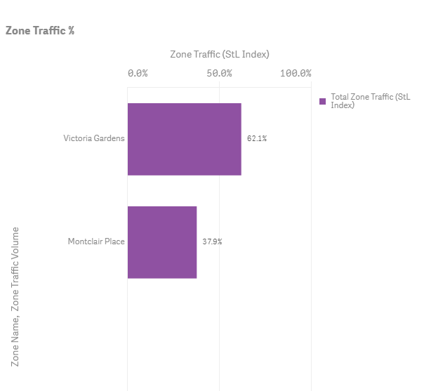
By using our Home and Work Locations metric, I was able to analyze shopping mall statistics for these two malls. They are located about thirty minutes from one another and have similar stores, but Big Data told me that Victoria Gardens had a much higher visitation rate:
Figure 1: Average weekend day visitor rates for Victoria Gardens and Montclair Place shopping malls.
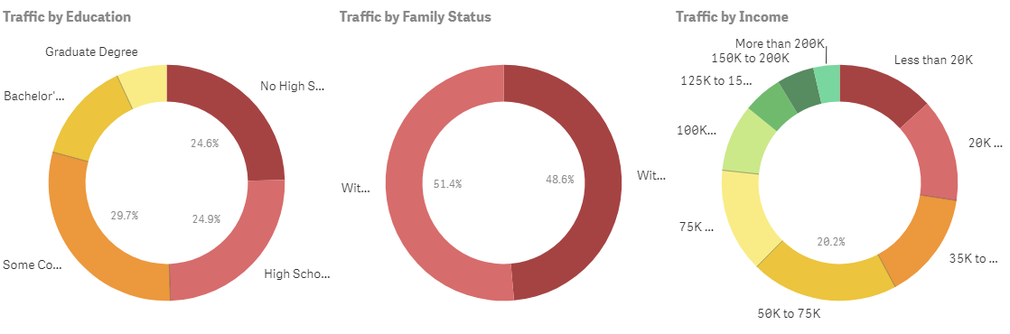
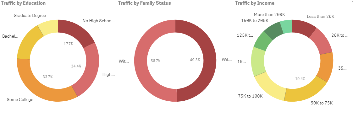
When looking at the mall visitor statistics, we can see that, on an average weekend in 2018, 62.1% of visitors went to Victoria Gardens compared to Montclair Plaza which only had 37.9% of visitors. We were also able to look at the demographics of visitors to the two shopping malls.
Figure 2: Average weekend day visitors to Montclair Plaza mall.
Figure 3. Average weekend day visitors to Victoria Gardens mall.
While the two malls have some slight variation in the demographics for visitors who shop there, the difference is not significant enough to account for the much higher visitation to Victoria Gardens overall. This pushed me to look into what was truly different about these two malls, and what might actually drive (literally) more folks to visit one over the other.
From my experience of visiting both locations, Victoria Gardens has put in a lot of effort to make those key pivots to become a modern mall. The data analysis reinforced my instinct that those efforts are attracting other visitors as well.
Why One Mall Attracts More Visitors
Consumers today are buying more experiences than durable goods. Millennials care a lot more about having new, Instagram-able experiences than luxury handbags. The cookie-cutter shopping meccas that past generations gravitated towards all look the same, but statistics from our analysis show that successful shopping malls are taking a cue from the past and focusing on what makes in-person visits enjoyable.
For example, Victoria Gardens has embraced the beautiful Southern California weather and branded itself as an outdoor retail hub rather than a traditional mall. It has pedestrian-friendly walkways, outdoor seating, and all the shops have an outdoor storefront. It reframed how a mall functions and made shopping mall visits less about convenience and more about community.
The development of Victoria Gardens was an effort by the City of Rancho Cucamonga to create the greater Victoria Gardens Cultural Center. Focusing from the beginning on a combination of culture, community, and retail invites more types of folks to visit the area to enjoy themselves in many ways — shopping, going to a movie, checking out a library book, or even seeing a show.
Measuring Results with Shopping Mall Statistics
At the end of the day, results are what matters. Shopping mall statistics should be able to tell you if new industries and experiences bringing more people into your shopping center. Are those new visitors also members of the demographic groups you targeted? Did your efforts pay off?
Using Big Data to quickly and easily measure the volume and breakdown of your visitors as you try different solutions, you can drill down on what moves the needle in your community.
By the way, on my last visit to Montclair Place, I noticed that they seem to be catching up to the pivots that other malls in America are making. They are adding experiences such as a movie theater, a music and entertainment venue, a large playground, and more! I guess we will have to check back in a few years and see how visitation changes.
How Biking Visits Increased to Virginia’s Top Mountain Bike Trails State Park
How Biking Visits Increased to Virginia’s Top Mountain Bike Trails State Park
Pocahontas State Park just outside Richmond, Virginia, has long been a mountain biking destination. But that attraction ramped up after May 2014, when trail builders won a $33,000 grant from Bell Helmets and the International Mountain Biking Association. To date, PSP has added 22 more miles of networked trails, for a total of about 44 miles of singletrack.
Being an avid mountain biker, I was curious about the effect of these new trails. I knew anecdotally that more of my friends were riding at PSP on the weekends, but was overall park visitorship rising? And where were visitors coming from?
It only took me a few hours in the StreetLight InSight ® software platform to find out, with the help of fellow cyclist and StreetLight support engineer Jon Wergin. Our results surprised me.
Virginia’s Most Popular Mountain Biking Park
First, I wanted to know where PSP currently ranks among Virginia’s state parks for cyclists. We ran a Zone Activity analysis in StreetLight InSight ranking 36 state parks, selecting bicycling traffic to analyze (versus vehicles or pedestrians).
PSP was the park with the second highest amount of cycling trips for the four months of bike data that we measured. First State Landing park topped the list, with ⅓ more bike trips.
Because First State Landing’s “bike trail” is a flat, sandy road, I feel confident in labeling PSP as Virginia’s top mountain biking destination. I was pleased to see that one of my favorite places to ride is a notable cycling attraction, but I wanted to know more.
Measuring the Impact of New Trails
Next, I explored how many visitors were going to PSP, and whether or not that had changed since the new trails opened. PSP finished the new 22-mile trail system in the fall of 2018. I tried identifying visitorship by analyzing personal travel for the six months before and after those trails opened.
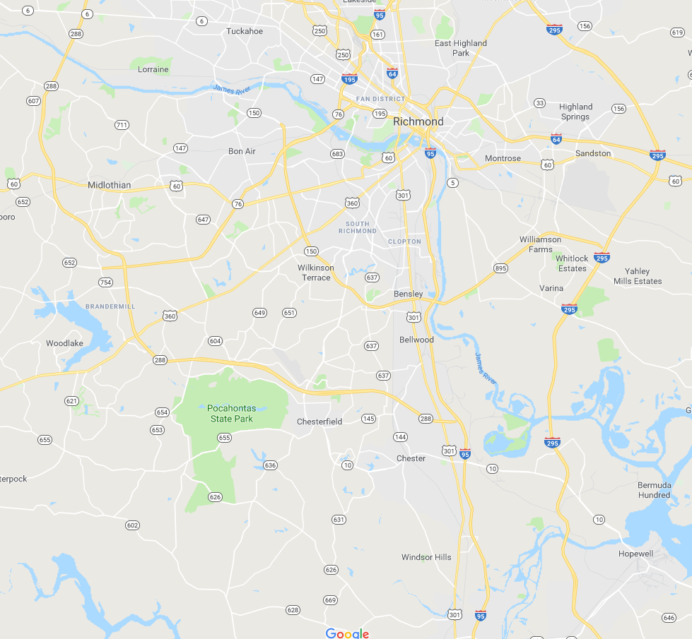
Figure 1: Pocahontas State Park is located just southwest of Richmond, Virginia.
In StreetLight InSight Jon created a zone just for PSP itself. He removed from the analysis two busy roads that cut through the park. Then he calibrated the index to known traffic on a nearby highway.
At first the results didn’t make sense. For March through August on the average weekend day, PSP had 4,433 visitors, but only 2,784 during the six months after the new trails opened.
I was confused, then I realized the new trails opened right before winter, when many Virginia mountain bikers choose not to ride, and many vehicle drivers don’t visit the park. Also, I remembered that Virginia had record-breaking rain levels during spring, and PSP closes muddy trails to prevent damage. That could explain the higher vehicle visitors during a lovely warm fall (PSP also has a public pool), and low numbers during a cold winter and very wet spring.
How Visitorship Has Increased
The issues with month-to-month comparisons pointed me towards analyzing year-over-year data, so that I could more evenly weight seasonal factors. I analyzed vehicle traffic for August 2017 and August 2018. That’s when I could see that PSP visitorship has taken off dramatically.
On the average weekday, PSP welcomed 2,595 visitors in 2017, and grew to 3,775 in 2018. On the average weekend day it was 4,266 in 2017, but 6,040 in 2018. That’s a 30% or better increase overall.
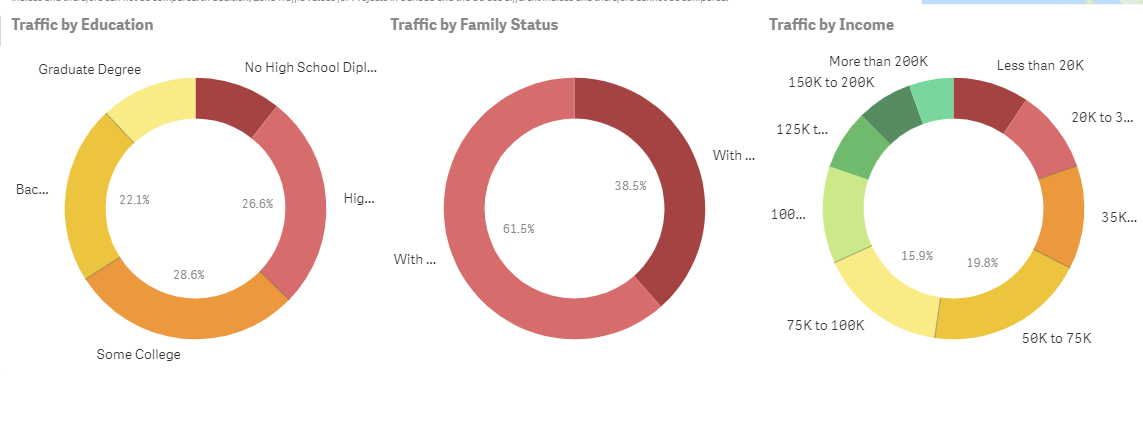
To learn more about who the visitors are, I ran a Zone Activity analysis for the average day in 2018 including “visitor attributes.” I was surprised to see that families are in the minority. Given the public pool, campsite, boating activities, and hiking trails, I expected PSP to be a family destination. It definitely is, but even more visitors come from households without children.
Figure 2: Demographic information for visitors to Pocahontas State Park.
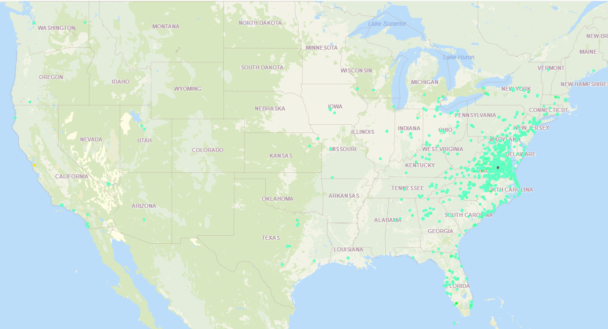
I analyzed where these visitors are coming from by applying the Home and Work Locations filter. The HWL metrics build composite visitor profiles based on LBS data, and infer likely home location zones for those composite profiles.
I found a marked change over time. For the year of 2016, PSP pulled mostly regional visitors on an average day, concentrated in Virginia, North Carolina and Maryland. Another chunk of visitors came from further south on the eastern seaboard, with a few outliers from Texas and California.
Figure 3: Home locations of visitors to Pocahontas State Park in 2016.
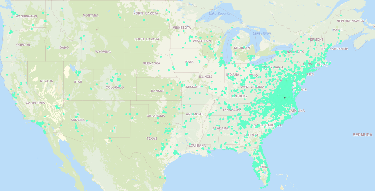
But for the year of 2018 visitors came from every state in the continental U.S. Not only did visitorship spread, but concentration also deepened among states outside our immediate region including Florida, New York, New Jersey, Georgia and Tennessee.
Figure 4: Visitors to Pocahontas State Park in 2018.
StreetLight doesn’t (yet) provide metrics directly comparing bicycle to vehicle traffic, but I tried a little workaround just because I was curious. I pulled the average-day bicycle traffic at PSP for four months in 2017 and 2018. When I compared those numbers to the calibrated personal trips during the same time period, bicycle trips were 11% of the total park traffic. Again, this isn’t a statistically valid finding for Virginia mountain biking numbers, it was just me playing around in the platform for directional, not definitive, data.
When to Visit Pocahontas State Park
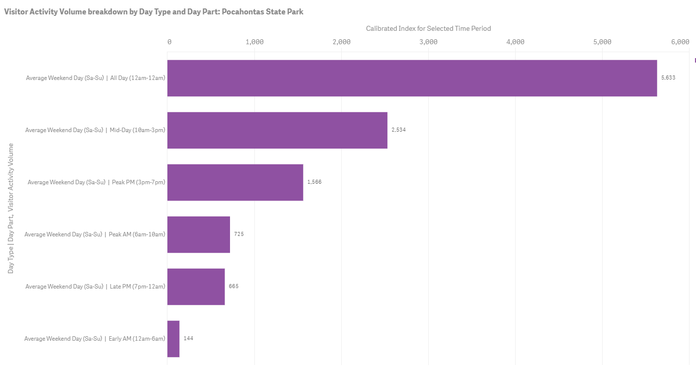
When I ride my mountain bike at PSP on the weekends, I’m usually trying to avoid peak times. So my final analysis of 2018 data helped me identify the best times to visit. I was happy to see that my preferred early morning riding time is a non-peak period on weekends. Not only am I avoiding the crowds, but I’m helping spread out visitorship to non-peak times, and leveling out this Virginia park’s demand curve.
Figure 5: Peak visit times to Pocahontas State Park on the average weekend day.
I live in downtown Richmond, a block away from about 20 miles of excellent single track. Before PSP added the new trails, I rode at home because I didn’t want to load my bike onto the bike rack and drive 30 minutes each way to PSP.
Now, I drive out there to ride almost every weekend — the new trails are that good. And clearly I’m not alone! StreetLight’s analysis confirmed my gut feel: Virginia’s Pocahontas State Park has indeed become a world-class mountain biking destination.
Nantucket Uses StreetLight Data to Estimate Population
Nantucket Uses StreetLight Data to Estimate Population
Seasonal population peaks are difficult to measure – especially in popular destinations like Nantucket Island. But population size is a critical metric for transportation planning, federal funding allocation, and more.
The Wall Street Journal cites a StreetLight Data client, the Nantucket Open Data Platform, who uses StreetLight’s innovative mobility analytics to estimate the island’s population around the year. This data is helping public agencies and local businesses in Nantucket build better plans for the future.
Measuring Travel Behavior Demographics at Walt Disney World
Measuring Travel Behavior Demographics at Walt Disney World
Walt Disney World is one of the most popular theme parks in the U.S. and every child’s dreamland. Many individuals come from around the world to view the characters, taste the food, and enjoy the rides. This amusement park creates an indescribable feeling of excitement and anticipation.
It’s a place I’ve always wanted to visit, and I know that I will someday. In the meantime, I’m satisfying my curiosity about Disney World by using StreetLight InSight (R) to explore the audience that goes there. However, I also think my analysis can add value for city and urban planners who want to:
Understand the types of people large amusement parks attract.
Understand the volume of hotels and accommodations you would need to provide for an amusement park of Disney World’s scale.
It’s important to note that this type of analysis could be used for economic development related to any attraction or special activity area – not just Disney World and theme parks. Some examples are:
Monuments (i.e. Statue of Liberty)
Museums (i.e. Virginia Fine Art Museum)
Parks (i.e. Yellowstone National Park)
Beaches (i.e. South Beach)
Methodology
As a marketing intern for StreetLight Data, I used StreetLight InSight to run an analysis on Walt Disney World. My research used Big Data to reveal important, hard-to-find insights about Disney World’s audience. For example, the study provides detailed information on where trips to Disney World usually begin, the aggregate home locations of visitors, and visitors’ demographic profiles.
Figure 1. The zones are Epcot, Magic Kingdom Park, Disney’s Animal Kingdom and Disney’s Hollywood Studios, the four major parks in Disney World. I created separate zones for each park because the areas between the parks have large roads, hotels, and resorts. The people in these locations do not necessarily visit Disney World, so it was important to exclude those areas from my analysis.
See the data in action, register for our live demo
My first step was to create the zones (Fig. 1) to run an analysis on Disney World. The platform allowed me to run several types of analyses that gave me the information I needed to understand who goes to Disney World. The analyses I performed are:
Zone Activity Analysis (ZAA), used to analyze all travel activity in a zone set, regardless of origins or destinations.
Visitor Home and Work Analysis (VHW), used to analyze the home and work locations of visitors to a zone or zone set by grid or census block group. Demographics are also available.
The platform also allowed me to study who is visiting the park using different data sources. The data sources I used for this study include:
Location-Based Service Data, which is created by smartphone apps that use location-based services. It offers high spatial precision and a large sample size.
U.S. Census Data, which comes from demographic surveys that are conducted every 10 years by the US government.
The LBS data in this study comes from smartphones owned by adults in the U.S. that were running location-based services apps in the Disney World Park from June through August 2017.
Demographics: Family Status
First, I decided to look at the demographics of Disney World visitors. I did this with the Visitor Home-Work analysis. The analysis gave me insights on the race, income levels, and family status of individuals who attend Disney World by combining LBS and Census data. These data are analyzed anonymously, in aggregate. They describe the groups of people who visit Disney World, not individuals. (Note: StreetLight InSight does not use LBS data from children.)
Figure 2. This graph shows the percentage of Disney World visitors that have kids in the household versus the percentage of visitors who do not have kids in the household.
In most commercials that advertise this dreamland, there are a diverse group of people at the amusement park and most of the individuals are young adults and/or children. Those advertisements display many families having a great deal of fun at Disney World. This is the image Disney uses to advertise their park as a family destination. However, according to Fig. 2, most people that visit the park do not have kids in their household. In fact, the research only shows 36.7% of the guests reside in a household with children under age 18. This is a surprising finding. Here are some reasons this may be the case:
Adult workers are most likely included in the results – they are likely to have smartphone apps with location-based services apps with them when they arrive for work.
The park has some attractions that appeal to adults and many corporate conferences are hosted in the park during weekdays
International visitors who come with family are not included in the study.
Some kids do not visit with relatives or adults they live with.
Some kids who visit the park may live with guardians or foster homes that are not accounted for in the US census.
Disney World captivates an audience of all ages. This is one of the reasons why Disney World is one of the best destinations for friends and family. This also goes to show that Disney’s marketing strategy successfully targets more than one age group.
Demographics: Race
There is no doubt that many people from different ethnic backgrounds and cultures go to the theme park, but there were fewer minority visitors than I expected. The graph below visualizes a large amount of white individuals.
Within the graph there is also a small streak of blue; which indicates that the smallest minority in the park are Pacific Islanders. This is somewhat understandable considering Pacific Islanders makeup 0.2% of the U.S. population. Nonetheless, there are still a few Pacific Islanders making the journey to visit the famous park.
After Caucasians, Black/African Americans are the second largest group in the Disney World. I find this to be interesting because I had expected Hispanics to be the second most represented race in Disney World. According to the Census Bureau, they are the second largest race in Florida and the U.S., while Black/African American are the third most represented race in North America.
Figure 3. Different races that visit Disney World.
Demographics: Income
Disney World has heavy congestion throughout the park and sometimes that causes the wait for rides to be extremely long. According to Fox News, Disney increased prices to reduce long lines for rides and improve the flow of traffic in the park. The new prices seem to be affordable for households who have an annual income of $35,000-50,000 because they are the most represented income level in the park.
Nonetheless, there are still many people from lower income levels that visit the park. About 42.1% earn less than $35,000 to be exact. It’s interesting to see in Fig. 4 that households who have an annual income of $125,000 or more (the second largest income group in the US), don’t visit the park as frequently, although they have the funds.
Figure 4. Income of Disney World visitors.
Origins and Destinations
A very popular Canadian musician named Drake once said, “Sometimes it’s the journey that teaches you a lot about your destination.” This quote emphasizes that you can learn a lot about your destinations through your origins. This brings me to the second analysis type I used: Origin-Destination to Preset Geography (ODG).
Figure 5 indicates that 41.1% of trips to Disney World are less than one mile long. This emphasizes that most people who come to Disney World begin their trips within walking distance of the park.
Did you know the average person walks three miles per hour? That’s about twenty minutes per mile. A few examples of the places that people visit Disney World from are: Walt Disney World Resort, California Grill, Oasis Canteen, SeaWorld, and other places that are nearby.
Figure 5. The graphs above show (from left to right) the duration, the length, and the speed of trips to Disney World.
Home and Work Locations
Lastly, I analyzed the visitors’ home and work locations. Most visitors’ homes are located as far as 100 miles away from the park. About 72.43% to be exact. Figure 6 shows only 0.50% of visitors live less than a mile from the park. According to Fig. 7 most visitors’ workplaces are also located at least 100 miles away from Disney World. I expected this to be the outcome since majority of the visitors’ homes were located more than 100 miles away too.
Figure 6: This graph is of how far the visitors’ home are located from the Disney World.Figure 7. A graph of how far the visitors jobs are from Disney World.
Conclusion
Although summer may be the busiest time of the year, it is also the best time to go Disney World. As songwriter Brian Wilson once said, “Summer means happy times and good sunshine. It means going to the beach, going to Disneyland, having fun.” If you swap “Disneyland” for “Disney World,” I totally agree with his statement. What better way to accomplish all these goals than going to Disney World? Next year, when the children are on summer break, plan a fun vacation with the family to the magical land of Disney World!
Explore the resources listed above and don’t hesitate to reach out if you have any questions. We’re committed to fostering a collaborative community of transportation professionals dedicated to building a better future for our cities and communities.
Travel Planning for Memorial Day – The Data-Driven Way
Travel Planning for Memorial Day – The Data-Driven Way
Memorial Day has a rich history of honoring soldiers who sacrificed their lives in service to their country. However, it’s also a travel-filled holiday weekend that signals the beginning of summer for many Americans. These days, it seems like most Memorial Day conversations revolve around traffic, congestion, and busy airports. Just try searching for “Memorial Day” on Google. You’ll see that about half of the search results are about holiday-related transportation challenges.
Vacationers and planners like want to avoid traffic snarls, and StreetLight can help. Although it’s easy for individuals like me to get travel data from Google Maps, it might not be so tailored to Memorial Day travel patterns. For transportation professionals, StreetLight InSight® can provide this type of data at an extremely fine resolution and on a massive scale. The best part is that it takes just a few minutes to run most analyses and just a few hours for more complex studies.
Like the avid planner I am, there were several questions swirling around my head while thinking about this trip. How bad will the traffic be when I head to the airport? When should I leave my house so I don’t miss my flight? Luckily, I work at StreetLight Data, and I can use our StreetLight InSight platform to answer transportation questions quickly and easily. In this blog post, I’ll show you how I did it.
The StreetLight InSight Analysis
I used StreetLight InSight to analyze traffic on the Thursday to Saturday before Memorial Day last year to help predict my travel experience – and, hopefully, plan the best possible route to San Francisco International Airport (SFO). I chose to analyze Thursday-Saturday because I think those are the most popular times to go to SFO for a weekend trip. To protect my privacy, I’ve changed the parameters of my exact travel plan: Let’s pretend I live near the Financial District in San Francisco and that I am going to spend this Memorial Day in Hawai’i.
When Should I Leave for the Airport?
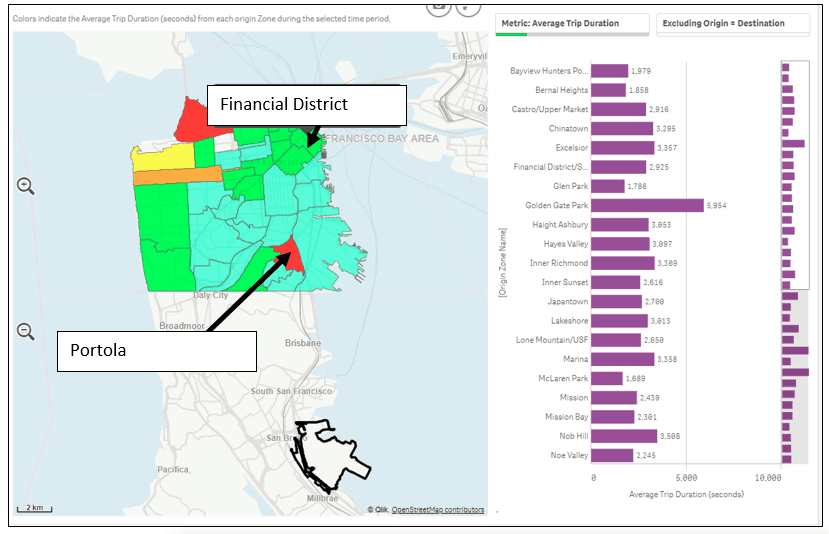
Utilizing StreetLight’s Origin-Destination Analysis, I can find the top traffic generator neighborhoods in San Francisco for trips to the airport. The majority of traffic comes from the Financial District. It’s interesting that trips coming from Financial District take half the amount of time (40 mins), of those coming from Portola, but the distance traveled is twice as long.
The visualization above shows the average duration of trips that originate in different San Francisco neighborhoods and travel to SFO.
When is the Busiest Time at the Airport?
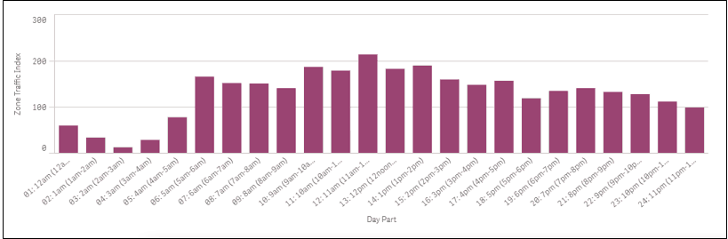
I also used StreetLight InSight to analyze the level of activity at SFO on an hourly basis. As you can see in the chart the below, the airport will be busy all day starting from 5am, and noon is the busiest hour. That means I have to leave a little bit more of a buffer on my travel time for security and queuing at the gate.
What’s the Best Mode of Travel?
I have two primary options for getting to SFO: Taking BART, our regional light rail system, or taking a ride with a transportation network company (TNC) like Uber or Lyft. For this piece of the analysis, I will have to pull other data sources to calculate the cost vs. time trade-off.
TNCs (data from Uber Fare Estimate): $32 – 41 (40 mins)
BART (data from BART): $9.15 (34 mins)
**Both estimates exclude the wait time for TNCs and walk time to BART station.
BART is a lot more affordable and faster than the TNC ride, so public transit is the clear winner for my mode of travel to the airport this Memorial Day weekend.
For transportation planners, holiday and other event analyses can help choose optimal routes for peak travel times. Get ahead of the holiday or your next event with accurate data, and make sure all modes of travel run smoothly.