Category: Events and Tourism
Measuring Travel Behavior for Special Events: Who Goes to Warriors Games at Oracle Arena?

Measuring Travel Behavior for Special Events: Who Goes to Warriors Games at Oracle Arena?
2017 has been a really busy year for the StreetLight Data Engineering team – and as Sr. Sales Engineer, I really appreciate their hard work. In today’s blog post, I’ll give you an in-depth introduction to one of my favorite new features in the StreetLight InSight® platform – “Customizing Your Own Data Period.” (For those that don’t know: StreetLight InSight is our easy-to-use web application for transforming Big Data into transportation analytics).
When we launched this feature, I was immediately reminded of the work I used to do at San Francisco Bay Area Rapid Transit District (BART), the regional heavy rail transit system that many Californians rely on everyday. Ensuring we had sufficient capacity in the system to accommodate special events was important – and it could be a challenge. We would regularly develop new service plans and even add special event trains to the schedule to deal with the crows and their unique travel patterns.
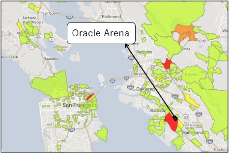
To show you how this new feature works, I’ll walk you through an analysis I did on home games for the Golden State Warriors basketball team in March 2017. I was working at BART at this time, and it was a big year for the Warriors – they won the NBA championship, and they also made a major decision to relocate from their home in Oakland’s Oracle Arena to a new venue in the Mission Bay neighborhood of San Francisco, California. That move is anticipated in 2019, and it promises to change the travel behavior of home game attendees.
Keep reading for all the details on our new Customize Your Data Period feature – and to find out about what the Warriors’ move might mean for travel patterns on game days in the San Francisco Bay Area.
Customize Your Data Period for Transportation Analyses
Here’s what our new feature means in a nutshell: You can now fine-tune your “Data Period” – that refers to the specific time period that you want to analyze – down to exact dates in StreetLight InSight. While this was always technically possible for our clients, it wasn’t convenient. They had to worked behind-the-scenes with our Engineering team to do it. If our clients wanted to run their own analyses in StreetLight InSight, the smallest data period available was a single month.
This new feature is incredibly useful if you’re trying to understand travel patterns for specific day or set of days, whether it’s a gameday, a holiday, or a natural disaster. It’s possible to get really precise analytics for that time period in just a few minutes with StreetLight InSight, and it’s really easy.
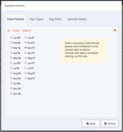
As always, you start by defining your Data Period in the Project Options menu located in the “Create Projects” Tab in StreetLight InSight. The first step is to choose the set of months that your specific dates fall in.
Next, you move to a new Tab that we just added to the Project Options menu: “Specific Dates”. Simply, you choose which specific days you want include or exclude from the analysis. (See Figure 1 below).
Figure 1: First, choose the months you want to analyze from the Project Options menu as shown in the first image. Then, choose the specific dates you want to include or exclude from the study.
As you can see in the Figure 1, I isolated five Warriors home games in March 2017 for this study. These games took place in the lead up to the play offs. I ran two studies with this Custom Data Period:
- Visitor Home-Work Analysis with Demographics using Location-Based Services (LBS) Data as my data source. This study provides aggregate home and work locations, census demographics, and the relative volume of visitors to Oracle Arena.
- Origin-Destination to Pre-set Geography, using Transportation Analysis Zones (TAZs) as my Pre-set Geography and Navigation-GPS Data as my Data Source. This analysis provides the origin and destination TAZs of vehicle trips to and from the Oracle Arena.
Visitor Home-Work Analysis
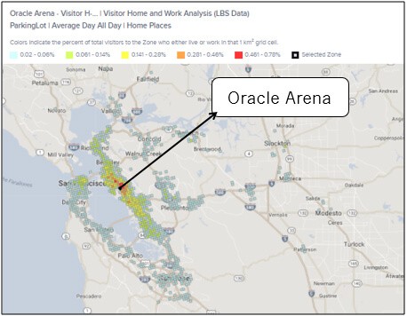
When looking at the Visitor Home-Work Analysis Project results, one of the first insights I gathered was that a lot of the attendees of these games live in the East Bay, closer to Oakland. However, the attendees are geographically distributed around the Bay Area, with folks distributed to South, North, and far East Bay, and relatively faraway towns like Modesto and Stockton. While there are some San Francisco residents travelling across the Bay to see games, I was surprised that we didn’t see higher numbers.
Figure 2: These are the aggregate home locations of Warriors game attendees in March. They are coming from all over the Bay Area but are concentrated in the East Bay. When I zoomed out the map even further in the platform, I saw ~<1% of attendees came from even further afield locations – towns in Arizona, Florida, and Las Vegas. These outliers would also appear in Metrics .CSV file downloads.
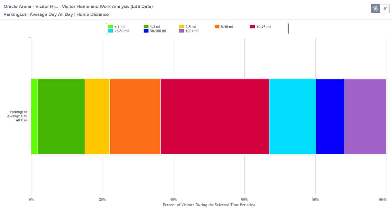
To see how these results compared to the typical day in March, I ran a second Visitor Home-Work Analysis for the entire month of March 2017. As you can see in Figure 3 before, the profile is different in a few key ways. First, the geographic reach is not as large. Fewer attendees are coming from the North, South, and far East Bay. Second, visitors are more concentrated in the Oakland area close to the stadium.
Figure 3: Aggregate home locations of all visitors to Oracle Arena in March ’17. They generally live closer to the Oracle Arena than game attendees.
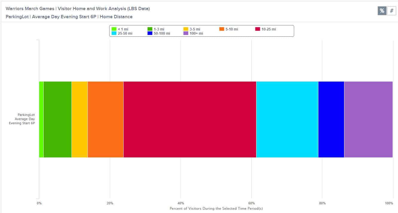
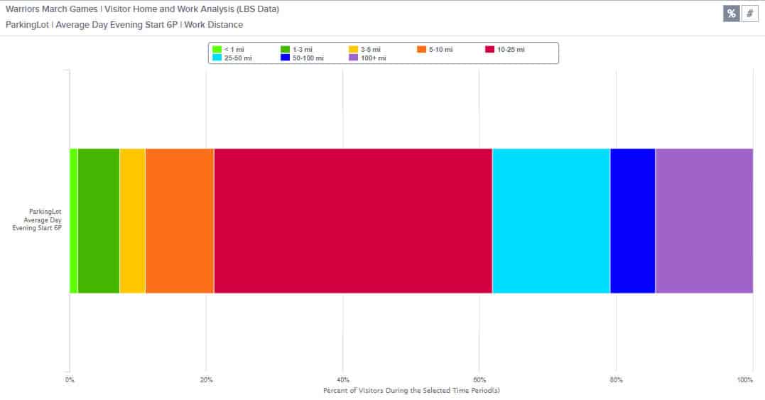
Another interesting insight is that 75% of game attendees live or work 10+ miles from the stadium (See Figure 4 below). With the changes in location of the stadium, we would want to consider how those travel patterns would change.
Figure 5: Distances of visitors’ home and work locations to the Oracle Arena on Warriors game days. As you can see, more than 75% of stadium visitors live or work over 10 miles from Oracle Arena.
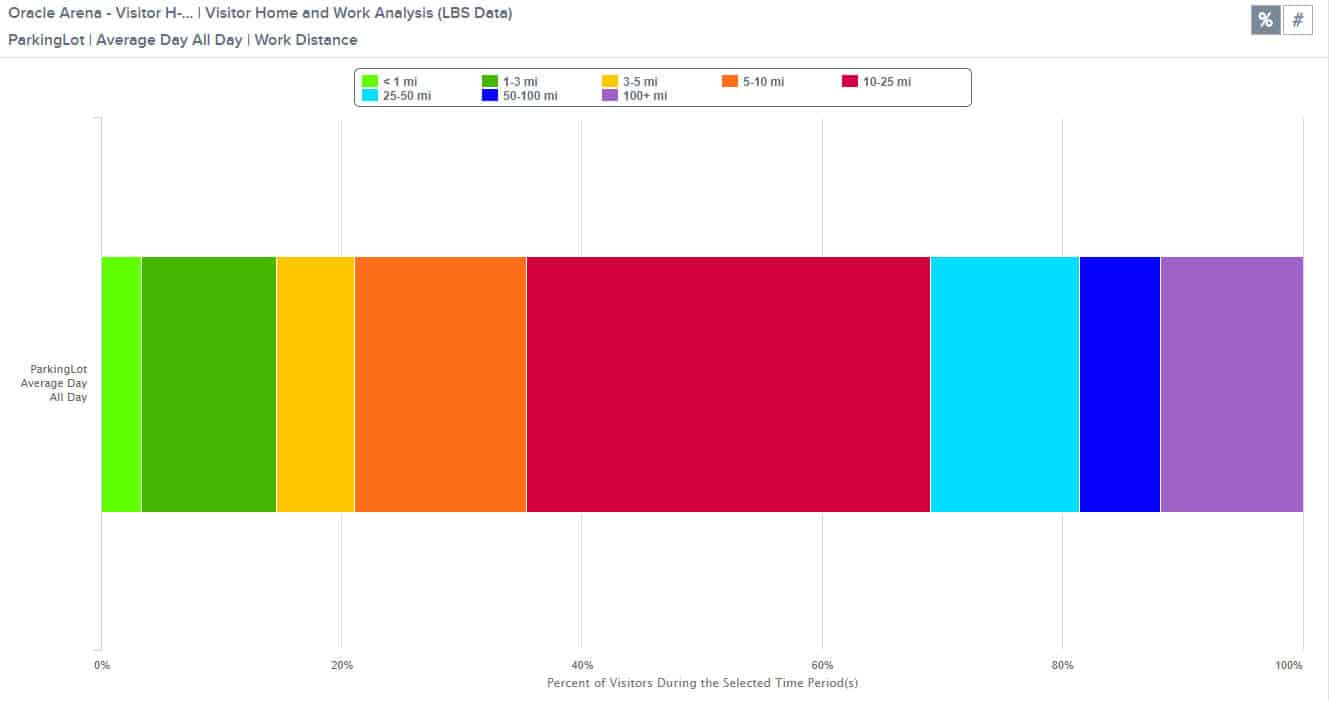
What this means is that people are usually traveling long distances to get to these games. For the most part, these long-distance travelers are probably driving or taking BART (the regional transit provider) to the games. As shown below, typical March 2017 visitors to Oracle Arena live and work closer. Just over 60% are traveling more than ten miles from their home or work location to reach the venue compared to 75% of Warriors game attendees (See Figure 6).
Figure 6: Just over 60% of attendees live or work more than 10 miles from Oracle Arena on the average day in March 2017.
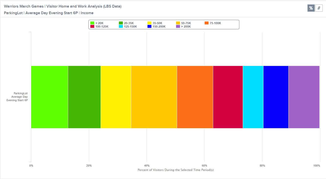
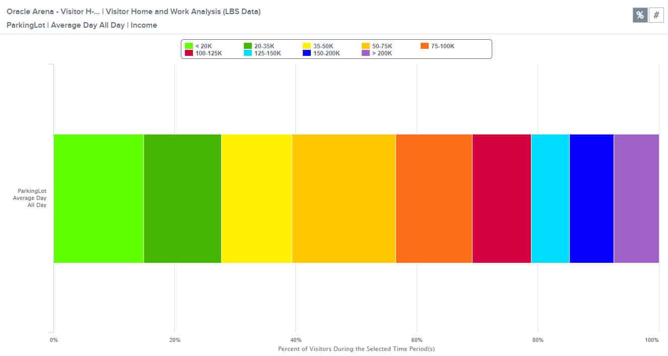
Next, I decided to drill down on income levels (See Figure 7). Not only are Warriors games attendees geographically diverse, but they’re also economically diverse. If the stadium were to change locations, would this change as well? Would there be different income levels attending games in San Francisco? One factor to consider is that while the Warriors attendees income levels skew slightly higher than the typical attendee, the overall distribution is fairly similar (See Figure 8).
Figure 7: This shows the percentage of Warriors games attendees in each income bracket. It shows that there is a broad range of income levels among attendees.
Figure 8: This chart shows the percentage of visitors in each income bracket for the Oracle Arena on a typical day in March 2017.
Origin-Destination to Pre-set Geography Analysis with Transportation Analysis Zones (TAZs)
I was also very interested to see who was driving to the stadium, so I decided to run an O-D to Pre-set Geography Analysis with TAZs and navigation-GPS data. Our navigation-GPS data is created by connected cars and turn-by-turn navigation tools, so it allows me to zero in on vehicle travel. You can see all the origin TAZs for game attendees in Figure 9 below.
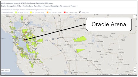
Figure 9: The heatmap above shows the origins of vehicle trips to Oracle Arena on Warriors game days in March 2017. While there are plenty of vehicle trips that make sense, a significant volume of vehicle trips are originating in areas with good transit options.
Some of these vehicle trips make a lot of sense. The drivers are coming from far away places that lack transit options – for example, it would be very time-consuming if not impossible to get to the stadium on transit from the Turlock area. However, there are also a lot of vehicle trips originating in places with great transit access (see Figure 10).
Figure 10: This is a zoomed in version of the heatmap in Figure 9. It shows the highest volume TAZs for vehicle trips to the Oracle Arena on game days. There are actually good transit options, including BART, in each of the red TAZs that light up for vehicle trips to the stadium.
I was surprised to see some areas that are on transit light up darker red. For example, San Francisco downtown has excellent transit to Warriors games, but it still lights up bright red. There’s also parts of the E. Bay with good transit options that lights up orange or red. While this is surprising, it’s also a good opportunity.
There’s clearly an opportunity to shift those vehicle trips to the arena over to BART or other transit options. BART could focus efforts on telling people in those areas to use BART as part of a highly targeted marketing effort. They would have a good chance of displacing at least some of those vehicle trips.
Customizing Data Periods: Putting it All Together
As you can see, the ability to customize our own Data Period down to the day in StreetLight InSight is really helpful for special events. I completed the entire process of setting up these analyses and running several studies in less than 30 minutes or so. The results provided a ton of useful insights that would be helpful for both managing travel patterns to home games at the Oakland Arena next year, and for identifying key focus areas and areas for further research in preparation for the team’s move to San Francisco.
Planning Effective Evacuation Routes: How Big Data Can Help
Planning Effective Evacuation Routes: How Big Data Can Help
As a San Francisco-based company, we have been troubled by California’s increasing wildfires. Fires have impacted the homes and personal well-being of StreetLight employees, clients, and families. While it is always difficult to see tragic events occur anywhere in the world, watching fires destroy places we love has been something else entirely.
The experience has forced us to think harder about what we, as a company, can do to help with evacuation planning.
Our product, StreetLight InSight®, helps transportation professionals use Big Data from mobile devices to understand travel patterns – but what specific information can it provide to aid in evacuations? At a personal level, how can we help communities in need, at least in the continental US and southern Canada, where we currently operate?
Before I dive into details, I want to stress that we’re here to help. If your community is facing an imminent evacuation, and our metrics could help you get people get out of harm’s way, email me (I’m the CEO) directly. Tell me what you need, and we’ll skip the formalities and paperwork to provide the data for free as quickly as we can.
When we first started brainstorming about evacuation planning, we were frustrated by our lack of real-time information: Our metrics won’t tell you where the people who need help are located “in the moment.”
We usually lag a month or two behind present-day, chiefly because it’s a time-consuming to process data from our providers. That means our analytics cannot help first-responders find specific people who are in crisis more quickly. They also won’t help traffic operators monitor real-time road conditions so that they can divert traffic to more efficient routes.
So, what support can StreetLight we provide? Ultimately, we identified two key ways that our metrics can be valuable:
- Using the best possible information at hand when time is tight (especially if communications networks are knocked out).
- Before disasters strike, being as prepared as possible for multiple scenarios.
We’re sharing our ideas in this blog post with the goal of helping the communities who can benefit. The key advantage of Big Data for evacuation planning is that it provides up-to- date information about trends in travel behavior. That’s important because as our travel behavior complexifies (think ride share, working-from- home, long distance commutes, and more), it’s harder to know where people will be at any given time.
In terms of transportation, there are two key types of evacuations: ones with a few days notice, and ones with no notice. In the paragraphs below, we’ll explain how Big Data can help communities manage both.
Evacuation Planning With a Few Days Prior Notice
Often, before hurricanes or other natural disasters occur, communities have advance notice that enables people a little time to evacuate. This type of evacuation planning is in many ways similar to other forms of urban and transportation planning. You’re identifying the likely movements and possible impediments that people may encounter as they try to leave. Here’s how planners can use Big Data when they have some advance notice:
1. Look at other “extreme” events in your community for comparison
The areas that are bottlenecks in a normal rush hour may be different from the “worst day of the year” traffic event. Zeroing in on atypical traffic events (say, when the Pope or the President comes to town – or even what happened during the last major evacuation) can help reveal unique congestion hotspots. By knowing these areas in advance, you can plan alternative routes that avoid them sooner. These predictions can also help traffic operations teams who are monitoring evacuation routes in real-time; they help them anticipate where extra support is likely to be required.
2. Look at the travel patterns of other communities during evacuations
Big Data doesn’t just show tell you about your city – it can tell you about any city. Learn from the evacuation experiences of other places by looking at their residents’ travel patterns during disasters. Identifying who responded to requests to leave at what time, and how traffic flowed out when people began to leave, can inform the predictions you make for your own community.
While every place is different, understanding the specific pitfalls other places faced can help you identify where yours are likely to be. Whether it’s prioritizing outreach in elderly communities or adjusting signal timing for key arteries, knowing what worked – and didn’t work – helps planners be more strategic when developing their own plans.
Evacuation Planning With No Notice
When an unexpected event happens, such as wildfires or earthquakes, the first priority is usually to get people out. We’re obviously not experts at the best practices when this happens – StreetLight Data is a mobility analytics provider. But when cellular towers stop operating and people can no longer reach out for help, how do first responders know where people are?
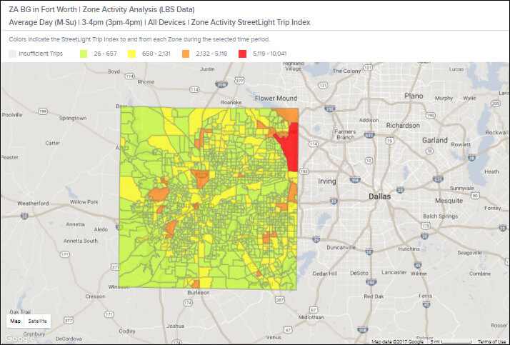
Knowing where people are statistically likely to be at the time an emergency arises is a huge advantage, and that’s where we think Big Data can help. Communities should have on hand a detailed map of activity for their city by block or block group, then by day type and day part. For example, the map below shows where the population is distributed on a typical July weekday from 3-4:00 p.m. in Fort Worth, Texas.
The heat mapabove shows the relative volume of people that are typically located in each census block group in Fort Worth, Texas during a typical July weekday between 3pm and 4pm. The darker red and orange areas have the greatest population densities.
This type of data can be used in real time in the event of an emergency – especially if communications networks are damaged. It can also be used to design evacuation scenarios and handbooks. The immediate evacuation scenario for a weekday at noon should be somewhat different than one for a weekend at 7:00 a.m.
We’re Here to Help
As I mentioned at the beginning of this article, our goal at StreetLight Data is to help. We also want to hear ideas from folks who have experience with evacuation planning. If you have other ideas about how to use data to improve evacuation processes, please reach out to us.
Real-World Travel Patterns: Who Works on Labor Day?
Real-World Travel Patterns: Who Works on Labor Day?
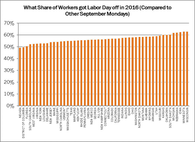
The Labor Day public holiday celebrates American workers by giving them the day off – or at least, that’s the idea. Here at StreetLight Data, we wanted to find out how many American workers are still commuting to their jobs on Labor Day. The results were surprising: Only about ~56% of American workers get the day off nationwide, with some variation in results across different states. In this blog post, we’ll show you how this type of analysis can help planners prepare for traffic flow for holidays, vacation times, and other special events.
Working on Labor Day: The Analysis
For this study, we analyzed aggregate commuter travel patterns in every state during September 2016. The travel pattern data was derived from geospatial data created by mobile devices; specifically, we used anonymous location records created by smartphone applications that provide Location-Based Services.
Note: We defined a work commuter as someone who goes to the same place during daytime hours most days. This means our analysis does not include workers like plumbers who visit different places each workday.
We wanted to find out:
- What share of workers go to their place of employment on Labor Day?
- Are travel patterns on Labor Day and Labor Day weekend different from other days in September?
Which States Work More?
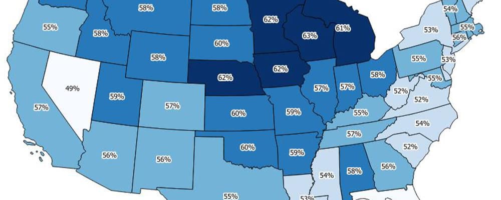
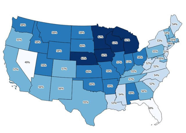
We found that many commuters are still doing their typical commutes on Labor Day. Figure 1, below, shows the share of workers in each state that took the day off on Labor Day 2016. Here are the highlights:
- Northern states seem to take Labor Day to heart the most. Workers in Wisconsin, Minnesota, Iowa, Nebraska and Michigan are more likely to get the day off than any other state.
- Workers in Nevada and Washington, DC are the least likely to get the day off.
Figure 1: The heat map and chart above visualizes the share of workers in each state that did not commute to their workplaces on Labor Day in 2016.
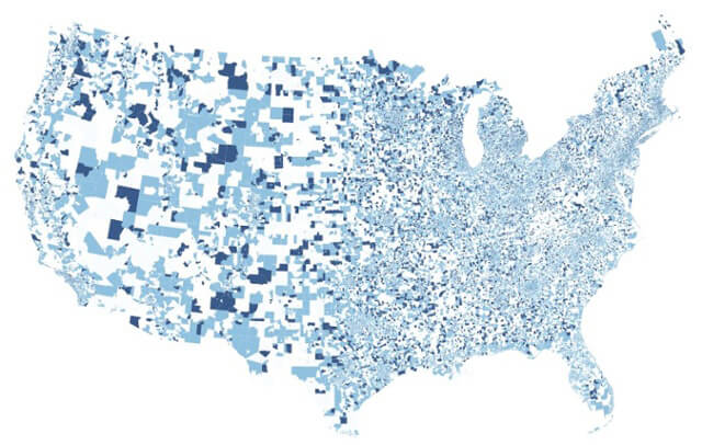
Next, we decided to go beyond states and look more granularly at travel patterns in individual block groups. Block groups are a Census designation – basically, they’re small neighborhoods that tend to have populations of 600 to 3,000 people.
As you can see in the map in Figure 2, there’s a lot of diversity in Labor Day vacations at the block group level. In fact, vacations appear to be correlated with the industry of workers. For example, agricultural districts seem to be extremely unlikely to take the day off. This makes intuitive sense: Farm animals and fields don’t take public holidays either!
Figure 2: This heatmap visualizes the share of workers who did not commute to work by census block group. The darker the shade of blue, the fewer people commute on Labor Day.
Labor Day Data Sources
To find out who is commuting to their jobs on Labor Day, we analyzed “Location-Based Services data” or “LBS data.” This is geospatial data from smartphones that use Location-Based Services. These apps provide a service to users that is tied to their location: Think weather, shopping, and navigation apps. When these services are provided or are “backgrounding,” they create location records.
All of our LBS data records are anonymized by our suppliers so that all personal identifying information is removed before we receive it. Once we receive this data, we process it algorithmically, looking at patterns of travel activity throughout the month. The location records are organized spatially and temporally into groups in order to infer likely home and work locations and travel patterns.
This processing methodology lets us measure typical Monday commute patterns. For this study, we looked at the commute patterns every Monday in September, then compared them to Labor Day. All data are aggregated and normalized into analytics that describes groups of people, never individuals.
Conclusion
Labor Day may be a day of rest for StreetLight Data, but our analysis shows that’s not the case for many American workers, at least on the basis of their commutes.
This type of traffic analysis can really help planners optimize for their region’s holidays, and other special events. Are your workers staying home or getting the job done? Collect accurate data to make traffic flow easier either way.
Where Should Jamil Go Skiing?
Where Should Jamil Go Skiing?
A few weeks ago, one of my best friends from graduate school moved to Colorado to work for my old employer, Rocky Mountain Institute. It’s a nonprofit research and educational foundation dedicated to efficient and sustainable use of resources. The downside – from my perspective – is that he and his equally awesome wife moved to Boulder, CO for this job. The upside – from his perspective – is that now he can go skiing every weekend. The question is: where should he go skiing?
When we discussed this conundrum last week, Jamil said “I know some resorts are closer than others, but everyone has anecdotes that suggest traffic can make the travel time so variable – especially on weekends during the ski season. Some of the further-away resorts might have better conditions and terrain on any given weekend. I guess there’s no way to know the real average travel time, or how to factor in potential for the worst case scenario.”
But there is, with StreetLight Data! Taking advantage of my unlimited access to StreetLight InSight® (that’s our easy-to-use web application for transportation data collection), I decided to help Jamil out by analyzing the travel times to local ski resorts.
The StreetLight InSight Analysis
My first step was to set up and run a travel time reliability study from Jamil’s Boulder neighborhood to the seven resorts he is interested in. In addition to average travel times, I looked at the distribution of travel times to all of the resorts during all winter weekends in 2014 and 2015, and all weekends from January to March in 2016. I wanted to understand not just the normal days, but the really terrible traffic days.
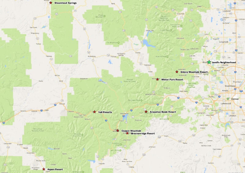
Figure 1 (below) shows Jamil’s neighborhood and the resorts in question. While Jamil also asked me to look at faraway Steamboat Springs and Crested Butte, those results weren’t statistically reliable: We had only a small volume of data on trips that drive straight between Boulder and those ski resorts. Perhaps Jamil should take this lack of data as a sign that traveling that far for a ski day trip is just not worth it!
Figure 1: This map shows the ski resorts that Jamil could feasibly drive to from Boulder his Boulder neighborhood for a ski day trip.
Once the StreetLight InSight Travel Metrics Travel Metrics completed processing, I evaluated the travel times when there was the least possible traffic to each of thehttps://www.streetlightdata.com resorts. This is essentially the time it takes for drivers to get to the ski resort if they drive straight there, with no congestion at all. I compared that to:
- The average travel time across all hours of the weekend, and
- The average travel time for the typical heaviest traffic time period – that is either the morning or the afternoon, depending on if you’re leaving or headed to the resort.
The Results
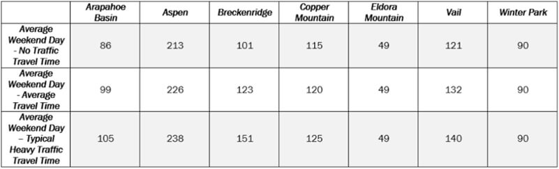
As shown in Figure 2 below, if Jamil drives from his neighborhood to Arapahoe Basin on a typical weekend, it should take 86 minutes. But if you look at all the trips across the weekend, their average time is 99 minutes – a 13 minute increase. And if you look at the typical trip during high traffic times, it will usually take 105 minutes – that’s nearly 20 minutes of lost skiing time. No one wants to waste an entire ski run sitting in traffic!
Figure 2: Travel Times Travel times for a typical weekend day during no-traffic, high-traffic, and all day time periods.
Also as shown in Figure 2, the nearby resorts of Eldora and Winter Park do not show much travel variation, so we’ll drop them from the rest of the study. Now Jamil can tell his “you should really just avoid I-70” friends that the data seems to back them up!
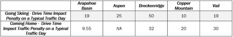
In Figure 3, we measure the scale of the impact, and differentiate going skiing from Boulder vs. coming home to Boulder. As you can see, the impact is usually greater heading out to ski (typically in the morning) than coming home. Perhaps everyone wants to show up when the corduroy is still fresh, but people tire out at different times, so return trips are spread out across the afternoon.
Figure 3 – Impact of traffic on travel time for a typical weekend between Boulder and resorts.
But, in Jamil’s case, he may not care as much about the typical day as he does about avoiding that 10% of the time when the car trips goes heinously awry, and he’s stuck on the road longing for the slopes or home forever. To understand this situation, I analyzed the 90thpercentile situation. In other words, what can he expect on the 10% worst days, when the powder is at its most epic and everyone wants to ski? As you can see in Figure 4, this is when Breckenridge and Vail start to look like really unpleasant drives, particularly on the way home from Vail.
Figure 4- Travel time from Boulder to and From Ski Resorts on 90th percentile worst traffic days.
So, Where Should Jamil Go?
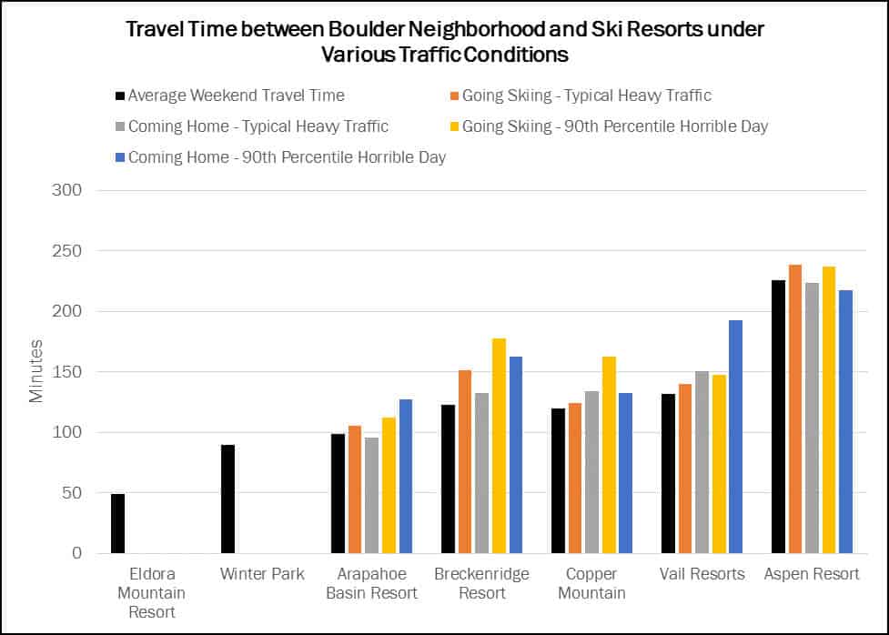
In Figure 5 (below), we summarize all of these results in a single chart for easy comparison. To me, if Jamil feels that Eldora and Winter Park aren’t going be quite thrilling enough on any given weekend, and as an employee of an energy efficiency non-profit, he should take the lowest vehicle-miles traveled (VMT) option to reduce energy use in his car, which is Arapahoe Basin (76 miles away).
However, if he carpools with friends to cut down on total VMT, and they want to optimize for both travel time and thrills, Copper Mountain seems the best bet. Even though it’s 13 miles further than Arapahoe, on most days the travel time is similar. Plus, Copper is a faster trip than Arapahoe if Arapahoe is having a bad day. While Copper Mountain has a similar average travel time to Vail and Breckenridge, Breckenridge and Vail have far more volatility in travel time potential. Also, Aspen is just really far.
Figure 5: This chart shows the travel time variation in graphic form.
A few nerdy technical notes: We do not include time stuck IN the parking lots or side streets of the ski resorts trying to get out. These trips only begin once the driver leaves the borders of the resorts. Sometimes, this can add up. We also excluded trips that stopped for lunch, gas, etc. on the way to and from the resorts. Lastly, the GPS data that we used for this analysis was provided by our partner INRIX.