Corridor Studies Explained: What they are and how analytics make them quicker and cheaper
Corridor Studies Explained: What they are and how analytics make them quicker and cheaper
Corridor studies create crucial insights that keep people and goods moving safely, but they also demand ample resources from agencies already grappling with budget and staff limitations. On-demand analytics streamline data collection, offering a quicker and less costly path to the insights that inform corridor improvements.
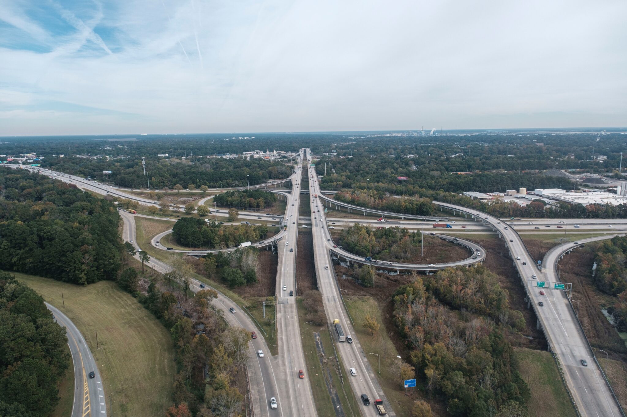
When it comes to mobility, not all roads are created equal. That’s why transportation professionals devote considerable time and resources to major corridors — like interstates, state routes, and other major thoroughfares — to ensure people and goods can get where they need to go safely and efficiently.
To understand how mobility can be improved or maintained along these major arteries of travel, corridor studies are essential. They enable transportation professionals to understand existing conditions, project future conditions, prioritize improvement projects, earn stakeholder and public buy-in for these projects, and ensure environmentally-friendly transportation systems.
These outcomes are so important that corridor studies are often required under federal and state regulations before transportation projects can be approved or funded. But these studies are also demanding, unwieldy, and time-consuming for those who carry them out. They typically take several months or even years to complete, which can deplete already-thin agency budgets and frustrate constituents who want to see action.
So what is a corridor study exactly, why are these studies so important, how are they conducted, and how can technological innovations help shorten timelines, lower costs, earn stakeholder buy-in on projects, and deliver a fuller picture of corridor connectivity? We explore all these questions below.
What is a corridor study?
A corridor study is a planning project that aims to characterize existing and future roadway conditions along a major connective roadway (i.e., corridors) used by vehicles, bicycles, transit, and pedestrians. The scope of a corridor study may be hyper-local (a few miles or less) or it may account for dozens of miles of roadway, as is often the case when studying a major interstate.
Interstates and other major connective highways are the most common subjects of corridor studies.
Corridor studies are often multi-purpose projects that support a wide range of transportation goals such as:
Improving Operations
Economic Growth & Stability
Sustainability & Resilience
Safety & Equity
Communication & Public Relations
Meeting Regulatory Requirements
Estimating roadway capacity
Accommodating freight movement
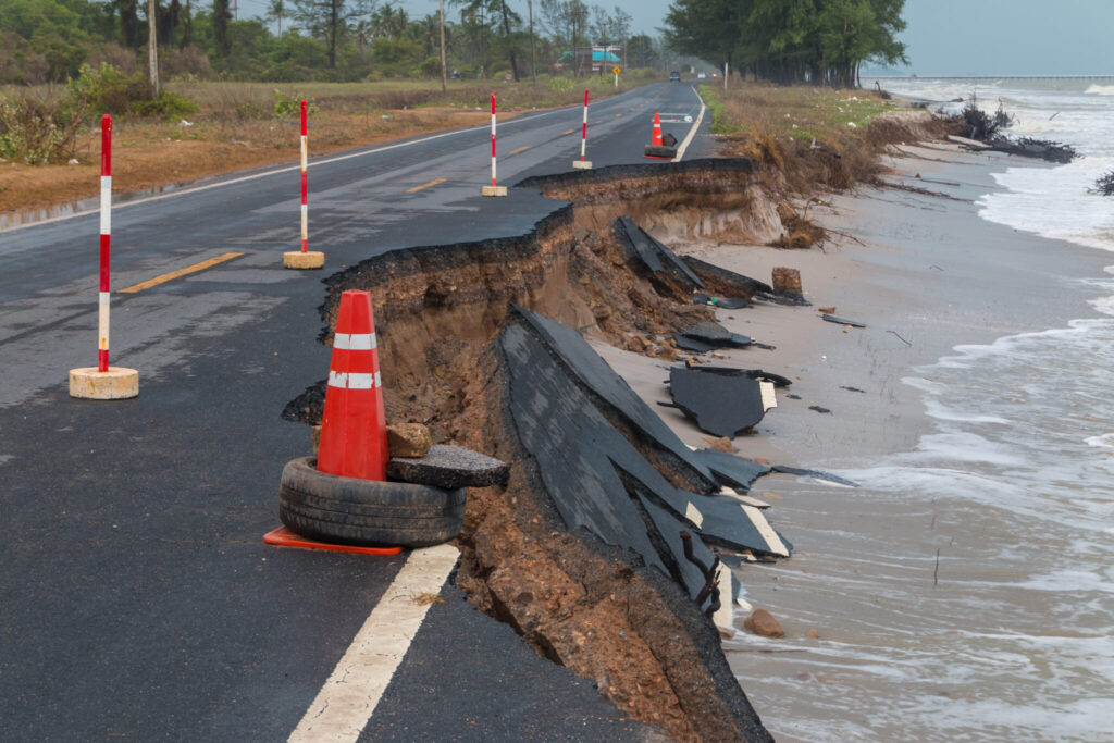
Ensuring resilience against climate change, natural disasters, and general deterioration
Revealing safety concerns and potential improvements
Gaining community buy-in for proposed projects
Satisfying regulatory requirements for a project that is already planned for a funding cycle
Quantifying and minimizing the environmental impact of travel
Addressing inequitable infrastructure
Minimizing impacts to the traveling public during implementation
Estimating costs of maintaining or improving a corridor
Developing a travel demand model to help forecast future travel conditions
Expanding multimodal access and designing Complete Streets
Assisting other transportation agencies like MPOs and RPOs in identifying future projects along a corridor
The outcome of a corridor study is typically a corridor plan, which lays out recommendations for infrastructure projects and operational changes that address concerns revealed by the study. Along with these recommendations, a corridor plan usually includes estimated costs for the proposed measures as well as potential sources of funding to cover those costs.
To encourage a transparent planning process with buy-in from the public and other stakeholders, study findings and recommended projects are typically shared with partners, regional governments, advocacy groups, and the public through a published report.
Long-Range Corridor Plans
This type of corridor plan typically studies a major interstate or other highway and aims to establish justification for upcoming improvements, which may be implemented at a much later date (sometimes 10 or more years after the plan is created). In many cases, the plan is designed to address requests tied to political interests.
Long-range corridor plans are often conducted on a recurring basis (e.g., every 10 years or so) to keep up with shifting travel demand and offer guidance to DOTs, MPOs, RPOs, and other stakeholders who may design or carry out corridor improvements recommended by the plan.
NEPA Corridor Plans
The National Environmental Policy Act (NEPA) requires federal transportation agencies to report on the environmental impact of proposed projects, such as the construction of highways and other publicly-owned facilities. These reports must include an exploration of alternatives to demonstrate why the project proposed is the best available option.
NEPA corridor plans help avoid unforeseen environmental consequences of corridor projects, such as increased risk of erosion.
A NEPA corridor plan is usually established once a project and set of projects along a corridor has been planned for a funding cycle (to be funded within 10 years). As part of the planning process, public review must be sought out and incorporated in order to satisfy NEPA requirements so that funding can move forward and projects can be implemented.
Sometimes projects are put on hold and the NEPA process languishes. In this case, when it is restarted, NEPA needs to be revisited along with any updates to existing conditions and forecasts. This is particularly true when a large funding stream becomes available.
Metropolitan Corridor Plans
MPOs regularly plan for network and corridor improvements in their region as part of their Metropolitan Transportation Plan (MTP). These corridor plans are often ongoing and evaluate many iterations of projects and project portfolios in their MTP.
If a project is not indicated with dedicated funding in a MTP, then it can’t receive federal dollars. MTPs are made for rolling 20-year periods and updated every five years.
While MTPs are typically managed and developed internally by large MPOs, AEC firms may be contracted to assist with planning and coordinating public involvement. AEC firms or research institutes may also assist in modeling and data collection. Project funding and later activities are typically provided by the state.
City/County Corridor Plans
A city DOT or Planning Department will also initiate more localized corridor planning activities. These may be done in coordination with the MTP, federal, and state funding processes or as part of local funding efforts. As with other types of corridor plans, AEC firms are often called upon to help with the planning process and public outreach.
These projects often support goals related to Complete Streets, access management, economic growth, safety, traffic signals, and local transit.
Streamline corridor analysis with on-demand metrics like VMT, VHD, Trip Speed, and more
In order to evaluate existing conditions and forecast travel demand on a corridor, a wide range of data must be collected. Traffic volumes for all vehicles, as well as bicycles and pedestrians, are just the beginning. Turning Movement Counts (TMC) at intersections, Origin-Destination (O-D) patterns showing how travelers use the corridor to get from point A to point B, and congestion metrics may also be collected. Additionally, analysis will typically include estimating LOS, VHD, VMT, Crash Rates, and Reliability Indexes.
Traditional data collection methods for corridor studies include:
Field observations
Staff are sent out to multiple locations along the corridor to collect roadway inventory and measure geometries
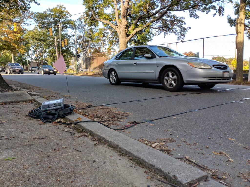
Roadway sensors
Sensors collect traffic counts, speeds, and turning movements
Crash reports
Existing crash report data is reviewed and used to derive crash rates and flag safety issues
Data from previous transportation studies
Past studies of the corridor are reviewed for additional insights and can help demonstrate change over time
Physical roadway sensors may be installed on roads to help measure traffic.
Because of the time and cost that goes into many of these traditional methods, transportation analytics are often used to supplement and streamline these measurements. Given the difficulty of collecting data across a large area — such as traffic counts for a whole interstate — not only do analytics save time and money, but they also allow transportation professionals to get a consistent snapshot of a corridor at the same point in time and from different perspectives. Multiple analyses can be run in minutes, and data can easily be segmented by factors like time of day or day of week.
Despite these advantages, analytics typically do not replace traditional methods entirely. For example, in order to assess conditions such as roadway geometry, guiderail erosion, and sight distance, manual field observations are often necessary. However, software-based analytics are often indispensable in deriving data like Vehicle Miles Traveled (VMT), TMC, VHD, and O-D patterns for a corridor.
Input from stakeholders and the public is also gathered during the study. This helps identify community priorities, provide insight into who the corridor serves, and inform viable projects. Since getting the public on board with upcoming projects is a key concern for corridor planners, these insights are crucial for developing data-backed recommendations that justify proposed plans.
The data that is collected may also be used to build travel demand models that help forecast future conditions along the corridor.
How analytics are making corridor studies easier and more complete
Because corridor studies combine so many elements and may inform decades of infrastructure projects, they often take months to years to complete, demanding considerable cost and effort along the way.
While total study costs vary dramatically based on the size of the corridor, hundreds of thousands of dollars are typically devoted to the process. For example, a 2020 corridor study by VDOT studying under three miles of roadway cost $100,000[1], while a study of just 4.7 miles of SR 303 in Bremerton, Washington, was budgeted at $500,000.[2] Corridor studies often cover much larger areas than these two examples, and thus costs escalate quickly.
Although certain data must be collected manually in the field, software-based transportation analytics can significantly streamline data collection, while providing a more holistic account of roadway conditions like traffic volume, congestion, O-D, and turning movements. Because historical data can be accessed on demand for any day of the week, time of day, or month of the year, these analytics offer a more complete view of roadway conditions than temporary sensors or manual field observations gathered over just a few days.
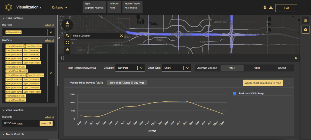
This Segment Analysis in StreetLight InSight® shows Vehicle Miles Traveled (VMT) along a corridor, segmented hourly with peak hours highlighted.
Additionally, on-demand analytics contribute to a more holistic understanding of roadway safety. Traditional safety analyses rely heavily on information from reported crashes, missing nuances from crashes which may not be reported and unsafe incidents which don’t result in crashes.This can provide an incomplete view of factors contributing to unsafe corridors and make it more challenging to pinpoint sections of roadway where safety improvements could make the biggest impact. But when corridor studies incorporate transportation analytics, factors like speed, bike and pedestrian activity, and turning movements by time of day or day of week can provide additional insight to inform safety solutions.
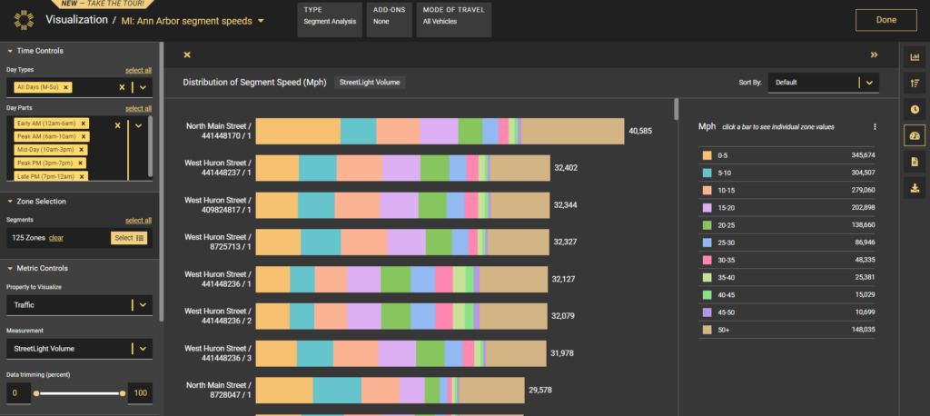
This sample analysis in StreetLight InSight® shows trip speeds along multiple road segments.
By incorporating Census data to overlay aggregated demographic info on other corridor data, on-demand analytics also assist planners and engineers in identifying existing inequities and proposing improvements that address these disparities so that corridors serve everyone. Traditional methods of data collection miss out on this equity lens, making it harder for transportation professionals to ensure equity-first infrastructure.
For example, a steering committee conducting a corridor study of PA Route 28 used StreetLight InSight® to analyze the geographic spread of the home locations of travelers, helping reveal who the corridor serves. The committee also leveraged StreetLight to understand trip purpose, O-D patterns, trip duration, and trip speed.[3] Another study of seven key corridors in Hartford, Connecticut, used StreetLight InSight® to collect travel patterns, including O-D and trip volumes by time of day.[4]
And analytics don’t just help with establishing existing conditions. Because of the additional nuance and granularity provided by on-demand analytics, this technology is also a boon for modelers looking to build complex travel demand models that help forecast future roadway conditions.
Additionally, analytics platforms can assist with NEPA plans by helping estimate emissions, reveal EV activity, and measure overall traffic on a corridor.
Finally, platforms like StreetLight InSight® assist planners in justifying proposed corridor projects to stakeholders and the public through data visualizations that put study findings into perspective.
So while analytics can’t replace the need for certain manual measurements and field observations, they can justify prioritization decisions for stakeholders and the public with validated data while saving time and money on data collection and modeling so transportation agencies can devote more time to designing and implementing safe, resilient, and well-operated corridors for all.
Virginia Department of Transportation, Shreve Road Corridor Study. December 2020.
Washington State Department of Transportation, SR 303 Corridor Study. May 2021.
Southwestern Pennsylvania Commission, Route 28 Corridor Study. November 2020.
Connecticut Department of Transportation, Greater Hartford Mobility Study Existing Conditions Report. December 20, 2021.
WEBINAR: See how on-demand analytics streamline corridor studies & clarify planning priorities
Explore the resources listed above and don’t hesitate to reach out if you have any questions. We’re committed to fostering a collaborative community of transportation professionals dedicated to building a better future for our cities and communities.
How to Make the Bipartisan Infrastructure Framework Work Better
How to Make the Bipartisan Infrastructure Framework Work Better
Streetlight Data applauds the Bipartisan Infrastructure Framework as a once-in-a generation opportunity to transform our nation’s infrastructure and address many of the most pressing challenges of our time. Success of this bold initiative will move our communities toward a more sustainable and equitable future, make our surface and physical infrastructure safer, and prioritize innovation so we can continue to adapt to the challenges of tomorrow.
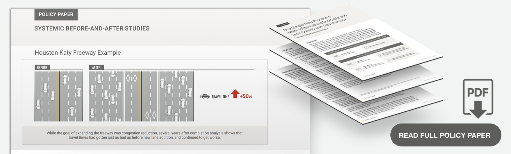
As Congress deliberates an investment at a scale we haven’t seen since World War II, we urge lawmakers to prioritize accountability of taxpayer dollars through proven methods such as before-and-after studies. Taking this important step will ensure that this bold legislation led by President Biden meets his commitment to “address the climate crisis, grow the economy sustainably and equitably for decades to come.”
Please click here to learn more about our approach for before-and-after studies for transportation infrastructure, and to download our policy paper.Streetlight Data applauds the Bipartisan Infrastructure Framework as a once-in-a generation opportunity to transform our nation’s infrastructure and address many of the most pressing challenges of our time. Success of this bold initiative will move our communities toward a more sustainable and equitable future, make our surface and physical infrastructure safer, and prioritize innovation so we can continue to adapt to the challenges of tomorrow.
As Congress deliberates an investment at a scale we haven’t seen since World War II, we urge lawmakers to prioritize accountability of taxpayer dollars through proven methods such as before-and-after studies. Taking this important step will ensure that this bold legislation led by President Biden meets his commitment to “address the climate crisis, grow the economy sustainably and equitably for decades to come.:
Please click here to learn more about our approach for before-and-after studies for transportation infrastructure, and to download our policy paper.
How We Can Ensure Transportation Equity and Emissions Reduction for Infrastructure Bill Projects
How We Can Ensure Transportation Equity and Emissions Reduction for Infrastructure Bill Projects
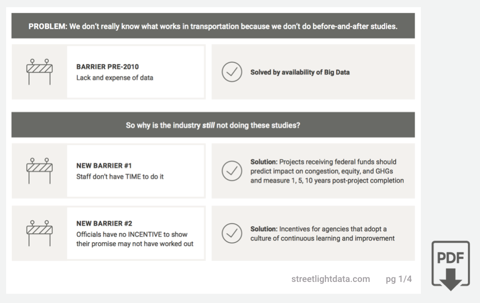
The Biden administration’s ambitious American Jobs Act proposes to spend $2 trillion in infrastructure improvements — including many transportation investments. But before the federal government starts awarding grant money, we must guarantee that our tax dollars achieve their intended goal of fostering equity and reducing greenhouse gas emissions.
How do we do that? By applying comprehensive transportation data to measure actual before-and-after results. The Biden administration’s ambitious American Jobs Act proposes to spend $2 billion in infrastructure improvements — including many transportation investments. But before the federal government starts awarding grant money, we must guarantee that our tax dollars achieve their intended goal of fostering equity and reducing greenhouse gas emissions.
How do we do that? By applying comprehensive transportation data to measure actual before-and-after results.
Two simple requirements can make this happen:
Assess all project grant applications by their stated predicted impact on climate and equity (and anything else the agency cares about)
Create incentives for agencies that continually measure if they achieved their goal, and adapt if they don’t
StreetLight Data remains a strong advocate for gathering the most comprehensive data possible to measure, monitor, and update transportation projects. That philosophy is what our company was founded on, and we urge the current administration to put it into practice to ensure the Infrastructure Bill benefits all Americans.
Need Ride-Hailing Services Intel? Big Data Has That.
Need Ride-Hailing Services Intel? Big Data Has That.
The ride-hailing revolution launched by Uber and Lyft has expanded to embrace shuttles, autonomous vehicles, and micro-mobility options like scooters and bike share.
As ride-hailing services expand, car ownership is decreasing, putting pressure on original equipment manufacturers (OEM) in the automotive industry. Many transportation and mobility companies are working with us to explore business options in this emerging industry.
Planning a ride-hailing business requires researching the target market to understand the best mobility options with strong business potential, and accurately forecasting revenue. But how can a company do that in a business where no data about core patterns exists outside of a few dominant companies who don’t data share? Big Data to the rescue.
The Data Behind Ride-Hailing Services
What companies entering this new field want is granularity, with accurate data to flow into a model for predictive analysis. Then they can simulate the best business outcomes and opportunities.
For example, key topics for planning a ride-hailing service include:
Macro considerations: If we start a ride-hailing service, should we launch in Orlando or Dallas?
Micro considerations: Which neighborhood and routes should we deploy in first? Where should we build assets (such as charging parking garages for a fleet of autonomous cars)? Where should we make costly investments such as HD mapping, and work to get city permissions for test routes? What size vehicle should we manufacture – how many seats, how much cargo space, etc?
StreetLight Data has been working with mobility companies to help answer these questions. With our metrics on ride-hailing service movements, our customers are able to build complex demand models, and help identify opportunities for related businesses.
Available Data and How to Get It
StreetLight is the only reliable, geospatially accurate source of ride-hailing data and non-ride hailing transportation all in one place. In fact, even Uber and Lyft don’t have good data on non-ride-hailing transportation, such as people traveling in their own cars, riding their own bikes, or with other transportation operators. Complete data on all modes is necessary to understand current demand and latent (unsatisfied) demand for new transportation offerings.
How can StreetLight estimate this closely guarded ride-hailing service behavior? Essentially, we can analyze how the movement patterns of devices belonging to ride-hailing drivers differ from other drivers. The patterns are clear: Ride-hailing service vehicles travel more miles per day, via irregular routes. Armed with detailed data, we then use machine learning and probabilistic modeling to apply these “gig driving” patterns/characteristics to our existing database of millions and millions of Location Based Data (LBS) from mobile devices.
As a result, we can offer an unprecedented array of analytics about ride-hailing behavior, including origins and destinations, the volume of ride-hail service drivers on different route segments, the neighborhoods where ride hailing is more or less concentrated, and more.
How Companies Use Ride-Hailing Data
Early adopters of our data have run analyses to identify various ride-hailing service patterns such as: Where are the busiest ride hailing routes? How does that change according to time of day and type of day (i.e. weekdays vs weekends)? Where are common clusters of origins and destinations? Are there common “spine” routes that ride-hailing service drivers take, even if the origins and destinations are different?
We not only have data on ride-hailing driving, we can also illuminate, with high spatial granularity/specificity, the difference between ride-hailing services and normal driving. That allows us to spot trends. One obvious example is with nightlife hot spots: we know that ride hailing as a percentage of total driving increases dramatically on Friday and Saturday late nights.
Our customers feed data into their forecast models that use their own proprietary info and assumptions (such as their customers’ willingness to pay, vehicle costs, deployment costs, etc). By layering their business intelligence with our metrics about demand (current and latent) for their future services, they can reveal what investments would be the most lucrative.
For example, consider testing the hypothesis of whether a six-seater shared-ride AV shuttle is more cost-effective to operate than a two-seater, non-shared shuttle. StreetLight’s metrics can show where in a city six people are most likely to share a trip to and from, along with which route(s) to take where people already have proven a willingness to use ride-hailing services.
Looking for granular data about fast-evolving travel behaviors? Don’t expect to get that anytime soon from ride-hailing service companies. Fortunately, Big Data has the answers, and can help companies make informed strategic decisions.
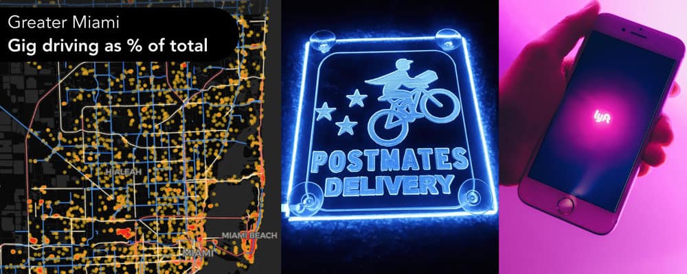
How Does Gig Driving Interact with Congestion? A Road-by-road Analysis.
How Does Gig Driving Interact with Congestion? A Road-by-road Analysis.
Many of our clients are concerned with new modes of travel and how they interact with existing transportation. Comprised of services like Uber and Lyft, “gig driving” for riders and delivery is a persistent concern. And its impact on congestion is hotly debated topic. Some claim it makes congestion better (less parking or less personal car driving), and others claim it makes congestion worse. The biggest challenge to finding the answer is a deep lack of available data about this mode of transportation.
Our team at StreetLight Data suspects that the interaction between gig driving and congestion depends heavily on what we call “context,” i.e. location, existing transit, urban density, land use, time of day, etc. We also believe that gig driving is here to stay and that we can arm policy makers with data to avoid the desire to “undo” what is a mobility mega trend — and instead try to harness and accelerate positive effects on the community and transportation networks.
To test our hypothesis about granular variation, we used our access to billions of transportation data points, and a lot of expertise in data science and transportation. We measured the interaction between gig driving and congestion road-by-road throughout the greater Miami region.
Our goals:
a. Find a way to measure gig driving that doesn’t rely on waiting for data sharing by private companies
b. Measure “gig mode share” — or the percent of vehicle trips on a given road segment at a given time that is a gig vehicle — on all roads within a single MSA. We chose greater Miami, an area boasting over six million people, heavy tourism, a diversity of urban density, rich variety of neighborhoods and plenty of nightlife, all adding up to a rich testing ground for our hypothesis.
c. Combine this “gig mode share” analytic with our core analytics about total vehicle volume and congestion to explore the interaction between gig share and congestion in different urban contexts.
Why do this? Because we suspect that sometimes gig is associated with better congestion, sometimes worse, and sometimes it’s neutral. There’s no one size fits all approach to managing gig driving within a city, so we need granular analytics to make good policy decisions, for example, figuring out which areas really need designated pick-up/drop-off areas or need incentives to encourage more equitable gig driving access, etc.
Spoiler alert – our hypothesis was proven largely correct. In the greater Miami region, depending on context, a road with a higher “gig mode share” can have a positive, negative, or neutral correlation with congestion. We measure congestion as (1 – [free flow factor]). See this link for details. The contexts we explored in this report are time of day, proximity to major transit centers, road class (highway/non-highway), land use, and density.
Methodology
StreetLight analyzes mobility patterns from millions of mobile devices every day. Analyzing congestion and driving characteristics for the full population is our core product, and for more on our approach, click here.
To create gig driving analytics, we worked with our partners at Cuebiq and Kochava Collective to segment anonymous users as having gig driving apps installed on their devices. Then we analyzed how those segments differ from the norm. It’s very clear that gig drivers don’t move around like you or me!
Their patterns include more miles traveled per day, irregular routes without fixed favorite places, and more. We used machine learning and probabilistic modeling to identify when a mobile device is in “gig driving” mode, and not — then applied those insights to our existing database. For this study, we analyzed over 15,000 gig drives, and several million personal driving trips.
Findings
Because each region is a unique with its own contextual nuances, these findings only hold for greater Miami! Each city must perform its own detailed analytics on its own context. As we repeat this effort in more places, we may find commonalities. However, we’ve shown that it’s feasible and straightforward to do this analysis for any city.
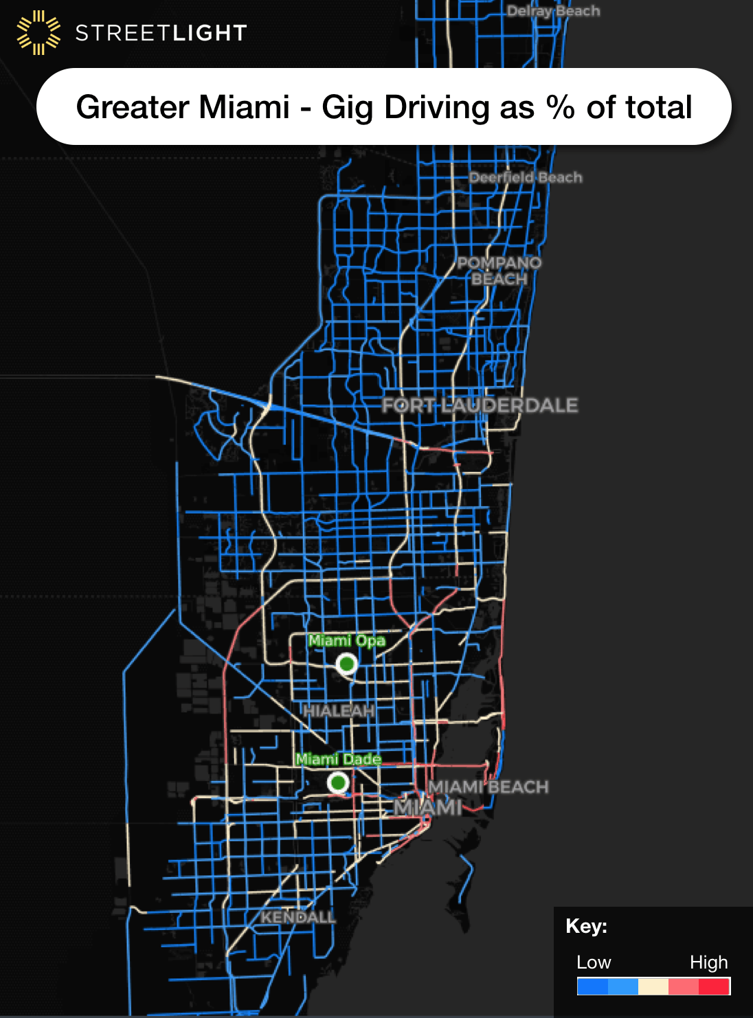
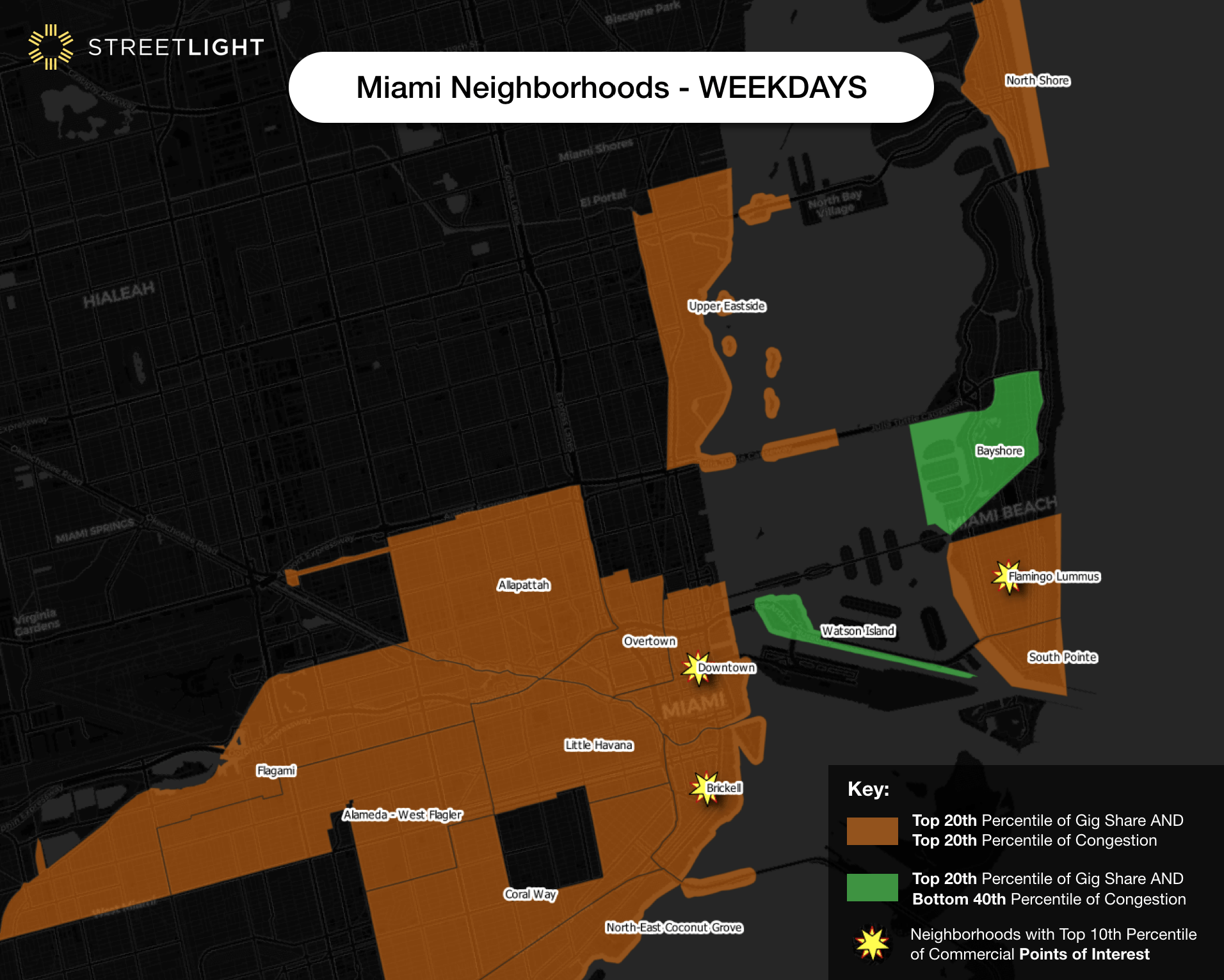
1. As shown in Figure 1 – gig mode share (gig trips as percent of all trips on the road segment) is higher in certain parts of town, notably tourist- and hotel-heavy areas like Miami Beach, downtown Miami, and at Transportation Network Company (TNC) ramps into Miami-Dade Airport. This matches intuition and helps build confidence in this hard-to-validate analytic.
Figure 1 – Gig mode share means gig driving as percent of all trips on road segments in greater Miami (weekday, all day). Heavy gig mode share areas, shown in darker red, are concentrated downtown, airports, and in beach/tourist areas.
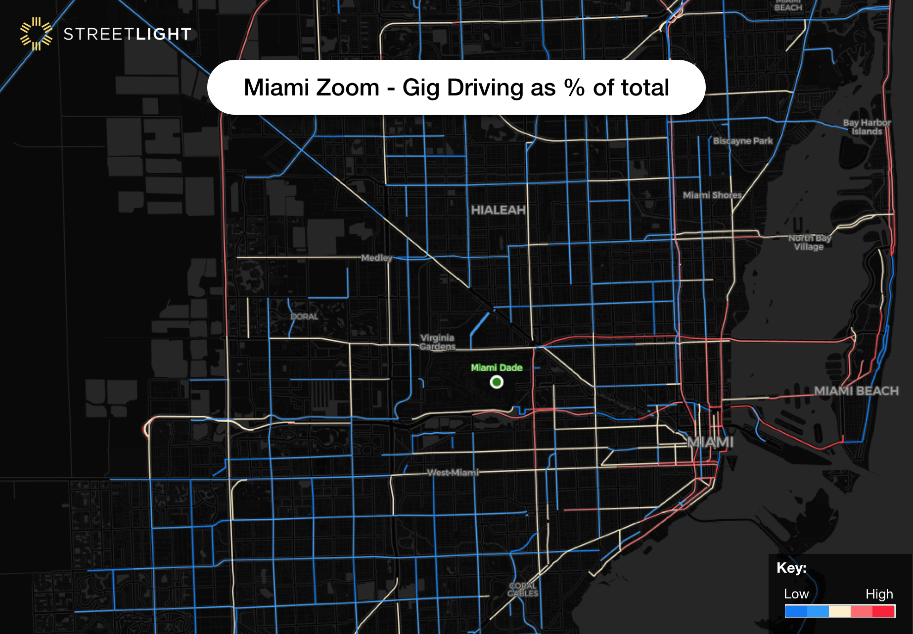
Figure 2: Close up of gig driving as percent all trips in downtown Miami. High gig mode share areas (darkest red) are concentrated at the Airport and heavy hotel/tourist districts, which matches intuition. It is extremely hard to find data to validate gig driving metrics at a granular level because this data doesn’t exist outside of private gig companies’ servers…until now.
2. In general, gig driving patterns follow overall temporal patterns. We see morning and evening peaks on weekdays, for example. However, gig mode share goes up on evenings, late night, and weekends. These are times with low congestion, when a few extra gig cars won’t make a big difference.
If the roads are congested in the first place, if gig creates more trips than would have existing otherwise, gigs do make a difference (like any type of marginal addition). Thus, the relationship between gig mode share and time of day is neutral.
3. In general, gig driving is a fairly consistent share of highway driving. This means that all highways have a similar experience with gig, and there are not one or two highways disproportionately impacted. Highways with higher gig mode shares have a very slight increase in congestion (especially on weekdays), but it is between 0.1% and 0.2% increase for each % increase in gig mode share – which is barely noticeable even in rush hour.
4. The bigger opportunity for policy makers is on non-highway roads. On arterial roads, we see 6x the impact as on highways: a 0.6-0.7% increase in congestion with each percent increase in gig mode share. Thus, we find that, in general, gig mode share has more variability, and more of an impact, on congestion, on non-highway roads. Policy makers can use this to find local roads to focus on for interventions.
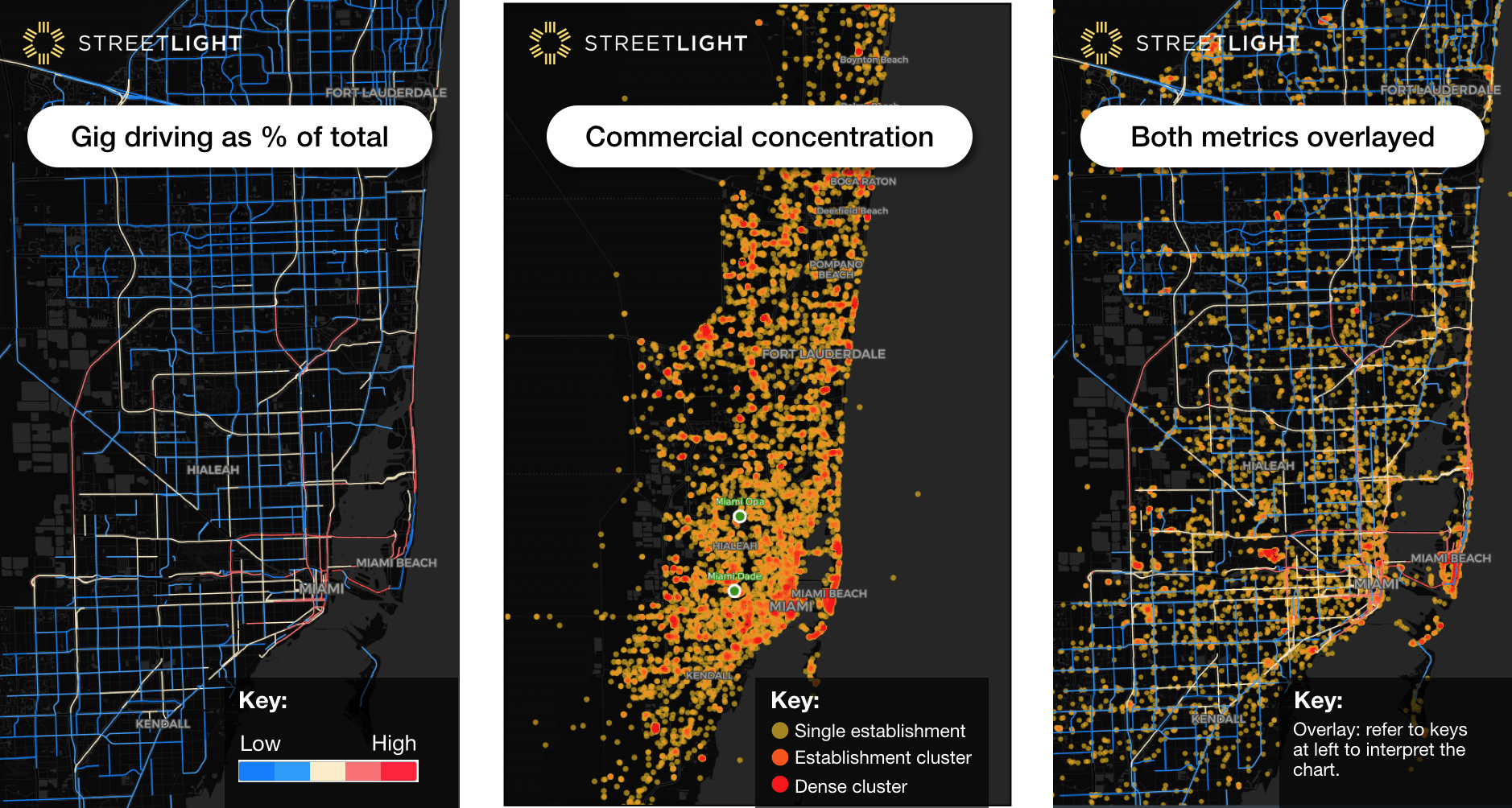
5. In commercial areas (as opposed to residential areas) is where it gets interesting. In greater Miami, in the very dense neighborhoods (top 10% of points-of-interest density, see map) a high gig mode share is correlated with a lower congestion.
However, in the mid-dense commercial areas, high gig mode share is correlated with higher congestion. We interpret this to mean that in greater Miami there’s a threshold of activity density above which gig mode share increases are associated with less congestion, and below which gig is associated with more congestion.
Perhaps this is because of reduced parking-searching in the very hot neighborhoods. But in medium-density neighborhoods, the gig vehicles may be adding trips or stopping and blocking traffic. Other Miami-neighborhood-specific factors like road width may come into play as well.
Figure 3a, b, c: Gig driving as percent of total, location of commercial points of interest (like restaurants, bars, entertainment) and a mashup. In some locations, both gig mode share and POI are “hot.’ These are areas associated with less congestion compared to areas with gig mode share is high but POIs are moderate – suggesting an activity threshold above which gig is associated with better congestion in greater Miami.
For example, Figure 4a shows neighborhoods near downtown Miami. All of them are in the top 20th percentile in terms of gig mode share as a percent of all driving on weekdays. Orange neighborhoods, like Little Havana, have both high gig mode share and high congestion. Green neighborhoods, like Bay Shore, have high gig mode share but very low congestion.
Even within the orange neighborhoods, the ones with a star, like Brickell, representing “top activity density” are likely to have lower congestion than one with no star. Image 4b shows the same information but for weekends.
Figures 4a and 4b: These maps show neighborhoods in central Miami (as defined by Zillow). Green neighborhoods are ones where gig mode share is very high (top 20th percentile) and congestion is fairly low (bottom 40th percentile). Orange neighborhoods are ones where gig mode share is very high (top 20th percentile) and congestion is very high (top 20th percentile). The stars show neighborhoods with very high concentration of bars, restaurants, stores etc. Even though some of these neighborhoods are “orange” they are likely to get a little less congested as more gigs enter, though the opposite relationship is true for their non-starred peers.
6. Transit Hub Proximity – We looked at the subset of roads that were within 400 meters (walkable range) of the various bus and transit stations in the region. Overall, these roads are more congested than the typical greater Miami road. This doesn’t mean transit causes congestion! It means we tend to put transit in busy places, as we should.
In these zones, the higher the gig mode share, the lower the congestion. This finding may be a restatement of our finding #4 – as more transit hubs are in high-density areas. It may also mean that lots of people are taking gig to transit stations in the further-flung, less congested parts of town. Future analysis of transit ridership and gig trip destinations will help us learn more about this relationship.
We know there are so many more contexts to analyze, and we are already getting started. This analysis looked at variation of gig driving across one region in the present – other researchers in the past have looked at changes over long period of time (before and after gig hit a city), and StreetLight can explore that in the future.
In addition, we can look into the context of demographics, rent prices, and transit ridership. We can split out gig delivery from gig rideshare. We want to measure the way gig driving interacts with social justice, safety, climate, and VMT, not just congestion.
If you have more ideas of context, please share them with us! It’s a complicated story, and we strongly believe granular analysis is critical for understanding it. We therefore wanted to get the conversation started with these first set of results.
To close, here’s a video that shows a subset of the Gig Driving “pings” animated over 24 hours. Most activity is concentrated downtown and in Miami Beach. But a few lucky (unlucky?) drivers get some 1+ hour trips into and across the Everglades!JTNDaWZyYW1lJTIwdGl0bGUlM0QlMjJ2aW1lby1wbGF5ZXIlMjIlMjBzcmMlM0QlMjJodHRwcyUzQSUyRiUyRnBsYXllci52aW1lby5jb20lMkZ2aWRlbyUyRjMwNDkyMzY3OSUzRmglM0Q1MTljODhlMjYzJTIyJTIwd2lkdGglM0QlMjI2NDAlMjIlMjBoZWlnaHQlM0QlMjIzNjAlMjIlMjBmcmFtZWJvcmRlciUzRCUyMjAlMjIlMjAlMjAlMjAlMjBhbGxvd2Z1bGxzY3JlZW4lM0UlM0MlMkZpZnJhbWUlM0U=
Nantucket Uses StreetLight Data to Estimate Population
Nantucket Uses StreetLight Data to Estimate Population
Seasonal population peaks are difficult to measure – especially in popular destinations like Nantucket Island. But population size is a critical metric for transportation planning, federal funding allocation, and more.
The Wall Street Journal cites a StreetLight Data client, the Nantucket Open Data Platform, who uses StreetLight’s innovative mobility analytics to estimate the island’s population around the year. This data is helping public agencies and local businesses in Nantucket build better plans for the future.
Measuring Travel Behavior Demographics at Walt Disney World
Measuring Travel Behavior Demographics at Walt Disney World
Walt Disney World is one of the most popular theme parks in the U.S. and every child’s dreamland. Many individuals come from around the world to view the characters, taste the food, and enjoy the rides. This amusement park creates an indescribable feeling of excitement and anticipation.
It’s a place I’ve always wanted to visit, and I know that I will someday. In the meantime, I’m satisfying my curiosity about Disney World by using StreetLight InSight (R) to explore the audience that goes there. However, I also think my analysis can add value for city and urban planners who want to:
Understand the types of people large amusement parks attract.
Understand the volume of hotels and accommodations you would need to provide for an amusement park of Disney World’s scale.
It’s important to note that this type of analysis could be used for economic development related to any attraction or special activity area – not just Disney World and theme parks. Some examples are:
Monuments (i.e. Statue of Liberty)
Museums (i.e. Virginia Fine Art Museum)
Parks (i.e. Yellowstone National Park)
Beaches (i.e. South Beach)
Methodology
As a marketing intern for StreetLight Data, I used StreetLight InSight to run an analysis on Walt Disney World. My research used Big Data to reveal important, hard-to-find insights about Disney World’s audience. For example, the study provides detailed information on where trips to Disney World usually begin, the aggregate home locations of visitors, and visitors’ demographic profiles.
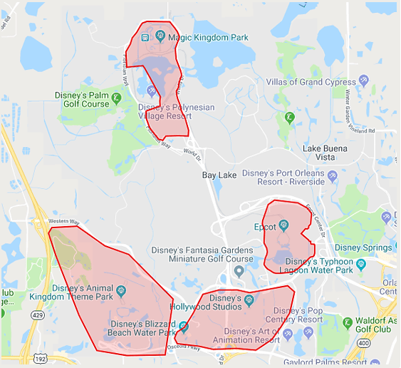
Figure 1. The zones are Epcot, Magic Kingdom Park, Disney’s Animal Kingdom and Disney’s Hollywood Studios, the four major parks in Disney World. I created separate zones for each park because the areas between the parks have large roads, hotels, and resorts. The people in these locations do not necessarily visit Disney World, so it was important to exclude those areas from my analysis.
See the data in action, register for our live demo
My first step was to create the zones (Fig. 1) to run an analysis on Disney World. The platform allowed me to run several types of analyses that gave me the information I needed to understand who goes to Disney World. The analyses I performed are:
Zone Activity Analysis (ZAA), used to analyze all travel activity in a zone set, regardless of origins or destinations.
Visitor Home and Work Analysis (VHW), used to analyze the home and work locations of visitors to a zone or zone set by grid or census block group. Demographics are also available.
The platform also allowed me to study who is visiting the park using different data sources. The data sources I used for this study include:
Location-Based Service Data, which is created by smartphone apps that use location-based services. It offers high spatial precision and a large sample size.
U.S. Census Data, which comes from demographic surveys that are conducted every 10 years by the US government.
The LBS data in this study comes from smartphones owned by adults in the U.S. that were running location-based services apps in the Disney World Park from June through August 2017.
Demographics: Family Status
First, I decided to look at the demographics of Disney World visitors. I did this with the Visitor Home-Work analysis. The analysis gave me insights on the race, income levels, and family status of individuals who attend Disney World by combining LBS and Census data. These data are analyzed anonymously, in aggregate. They describe the groups of people who visit Disney World, not individuals. (Note: StreetLight InSight does not use LBS data from children.)
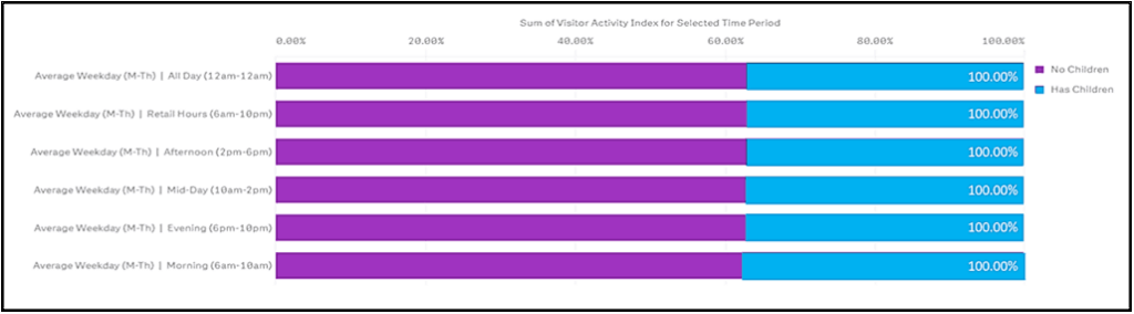
Figure 2. This graph shows the percentage of Disney World visitors that have kids in the household versus the percentage of visitors who do not have kids in the household.
In most commercials that advertise this dreamland, there are a diverse group of people at the amusement park and most of the individuals are young adults and/or children. Those advertisements display many families having a great deal of fun at Disney World. This is the image Disney uses to advertise their park as a family destination. However, according to Fig. 2, most people that visit the park do not have kids in their household. In fact, the research only shows 36.7% of the guests reside in a household with children under age 18. This is a surprising finding. Here are some reasons this may be the case:
Adult workers are most likely included in the results – they are likely to have smartphone apps with location-based services apps with them when they arrive for work.
The park has some attractions that appeal to adults and many corporate conferences are hosted in the park during weekdays
International visitors who come with family are not included in the study.
Some kids do not visit with relatives or adults they live with.
Some kids who visit the park may live with guardians or foster homes that are not accounted for in the US census.
Disney World captivates an audience of all ages. This is one of the reasons why Disney World is one of the best destinations for friends and family. This also goes to show that Disney’s marketing strategy successfully targets more than one age group.
Demographics: Race
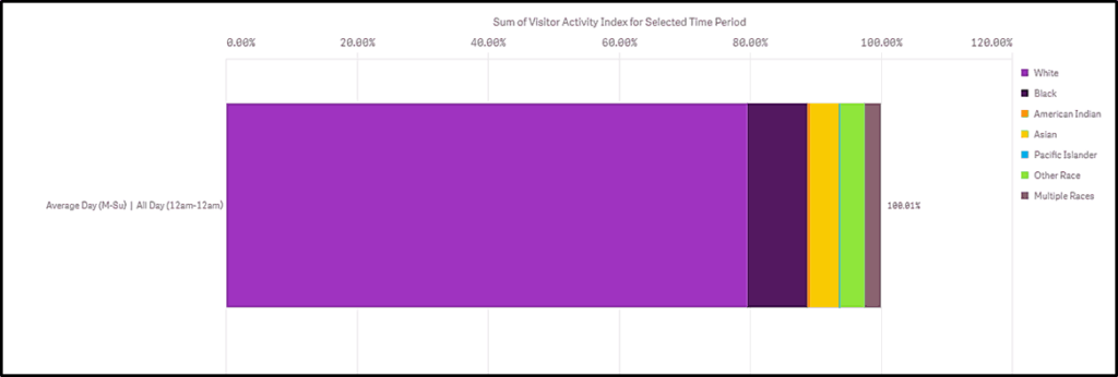
There is no doubt that many people from different ethnic backgrounds and cultures go to the theme park, but there were fewer minority visitors than I expected. The graph below visualizes a large amount of white individuals.
Within the graph there is also a small streak of blue; which indicates that the smallest minority in the park are Pacific Islanders. This is somewhat understandable considering Pacific Islanders makeup 0.2% of the U.S. population. Nonetheless, there are still a few Pacific Islanders making the journey to visit the famous park.
After Caucasians, Black/African Americans are the second largest group in the Disney World. I find this to be interesting because I had expected Hispanics to be the second most represented race in Disney World. According to the Census Bureau, they are the second largest race in Florida and the U.S., while Black/African American are the third most represented race in North America.
Figure 3. Different races that visit Disney World.
Demographics: Income
Disney World has heavy congestion throughout the park and sometimes that causes the wait for rides to be extremely long. According to Fox News, Disney increased prices to reduce long lines for rides and improve the flow of traffic in the park. The new prices seem to be affordable for households who have an annual income of $35,000-50,000 because they are the most represented income level in the park.
Nonetheless, there are still many people from lower income levels that visit the park. About 42.1% earn less than $35,000 to be exact. It’s interesting to see in Fig. 4 that households who have an annual income of $125,000 or more (the second largest income group in the US), don’t visit the park as frequently, although they have the funds.
Figure 4. Income of Disney World visitors.
Origins and Destinations
A very popular Canadian musician named Drake once said, “Sometimes it’s the journey that teaches you a lot about your destination.” This quote emphasizes that you can learn a lot about your destinations through your origins. This brings me to the second analysis type I used: Origin-Destination to Preset Geography (ODG).
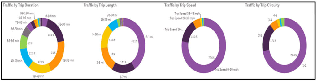
Figure 5 indicates that 41.1% of trips to Disney World are less than one mile long. This emphasizes that most people who come to Disney World begin their trips within walking distance of the park.
Did you know the average person walks three miles per hour? That’s about twenty minutes per mile. A few examples of the places that people visit Disney World from are: Walt Disney World Resort, California Grill, Oasis Canteen, SeaWorld, and other places that are nearby.
Figure 5. The graphs above show (from left to right) the duration, the length, and the speed of trips to Disney World.
Home and Work Locations
Lastly, I analyzed the visitors’ home and work locations. Most visitors’ homes are located as far as 100 miles away from the park. About 72.43% to be exact. Figure 6 shows only 0.50% of visitors live less than a mile from the park. According to Fig. 7 most visitors’ workplaces are also located at least 100 miles away from Disney World. I expected this to be the outcome since majority of the visitors’ homes were located more than 100 miles away too.
Figure 6: This graph is of how far the visitors’ home are located from the Disney World.Figure 7. A graph of how far the visitors jobs are from Disney World.
Conclusion
Although summer may be the busiest time of the year, it is also the best time to go Disney World. As songwriter Brian Wilson once said, “Summer means happy times and good sunshine. It means going to the beach, going to Disneyland, having fun.” If you swap “Disneyland” for “Disney World,” I totally agree with his statement. What better way to accomplish all these goals than going to Disney World? Next year, when the children are on summer break, plan a fun vacation with the family to the magical land of Disney World!
Explore the resources listed above and don’t hesitate to reach out if you have any questions. We’re committed to fostering a collaborative community of transportation professionals dedicated to building a better future for our cities and communities.
Now that we’re in the full swing of summer here on the East Coast, my friends and family have been taking road trips along I-95 – and for better or for worse, rest stops are an inevitable part of those trips. A few weekends ago, my parents’ car broke down on their way back home from New York, but fortunately they were able to make it to a rest stop. As my mom texted me from the rest stop parking lot, waiting for a tow truck at 11pm, I started to wonder: How many other people were at rest stops at such a late hour? Who else might be there with my parents? Was this rest stop typically a busy one?
It wasn’t long before I realized that, as a StreetLight Data employee, I had the answers at my fingertips – it was just a matter of running a study with StreetLight InSight®, our on-demand transportation analytics platform. In this post, I’ll show you what I found out, and share a few tips for evaluating your state’s rest stops.
The StreetLight InSight Analysis
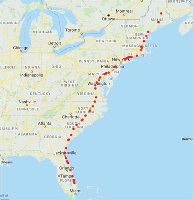
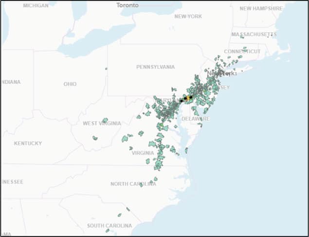
I used StreetLight InSight to analyze the volume of traffic entering and exiting 76 rest stops along I-95 – an interstate highway that runs down the East Coast of the U.S. from Maine to Florida – during the months of June, July, and August in 2017.
To do this, I first downloaded a list of 103 rest stops by latitude/longitude from POI Factory. From there, I removed any rest stops that did not have any facilities – basically, rest stops that just have parking or a scenic view. Next, I entered each latitude/longitude into StreetLight InSight, located the rest stop, and drew a polygon around it to create my analysis zones.
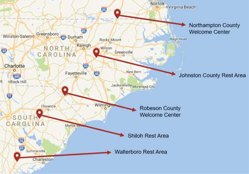
Figure 1. The map above shows all 76 rest stop locations that I included in this analysis.
I chose to analyze June, July, and August in order to capture family trips taken when kids are out of school. To run this study, I used StreetLight’s Location-Based Services data source. These are anonymous location records created by smartphone applications that provide Location-Based Services. This type of Big Data is great for analyzing personal travel, so it was the right data source to use given my focus on summer road trips. Here’s exactly what I wanted to find out:
What are the top busiest five busiest rest stops along I-95?
What is the busiest time of day to go to rest stops?
Which rest stops have visitors traveling the furthest away?
See the data in action, register for our live demo
What Are the Top Five Busiest Rest Stops Along I-95?
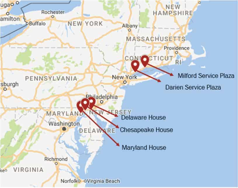
I used the StreetLight InSightZone Activity analysis for this study. It provides transportation analytics that describe the relative volume of trips that begin, end, or pass through specific locations. The results showed that the top five busiest rest stops along I-95 are at the following locations:
Delaware – NB/SB at MM 5 (Delaware House)* – Newark, DE
Maryland – NB/SB at MM 81 (Maryland House)* – Aberdeen, MD
Connecticut – NB at MM 12.4 (Darien Service Plaza) – Darien, CT
Maryland – NB/SB at MM 2/3 (Chesapeake House)* – North East, MD
Connecticut – SB at MM 41.4 (Milford Service Plaza) – Milford, CT
*These rest stops are in the middle of the highway, so visitors from both directions share the facility, which may help explain the high volume. But it’s a good insight for rest stop builders of the future who want to maximize visitors.
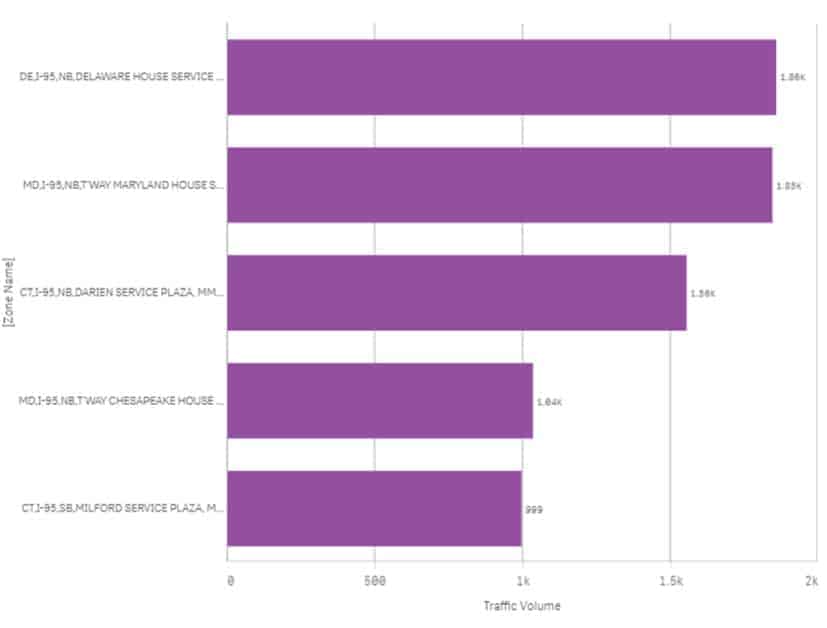
Figure 2. Locations of I-95’s top five busiest rest stops.Figure 3. This is a visualization from StreetLight InSight of traffic volume at the top five rest stops on an average day, across the entire day, using trips that began at the rest stop. (Note: Volumes are index values, not traffic counts.)
And with that, my first question was answered – my parents were at the fourth busiest rest stop along I-95, the Chesapeake House rest stop.
It’s interesting to note that the top five rest stops are clustered around two locations. The Milford Service Plaza and Darien Service Plaza are both located north of New York in Connecticut. It is possible that these are popular rest stops because they serve travelers between New York City and Boston heading to summer beach destinations. Likewise, the three rest stops further south, in Delaware and Maryland, are between Philadelphia and Washington, D.C., and they’re “on the way” to beach destinations in the mid-Atlantic.
While I didn’t analyze rest stop amenities comprehensively as part of this study, I was curious about the services offered at the top five most popular rest stops. This is what I learned:
They all appear to be recently remodeled.
They all provide electric vehicle charging stations as well as gas stations.
They each have at least six different food service options.
Four out of the top five rest stops have green/eco-friendly initiatives: The two rest stops in Maryland are LEED certified and the two in Connecticut are solar-powered.
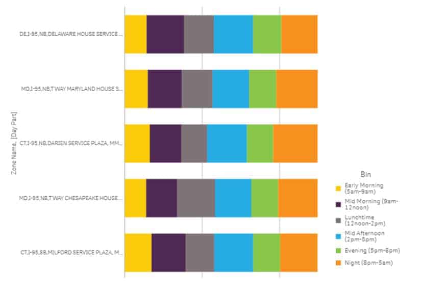
What Are the Busiest Times of Day to Go to Rest Stops?
Next, I dug a little further into the transportation analytics and found out the busiest times of day to go to the top five rest stops. StreetLight InSight lets me customize day parts, so I defined them as:
Early morning (5am-9am)
Mid morning (9am-12pm)
Lunchtime (12pm-2pm)
Mid afternoon (2pm-5pm)
Evening (5pm-8pm)
Night (8pm-5am)
Across the top five rest stops, the busiest times of day were:
Mid afternoon (2pm-5pm)
Night (8pm-5am)
Mid morning (9am-12pm)
Lunchtime (12pm-2pm)
Evening (5pm-8pm)
Early morning (5am-9am)
Here’s the breakdown for each rest stop:
Figure 4. This visualization from StreetLight InSight shows the distribution of traffic volume at the top five most popular rest stops across different day parts.
With this information, I learned the answer to my second question – my parents were at the Chesapeake House rest stop during one of their top two busiest times of day, between 8pm and 5am.
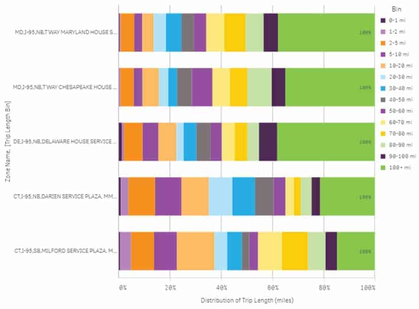
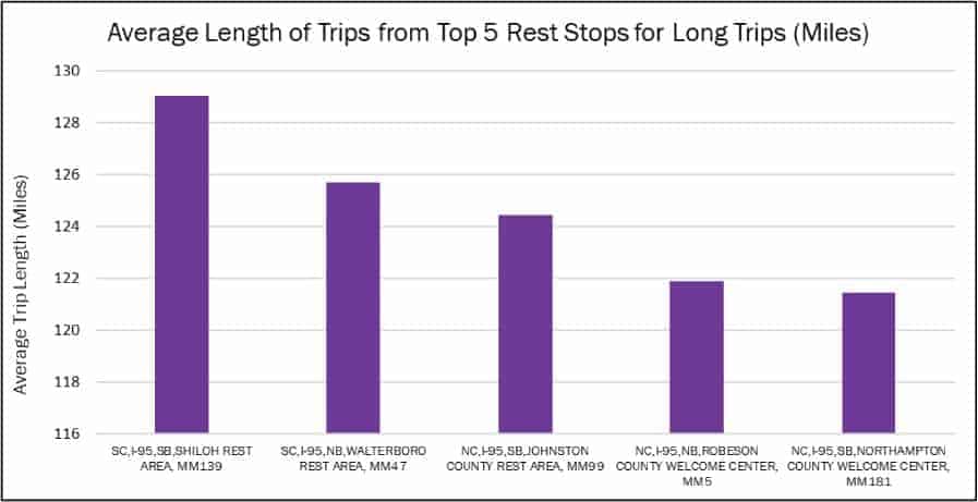
Which Rest Stops Are Visitors Traveling the Furthest To?
Finally, I wanted to find out which of these rest stops have visitors traveling from the furthest away. With a few clicks of my mouse, I learned that the Delaware House rest stop has visitors traveling from the furthest distance, with Maryland House in Aberdeen coming in a close second. I suspect that the popularity of Delaware House is related to this rest stop’s proximity to three highly populated metropolitan areas – Washington, DC, Philadelphia, PA, and New York City. If any local planners are reading this and have some context to share on this location, I’d love to hear from you.
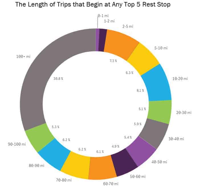
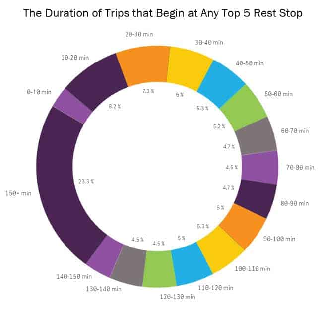
Figure 5. This chart from StreetLight InSight shows the distribution of trip length at each of the top five busiest rest stops. I analyzed the length of trips that began at the rest stop.Figure 6. This chart aggregates the lengths of trips, in miles, that begin at any one of the top five most popular rest stops on I-95. More than 30% of trips are over 100 miles long. About 31% of trips are less than 20 miles long. 0.8% of all trips are less than one mile long and 1.6% of trips are between one and two miles.Figure 7. This chart aggregates the duration of trips, in minutes, that begin at any of the top five most popular rest stops on I-95. About 23% of these trips are longer than 150 minutes long. About 18% of trips are less than 30 minutes. 2.9% of trips are between 0 and 10 minutes.
Next, I decided to look into the length and duration of trips from all of the rest stops I studied, on average. Were trips from the top five most popular rest stops typically longer or shorter than the average rest stop trip? It only took minutes to find out that the rest stops with visitors coming from the furthest distances were in South Carolina and North Carolina – states home to popular beaches like Myrtle Beach, Nags Head, and Hilton Head. Looks like people will go the distance to visit beaches in the South.
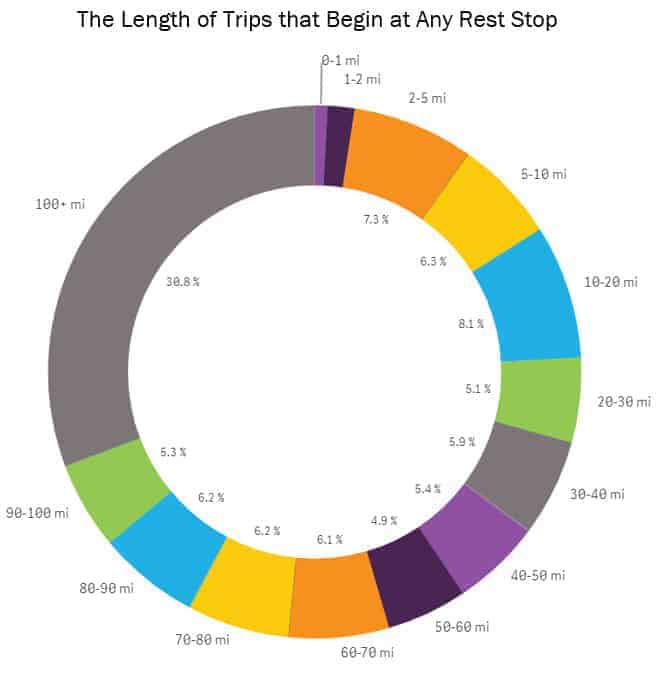
Figure 8. This map shows the rest stops that have visitors traveling the furthest distances.Figure 9. This chart shows the rest stops that have visitors traveling the furthest distances.Figure 10. This chart aggregates the length of trips, in miles, that begin at rest stops on I-95. I was surprised by the relatively high volume of trips under 20 miles – nearly 35%. 1.9% of trips are less than one mile and 2.7% of trips are between one and two miles.
The next step was to compare the length of trips that begin at any of the 76 rest stops I analyzed with the top five most popular rest stops. I was surprised to see the relatively high volume of shorter, regional trips that originate at rest stops. Nearly 35% of trips from all of the rest stops in the analysis are less than twenty miles long. Thirty one percent of trips from the top five most popular rest stops are under 20 miles – a slightly smaller share, but not by much.
This finding indicates that rest stops are providing important benefits and services to regional travelers – not just long-distance ones. When we invest in rest stops, we’re certainly helping road trippers and truck drivers, but also residents of local and nearby jurisdictions.
Where Do Rest Stop Visitors Go Next?
Of course, this led me to wonder: where were the visitors to the top five busiest rest stops going next, and where are their home locations? To find out, I ran two additional analyses – an Origin-Destination to Pre-Set Geography and a Visitor Home-Work analysis. Origin-Destination to Pre-set Geography analyses scan all trips that begin, end, or pass through any geography to identify the origins and destinations, ZIP code, census block group, or transportation analysis zone. (For Canadian analyses, dissemination areas are available.) Visitor Home-Work analyses provide the aggregate expected home and work locations of visitors to a specific location.
From the O-D to Pre-Set Geography analysis, I learned that the next stop for visitors traveling to the top five rest stops were generally clustered around the coast or around major metropolitan areas. Travelers departing from rest stops in Connecticut tended to go to New England’s beaches, while travelers departing from rest stops in Maryland and Delaware had a broader range of coastal destinations across the Chesapeake Bay and in New Jersey, Delaware, Maryland, and New York.
Figure 11. This heat map from StreetLight InSight show the next destinations of visitors visiting the Darien Service Plaza and Milford Service Plaza, which are both in the top 5 most popular I-95 rest stops.Figure 12. This heat map from StreetLight InSight show the next destinations of visitors visiting the Maryland House, Chesapeake House, and Delaware House, which are all in the top 5 most popular I-95 rest stops.
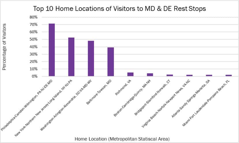
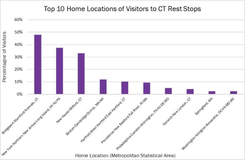
From the Visitor Home-Work analysis, I learned that visitors to these rest stops reside fairly close-by – check out the charts below. This makes sense given that over 30% of trips from the top five rest stops are fewer than 20 miles long. Plus, families traveling with children tend to stop more frequently for bathroom breaks. I’m not at all surprised that Richmond, Virginia is also a popular home destination of visitors, seeing as my parents live there, and it’s home to StreetLight’s East Coast offices!
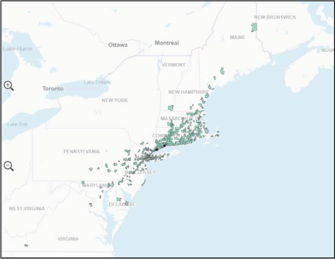
Figure 13. This chart shows the top 10 home locations of visitors to the Maryland and Delaware rest stops that are in the top five most popular I-95 rest stops.Figure 14. This chart shows the home locations of visitors to the Connecticut rest stops from the top five rest stops. Home locations are provided as metropolitan statistical areas (MSAs).
Conclusion
Whether you’re planning a road trip and want to avoid the crowds, a transportation planner looking to understand travel behavior for road maintenance and construction projects, or an economic development professional interested in the impact of rest stops, StreetLight InSight can provide a wealth of information in a matter of minutes.
Have you stopped at any of these rest stops – do they feel as busy as the numbers say they are? Let us know in the comments below!
See the data in action, register for our live demo
Explore the resources listed above and don’t hesitate to reach out if you have any questions. We’re committed to fostering a collaborative community of transportation professionals dedicated to building a better future for our cities and communities.
Transportation Policies and Equity: A Bay Area Regional Ballot Initiative
Transportation Policies and Equity: A Bay Area Regional Ballot Initiative
StreetLight Data is located in San Francisco CA, so many of our staff are voting next week on a Regional Ballot Initiative with considerable equity implications. It’s called Regional Measure 3. In short, it would increase tolls on all eight Bay Area bridges that are currently tolled. Thus, by the end of the six years, each toll will be $3 more expensive than it is now. This would raise an estimated $4.5B during the six years, all of which would go to fund a set of 35 highway and transit projects across the Bay Area. If you want more details, here’s an article from our local National Public Radio station, KQED: “10 Things to Know: Regional Measure 3, the Proposed Bay Area Bridge Toll Increase”.
I used StreetLight InSight® (that’s our on-demand transportation analytics platform) to get a better understanding of the equity implications of the toll increase. (Note: StreetLight Data does not currently endorse any political candidates or initiatives.)
Regional Measure 3 Ballot Initiative: Pros and Cons
The bill mirrors previous Regional Measures passed in 1988 and 2004. The bill enjoys very broad regional support, from agencies, newspaper editorial boards, legislators, and local groups. The presiding reason it enjoys support is because congestion is atrocious in the Bay, and many of our transit systems and networks are aging rapidly and unable to keep up with demand. As the population of the Bay Area continues to rise, the situation is becoming untenable. While some of the money will be spent on road improvements, about 2/3 of the money will be spent on transit projects,and many of the road dollars are for high occupancy vehicle (HOV) lanes. For example, $500M will go to BART upgrades and improvements, and $300M will to go ferry service expansion.
As for the cons, as KQED put it: “A handful of local legislators… oppose the measure. So do taxpayer groups such as the Howard Jarvis Taxpayers Association and taxpayers groups in Alameda, Contra Costa and Solano counties and in Silicon Valley. Republican Party county committees throughout the Bay Area also urge a “no” vote on the measure. A Marin County transportation advocacy group, the Transportation Defense and Education Fund (TransDEF), is also opposed. Among the chief reasons cited for opposing the measure: Higher bridge tolls amount to a regressive tax that will hit lower- and middle-income workers, who are already struggling with skyrocketing housing costs.”
For someone who drives to work five days a week across one of these bridges, and does or cannot take advantage of the new transit options funded by the measure, including the reduced-cost carpool bridge tolls, this will raise the cost of commuting by ~$750/year.
I want to note that all transportation policies that use cost as a lever are economically regressive – because transportation is a critical service, any increase that is not tagged to income will necessarily take a larger share of low-income travelers’ budgets. The question some Bay Area voters may be pondering this weekend is: “How disproportionate is the impact? If only we could know more about who is crossing each bridge…”
StreetLight InSight Analysis of Income of Bridge Travelers
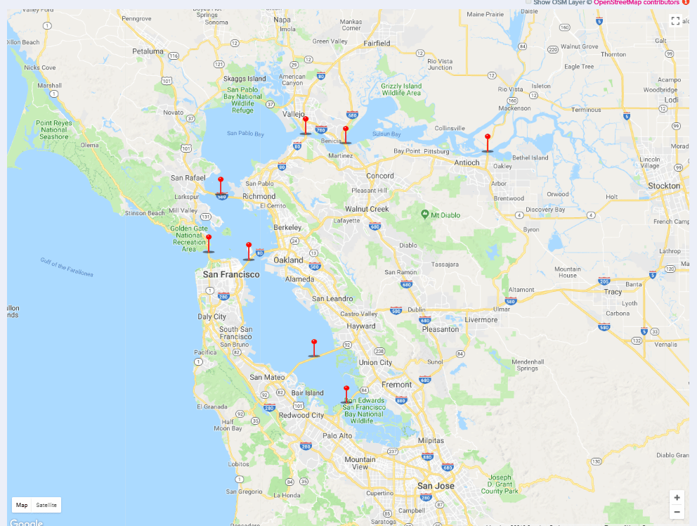
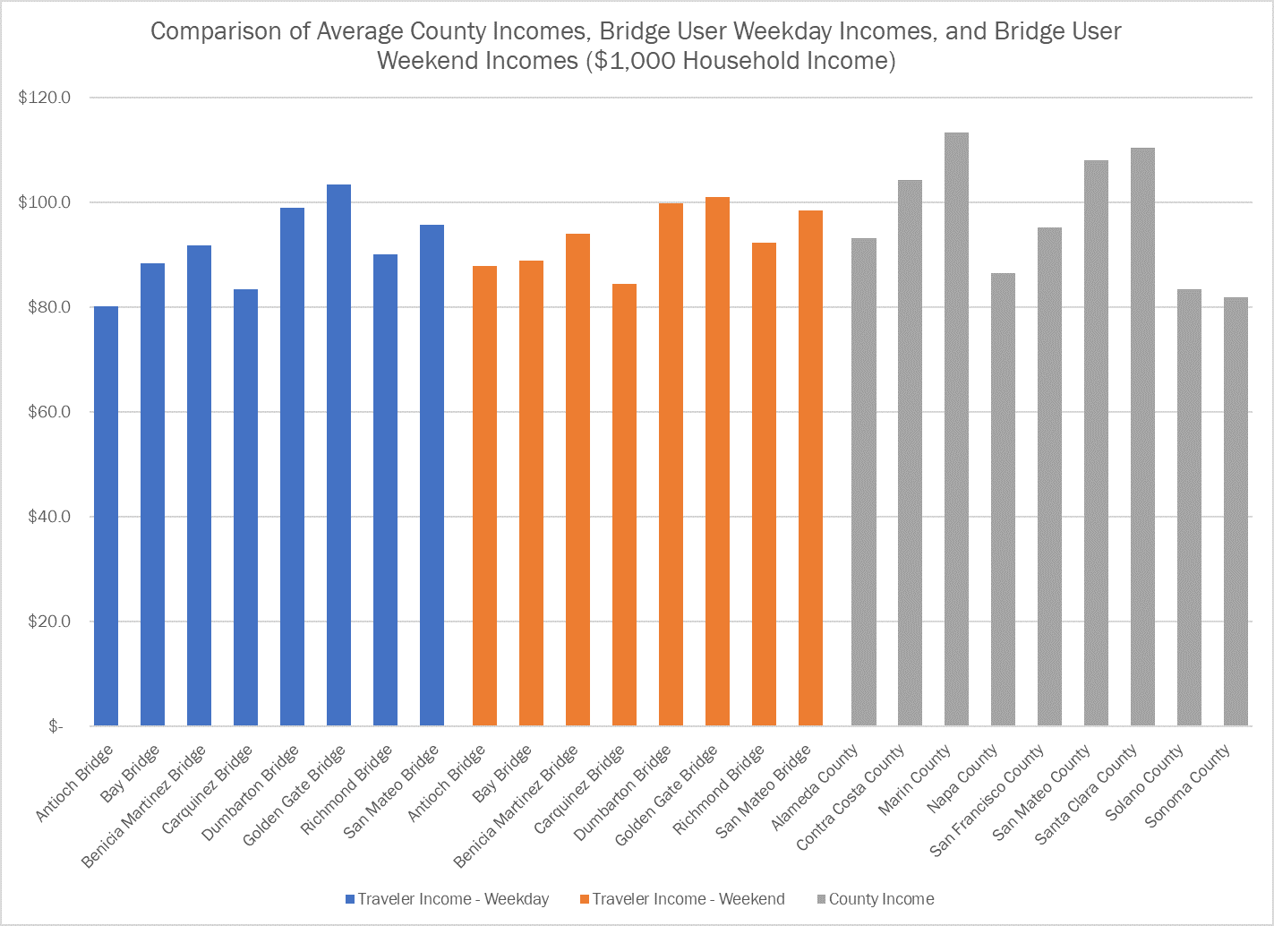
I was one of those voters when I realized I have access to all the data I need. I set up a Project in StreetLight InSight to get an income breakdown for all of 2017 for travelers across the eight Bay Area bridges that will be affected by the toll increases. I included the Golden Gate Bridge too (although it is not included in the measure) because I was curious.
Map of the 9 bridges analyzed for this comparison.
First, we compared the average income of bridge users during weekdays, weekends, and also compared that to average county incomes. The chart below shows the results. As you can see, there is a significant difference in the income of different bridge users. For example, users of the Dumbarton Bridge on average make over 20% more than users of the Carquinez Bridge. Weekends are much more equitable in terms of bridge income than weekdays.
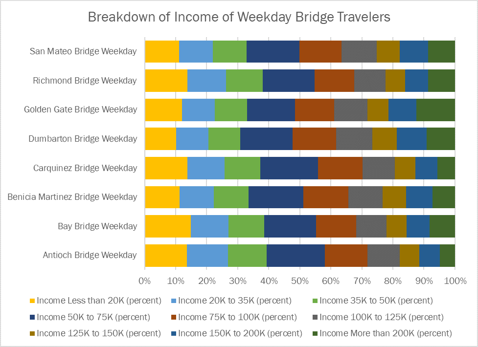
Because averages can sometimes be misleading, we also created charts showing the breakdown of income classes for bridge users, and the counties. All this just took a few clicks in StreetLight InSight.
This type of data should be considered when distributing resources that will help mitigate the impact of the toll increases on the users of the bridge. For example, the measure could allow for moving up the schedule to relieve lower income bridges with new transit and carpool lane options sooner.
StreetLight Data Powers UberFlux for Aerial Urban Transportation
StreetLight Data Powers UberFlux for Aerial Urban Transportation
At this week’s Uber Elevate Summit in LA, I saw the power of using StreetLight Data’s transportation analytics for a brand-new mobility challenge: Optimizing the rollout of new infrastructure for aerial urban transport. Uber hosted the conference to “explore the exciting future of urban aviation” (read: flying shuttles). While lots of the press focused on the new models of Electric Vertical Take-Off and Landing Vehicles (eVTOLs), I know readers of this blog will be even more excited by the use of data-driven planning to design their infrastructure!
What is UberFlux and How Did it Use StreetLight InSight?
At the opening address, and again at a deep dive panel, Uber showed off updates to the UberFlux tool. This tool pulls in data from several sources, including StreetLight InSight, our on-demand platform for turning Big Data into transportation analytics. UberFlux is used, among other things, to find optimal solutions to a complex problem: Where are the best places to site “nodes” for Uber’s upcoming UberAIR program? It is a stellar example of putting Big Data to work to drive transportation forward (should I say “fly” transportation forward?).
Jon Petersen, Head of Data Science at Uber Elevate, said: “StreetLight InSight and the StreetLight team play an important part to our modeling efforts and remain wonderful partners for the Elevate team.”
You might ask – why does Uber, a company with so much transportation data, benefit from StreetLight analytics? The answer is that Uber knows about Uber trips. But they don’t know about non-Uber trips. That’s where we come in.
The Uber team used StreetLight InSight to measure the volume and detailed characteristics of trips and travel activity between every block in the LA Metro area – to understand all 45+M daily trips. In the words of Eric Allison, Head of Elevate at Uber, “We’ve taken our own Uber data, which we have a lot of, and combined it with third-party data…and thus we can build a picture of close to 100% of the movement in cities.” StreetLight InSight is a key source of that third party data. You can watch this beautiful animation of total activity and origin and destinations derived from our Metrics by watching Eric’s address on YouTube. In the video embedded here, you can start at around minute 42 and keep watching through minute 57 to see how it all fits together:JTNDaWZyYW1lJTIwd2lkdGglM0QlMjI2NjAlMjIlMjBoZWlnaHQlM0QlMjIzNzElMjIlMjBzcmMlM0QlMjJodHRwcyUzQSUyRiUyRnd3dy55b3V0dWJlLmNvbSUyRmVtYmVkJTJGaG5jZU1jU25qUTAlMjIlMjB0aXRsZSUzRCUyMlViZXIlMjBFbGV2YXRlJTIwU3VtbWl0JTIwMjAxOCUzQSUyMExpdmUlMjBTdHJlYW0lMjBEYXklMjAxJTIwJTI4UGFydCUyMDElMjklMjIlMjBmcmFtZWJvcmRlciUzRCUyMjAlMjIlMjBhbGxvdyUzRCUyMmFjY2VsZXJvbWV0ZXIlM0IlMjBhdXRvcGxheSUzQiUyMGNsaXBib2FyZC13cml0ZSUzQiUyMGVuY3J5cHRlZC1tZWRpYSUzQiUyMGd5cm9zY29wZSUzQiUyMHBpY3R1cmUtaW4tcGljdHVyZSUzQiUyMHdlYi1zaGFyZSUyMiUyMGFsbG93ZnVsbHNjcmVlbiUzRSUzQyUyRmlmcmFtZSUzRQ==Here’s why using third-party data like ours is so important: When planning for long distance aerial transportation, you have to know about long distance trips that currently take place in Ubers, but you also have to know about the trips that take place in private cars and via other modes.
By mixing together both data sources, as well as other information from a detailed adoption survey done by RSG, the team at Uber Elevate was able to create a tool dedicated to creating the most cost-, time-, and energy-efficient strategy to kick off this bold new concept for urban transportation.
From StreetLight’s perspective, this is an excellent example of clients integrating their own data with ours to solve complex problems. It demonstrates the power of data to push transportation infrastructure planning beyond the status quo. We see other partners moving in this direction (though not necessarily with flying cars) and can’t wait to share more examples.
Should We Be Excited or Worried about Flying Shuttles?
The conference brought up several other questions for me in regards to StreetLight’s Data’s broader mission to reduce vehicle miles traveled (VMT) in gas-powered, privately owned cars:
1. I still have outstanding concerns about the greenhouse gas efficiency of electric aerial transport compared to electric vehicle transport. Ride-sharing is key for both and Uber Elevate seems dedicated to shared access, which is good.
2. Uber stated that the availability of this option will probably unlock latent demand for longer distance trips that don’t occur today because the travel times are just too long. This raises a flag to me. I think they’re right because lowering travel costs (in time or dollars) usually does increase VMT. While there is some economic benefit in this, such as linking smaller, co-located cities so they can operate like a megacity. However, we’ve seen historical evidence that opening up new long-distance options (even transit!) may drive up total regional VMT. No matter how efficient the mode may be, we cannot achieve our sustainability and quality of life goals if VMT increases.
3. A lot of people have instinctive concerns about the equity of aerial transportation. I share those concerns. As with the greenhouse gas emissions, sharing is again critical to make this mode as affordable and equitable as possible and I’m glad to see the emphasis of the Elevate program on shared rides. In addition, it’s critical that Elevate achieve its vision for a multimodal transport future that includes transit, bike/scooter/vehicle shares, and other options in a network with aerial transport. Good corporate and public policy and political courage will be required to mitigate negative equity consequences. (Of course, we’ll also need data to measure how the launch of new modes like UberAIR affects everyone else in the system to make such policy.)
4. If you have a chance, listen to the presentation from Uber Elevate about sound psychology by Joseph Schittenlacher! There’s a lot of complexity when it comes to urban aerial transport sound and nuisance. As someone with some serious misophonia, I was intrigued on a personal level. Uber’s goal is to be half as loud as an urban truck. I propose a noise cap-and-trade system. For every eVTOL that Uber (or anyone else) gets licensed to fly, it has to pay for an electric (noiseless) retrofit of two locally owned trucks.