Big data is now a common tool for agencies, firms, and businesses looking to understand traffic conditions and transportation patterns – from analyzing the top routes taken by drivers to anticipating how a bike lane will impact safety and congestion.
Alongside this growing adoption of big transportation data, a host of data providers have also proliferated, presenting users with a complex array of options that can be challenging to navigate.
INRIX is among the commonly used big data providers with solutions aimed at transportation use cases and related land use and business applications.
INRIX Pros
INRIX is a popular choice for:
Real-time analytics
Safety analytics targeted at securing grant funds
Smart Delivery analytics, including data on ride share and food delivery patterns
Parking and curb analytics
INRIX Pricing
Like most INRIX competitors covered here, INRIX’s website does not have explicit pricing information readily available, and pricing likely varies based on the metrics and coverage needed.
So how do INRIX’s competitors and alternatives stack up, and when should you consider other options for big transportation data? Below, we explore some of INRIX’s most common alternatives, and the pros and cons of each choice.
StreetLight
Among the leading big data providers in the transportation landscape, StreetLight is the most widely adopted transportation platform in North America. Backed by a robust set of third-party validations, white papers, and customer testimonials, StreetLight is highly trusted by transportation agencies, firms, and businesses across the U.S. and Canada.
StreetLight has a long history in transportation data, and has built up a 10+ year repository of mobility patterns since its founding in 2011. As data sources have come and gone, StreetLight has continuously updated its methodologies to take advantage of emerging data sources and ensure users get only the most reliable insights based on real-world traffic patterns and ample datasets.
This allows StreetLight to turn the richest, largest, and most secure datasets available today into reliable and granular metrics used by professionals across North America.
Specialized Solutions for Many Use Cases
Because of its long history in the industry, StreetLight also offers the advantage of an entire suite of products that address the most common challenges faced by transportation professionals. From improving pedestrian safety and deploying EV chargers to managing traffic congestion and planning construction detours, StreetLight’s purpose-built solutions make it easy for users to make data-driven decisions about their road network, client projects, or business operations.
Highly Granular Data for any Geography in North America
Streetlight’s data also offers deep granularity across space and time. Thanks to its robust repository of data and diverse set of industry-leading data sources, users can confidently dive deeper into highly granular analyses – even looking at temporal increments as small as 15 minutes, and spatial increments as small as a single road segment. In other words, you can get data on any road, any mode, and for any time period.
That means not only can you use StreetLight to understand high-level historical trends over the past five years, but you can also monitor fast-changing traffic trends over the course of a single morning. Transportation operations experts can even monitor real-time traffic patterns that happened a few seconds ago, to ensure traffic is moving safely and efficiently. Likewise, you can zoom in on individual road segments or get region-wide insights, depending on the scope of your project.
This granularity is a major advantage for transportation modelers, who need granular data based on real, observed traffic patterns to help predict how conditions will change over time, or in response to specific infrastructural and policy changes.
Granular data is also highly valuable for practitioners at public agencies, firms, and businesses, who need actionable insights to prioritize projects, evaluate impact, and anticipate future needs.
Industry Longevity and Reliability
The transportation data landscape has undergone several evolutions since StreetLight’s founding in 2011. But StreetLight’s industry-leading data science engine has stood the test of time, offering stability and transparency to its users during times of uncertainty.
Today, StreetLight is part of Jacobs, a Fortune 500 company with years of industry knowledge, adding to StreetLight’s stability in the market.
Pros of StreetLight Over INRIX
With ample white papers and third-party validations available, StreetLight is a strong choice for users who value data transparency or need to ensure the data they use meets very specific qualifications.
For practitioners looking to analyze all modes in one platform, StreetLight offers tools for planners to access insights for vehicle, truck, bicycle, pedestrian, bus, and rail modes.
Because some of INRIX’s solutions are available on non-integrated 3rd-party platforms, users who prefer an integrated, seamless experience may choose StreetLight.
StreetLight Pricing
StreetLight’s pricing depends on which solution you choose. Custom metrics packages may also be available depending on your goals and budget.
Replica’s tagline is “Data to Drive Decisions about the Built Environment,” and its data offerings are designed to match. Similar to INRIX, many of Replica’s applications cater directly to transportation industry use cases, and related use cases in land use and commercial real estate.
Some of Replica’s applications include:
Active Transportation Analysis
EventSight
GeoSnapshot
Standard Growth Scenarios
Transit Demand and Equity Scores
Replica Pros
Replica’s strengths include:
Dashboard data visualizations
Filtering capabilities
Consumer spending behaviors
Land use insights
Traditional mobility patterns
Replica Cons
Despite Replica’s strengths, data recency and granularity may not be as strong as other options on the market. Transportation modelers or other users who want to analyze synthetic behaviors rather than empirical behaviors may also choose Replica. Users will also have less flexibility in how they use the data, since Replica does not offer API or ESRI integration. These limitations can make it challenging to analyze small time frames and individual roadways or segments.
Replica Pricing
A complete breakdown of Replica’s pricing info is not readily accessible on their website, but Replica offer a pricing breakdown for public agencies based on the population of the city, county, or state the agency serves, as well as prices for a single department vs. multiple departments within an agency.
LOCUS
LOCUS, a subsidiary of the consulting firm Cambridge Systematics, was once a visualization tool used exclusively for Cambridge Systematics clients. Now, it is a standalone, on-demand platform offering performance, safety, freight, EV, and multimodal mobility metrics. Like other INRIX alternatives, it specializes in delivering insights on transportation and travel behavior.
LOCUS is a newer offering on the market with a smaller range of products. However, they emphasize custom solutions paired with consulting services through Cambridge Systematics to help customers accomplish a variety of goals.
LOCUS Pros
One thing that makes LOCUS unique is its strengths in transit data, including:
Real-time transit activity
Ridership trends
Transit performance metrics
LOCUS’s real-time transit dashboard uses farecard or survey data and routing to help customers understand these transit patterns.
LOCUS Cons
LOCUS emphasizes custom-built data solutions paired with consulting services, making it a viable option for customers who want a bespoke approach. However, LOCUS offers fewer out-of-the-box solutions than some INRIX alternatives, and may not be the best fit for those who want a do-it-all platform or a self-driven research experience.
LOCUS Pricing
LOCUS’s pricing info is not featured on their website, and may vary based on the customer’s needs.
AirSage
AirSage offers transportation data “customized” to each customer’s needs, and serves public agencies, firms, and businesses. It uses Big Data to deliver insights on how people and vehicles move.
AirSage offers a few products, including:
Trip Matrix – an Origin-Destination matrix the includes trip attributes and trip purpose information
Activity Density – measuring population movement and density, useful for event-based migration patterns such as emergency evacuations
Pedestrian Activity Density – specifically for understanding pedestrian movements
Target Location Analysis – used to understand visitor activity at points of interest
AirSage Pros
Many of AirSage’s products are delivered in CSV format, making it easy to integrate with:
Your own dashboards
GIS platforms
Power BI
Excel
Other mapping tools
AirSage Cons
However, customers who value data transparency may choose other alternatives due to AirSage’s limited availability of white papers, 3rd-party validations, and case studies. Those who want to analyze bike, bus, rail, or truck modes may also prefer other options, as AirSage places more emphasis on personal vehicle and pedestrian use cases.
AirSage Pricing
AirSage does not offer explicit pricing info on their website, however their Terms of Service state that pricing is available on request from a Sales representative, and may vary based on usage and location.
Looking for an INRIX alternative?
While INRIX may appeal to those who need global transportation insights, or with specific interests in parking, curb, and signal data, StreetLight is a powerful alternative for practitioners across North America who value a seamless experience that allows them to analyze any mode, any road, and any time period within a single integrated platform.
If data transparency is important to you, you may also appreciate StreetLight’s robust variety of 3rd-party validations and white papers, which help make StreetLight one of the industry’s most trusted transportation data platforms, satisfying even the most highly technical users in agencies, firms, and businesses.
Today, the transportation industry, smart cities, and commercial businesses are all increasingly turning to big transportation data to make informed decisions. Alongside this growing demand, big data providers have also proliferated, making decisions about where to source this data more complex.
StreetLight has long been a frontrunner in the transportation data landscape, and below we’ll explain a few reasons why it remains a popular choice. But we’ll also cover some leading alternatives to StreetLight and how they may be useful for certain use cases and practitioners so you can explore your options and find the best solution.
As you’ll see, while many of these alternatives do certain things well, StreetLight is a strong choice for granular, empirical, reliable, full-coverage metrics across North America.
If you’re a current customer looking to improve upon your experience with StreetLight, or have a project you’re not sure how to accomplish in our platform, reach out to our Support team here! Our best-in-class customer service and full suite of training and support resources are part of what makes StreetLight the leading choice in transportation data analytics.
Why People Choose StreetLight
StreetLight is the most widely adopted transportation software, trusted by transportation agencies across the U.S. and Canada, with third-party validations across North America backing its reliability across a wide range of applications. Due to its strong reputation in the transportation data landscape, you may have already seen StreetLight data at work on some high-profile projects, such as the rebuilding of the collapsed Fern Hollow Bridge, or major industry research like this report revealing VMT and congestion are higher than ever.
So what makes StreetLight such a popular choice for agencies, firms, and businesses?
Comprehensive and Cutting-Edge Data Sources
One key advantage to StreetLight is its long history in the transportation industry. Founded in 2011, StreetLight has a 10+ year repository of mobility patterns and is continuously updating its data sources as new ones emerge. This allows StreetLight to turn the richest, largest, and most secure datasets available today into reliable and granular metrics used by professionals across North America.
Purpose-Built Solutions Supportinga Wide Range of Use Cases
StreetLight’s long history in transportation has evolved into a robust suite of productsthat directlyaddress the needs of transportation professionals. Whether you need to manage traffic congestion, improve safety, or deploy EV chargers, StreetLight has a purpose-built solution to help you make data-driven decisions impacting urban mobility and more.
Highly Granular Data for any Geography in North America
Not only can StreetLight support a wide variety of use cases, our data also offers deep granularity across space and time. In other words, you can get data on any road, any mode, and for any time period. That means you can analyze fast-changing road conditions (in increments as small as 15 minutes), high-level historical trends over the past five years, or real-time traffic patterns that happened a few seconds ago for transportation operations management. Similarly, you can zoom in on individual road segments or get region-wide insights, depending on the scope of your project.
This granularity ensures agencies of all sizes, as well as firms and businesses, can get actionable insights to prioritize projects, evaluate impact, and anticipate future needs. It’s also particularly important for transportation modeling, which requires granular, empirical data to help predict how conditions will change over time, or in response to specific infrastructural and policy changes.
Industry Longevity and Reliability
The transportation data landscape has gotten shaken up more than once since StreetLight’s founding in 2011. But as data sources come and go, StreetLight’s industry-leading data science engine has stood the test of time, offering stability and transparency to its users during times of uncertainty.
Today, StreetLight is part of Jacobs, a Fortune 500 company with years of industry knowledge, adding to StreetLight’s stability in the market.
So, given all the advantages we’ve explored, how does StreetLight compare to other mobility data providers on the market? Next, we’ll explore some of StreetLight’s competitors and alternatives to help you determine if StreetLight or another option is right for you.
Replica
Replica’s tagline is “Data to Drive Decisions about the Built Environment,” and its data offerings are designed to match. Similar to StreetLight, many of Replica’s applications cater directly to transportation industry use cases, and related use cases in land use and commercial real estate.
Some of Replica’s applications include:
Active Transportation Analysis
EventSight
GeoSnapshot
Road Closure Scenarios
Safe Streets Planner
Standard Growth Scenarios
Transit Demand and Equity Scores
When People Might Choose Replica Over StreetLight
Replica is a common choice for users who want to analyze economic activity, including consumer spending trends, or certain nuanced land use scenarios.
Replica’s scenario tools (projecting population growth, employment growth, remote work rates, and other scenarios) also offer insights and data visualizations based on predicted behavior and synthetic populations.
When People Might Choose StreetLight Over Replica
StreetLight is a common choice when highly granular datasets or comprehensive, empirical coverage is needed for all road segments, intersections, or time periods. In addition, for transportation operations professionals, StreetLight data offers real-time and historical vehicle traffic patterns to solve capacity constraints and develop traffic management plans.
Transportation modelers or other users who want to analyze empirical behaviors rather than synthetic behaviors may also choose StreetLight.
With APIs and ESRI integration available, StreetLight may also be well-suited to users who want to use datasets within their own software and third-party tools.
Operations and event traffic managers may also choose StreetLight for its real-time and near real-time data solutions.
INRIX
Like StreetLight and Replica, INRIX offers big data solutions designed for transportation use cases and related land use and business applications. INRIX’s global presence also makes it a leading choice beyond North America.
Among INRIX’s strengths on the market are offerings in real-time analytics and safety analytics targeted at securing grant funds such as those available through the Bipartisan Infrastructure Law (BIL).
INRIX’s products also include Smart Delivery analytics for ride share and food delivery, as well as parking and curb analytics.
When People Might Choose INRIX Over StreetLight
INRIX’s global presence makes it a common choice for practitioners who need to analyze mobility beyond North America (however, StreetLight is beginning to expand its operations beyond North America, including the UK and other countries).
INRIX is also a strong choice for users who want to analyze parking, curb, and signal analytics, as well as real-time data that includes roadway alerts.
When People Might Choose StreetLight Over INRIX
With ample white papers and third-party validations available, StreetLight is a strong choice for users who value data transparency or need to ensure the data they use meets very specific qualifications.
For practitioners looking to analyze all modes in one platform, StreetLight offers tools for planners to access insights for vehicle, truck, bicycle, pedestrian, bus, and rail modes.
Because some of INRIX’s solutions are available on non-integrated 3rd-party platforms, users who prefer an integrated, seamless experience may choose StreetLight.
LOCUS, a subsidiary of the consulting firm Cambridge Systematics, was once a visualization tool used exclusively for Cambridge Systematics clients. Now, it is a standalone, on-demand platform offering performance, safety, freight, EV, and multimodal mobility metrics. Like other StreetLight alternatives, it specializes in delivering insights on transportation and travel behavior.
LOCUS is a newer offering on the market with a smaller range of product offerings. However, they emphasize custom solutions paired with consulting services through Cambridge Systematics to help customers accomplish a variety of goals.
When People Might Choose LOCUS Over StreetLight
Users may choose LOCUS for its transit-focused solutions, including solving for the Transit Redesign use case since you can integrate transit data (farecard and APC) with LOCUS data, providing insights on the transit travel market in your region.
When People Might Choose StreetLight Over LOCUS
StreetLight offers AADT, TMC, VMT, and other core transportation metrics not advertised on LOCUS’s website. While LOCUS users may be able to access these insights through custom solutions, users who prefer self-service access to a wide variety of industry metrics may prefer StreetLight.
In addition, for transportation operations professionals, StreetLight offers real-time and historical vehicle traffic patterns to solve capacity constraints and develop traffic management plans.
As a long-term player in the transportation data space, StreetLight also has the benefit of 10+ years of SaaS development experience, a wealth of validated white papers, dozens of case studies, and proven market stability making it a trusted choice for thousands of professionals.
CATT Lab
The Center for Advanced Transportation Technology Laboratory – AKA CATT Lab – is affiliated with the University of Maryland and offers a few products, including:
RITIS – offering real-time data feeds, real-time situational awareness tools, and archived data analysis tools
Probe Data Analytics Suite – a data visualization platform that uses probe data mixed with other agency transportation data to support operations, planning, analysis, research, and performance measures.
In addition to RITIS and the Probe Data Analytics Suite, CATT Lab offers several other tools for monitoring vehicle and freight traffic, including Work Zone Performance Monitoring, Virtual Weigh Station, Incident Timeline, Explore and Visualize Crashes (EVC), and Sky Graph.
CATT Lab’s strength lies in real-time data visualization tools, which are powered by “data fusion” from dozens of agency data feeds, including emergency operations centers, transportation management centers, sensors, CCTV cameras, and sub-systems across the country.
When People Might Choose CATT Lab Over StreetLight
CATT Lab’s strengths in real-time data visualization make it a good option for operations departments and practitioners within public agencies who may already have access on a non-profit or government-funded basis.
Customers looking for data visualization capabilities for air traffic control, incident analysis, or weigh stations may find additional value in CATT Lab’s unique suite of tools.
When People Might Choose StreetLight Over CATT Lab
For those who need multimodal metrics including bike and pedestrian analytics, StreetLight data may be the preferred choice, as CATT Lab’s offerings focus on vehicle and freight activity.
Additionally, some users may prefer StreetLight’s unified platform with robust onboarding, training, and support resources over CATT Lab’s various standalone tools.
Finally, while CATT Lab offers effective real-time data visualization tools, StreetLight’s repository of historical data may be better suited to certain transportation planning applications.
AirSage
AirSage offers transportation data “customized” to each customer’s needs, and serves public agencies, firms, and businesses. It used Big Data to deliver insights on how people and vehicles move.
AirSage offers a few products, including:
Trip Matrix – an Origin-Destination matrix the includes trip attributes and trip purpose information
Activity Density – measuring population movement and density, useful for event-based migration patterns such as emergency evacuations
Pedestrian Activity Density – specifically for understanding pedestrian movements
Target Location Analysis – used to understand visitor activity at points of interest
Many of AirSage’s products are delivered in CSV format, making it easy to integrate with your own dashboards, GIS platforms, Power BI, excel, and other mapping tools.
When People Might Choose AirSage Over StreetLight
According to the Airsage website, many of the offerings are primarily delivered via CSV. Users who prefer CSV data outputs may not find as much value in StreetLight’s in-platform data visualization tools and on-demand, customizable analyses, however StreetLight also offers CSV downloads for all analyses.
When People Might Choose StreetLight Over AirSage
When users are looking for a self-serve, on-demand analytics software with robust data visualization tools for historical and real-time metrics catered to their specific use case, StreetLight may be the preferred option.
StreetLight also has a wealth of 3rd-party validations, case studies, and white papers that may appeal to users that value data transparency or want to ensure their data provider meets specific technical qualifications.
How StreetLight Stacks Up Against Its Competitors
To summarize, while some StreetLight alternatives offer advantages in specific areas such as analyzing economic activity, parking and curb data, transit competitiveness, or air traffic control, StreetLight’s self-serve software with robust data visualization tools catered to the transportation industry’s top use cases makes it a popular choice for many users across North America.
With highly granular real-time and historical multimode metrics derived from diverse data sources and supported by 3rd-party validations and white papers, StreetLight is trusted by agencies, firms, and businesses to deliver reliable insights that satisfy even their most technical users.
And with the recent disruptions that have impacted the transportation data landscape, StreetLight’s unmatched market stability adds peace of mind for customers looking for a long-term solution that can fill their data gaps for years to come.
7 Key Features of Transportation Analytics Software
7 Key Features of Transportation Analytics Software
For today’s transportation planners, the need for specialized, in-depth data is a given. Planning departments rely on a plethora of important metrics to evaluate traffic patterns and choose the best possible infrastructure upgrades.
Yet access to such data and analytics comes in many forms. Many transportation analytics providers offer Big Data solutions, but not all of these options are created equal. With a variety of choices, how can planners ensure they select the right transportation software for their needs?
The best tools have seven essential features for transportation data analytics, each working together to provide a complete source of transportation insights. We’ll explore each of the following features in turn:
The power of Big Data
Machine-learning algorithms
A wide variety of metrics
Detailed mobility insights
Built for transportation studies
User-friendly formats
Privacy protection
1. The Power of Big Data
While traditional data from surveys and sensors still has a place in modern transportation planning, the depth of insight that Big Data can provide is an indispensable addition. With broader coverage and large datasets that support enhanced granularity, big data helps planners keep up with fast-changing traffic patterns and region-wide trends that traditional methods typically struggle to capture.
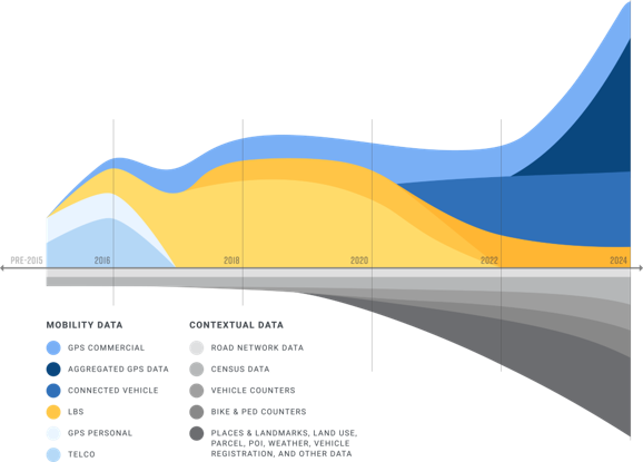
Instead of relying solely on limited data collection methods, the best transportation analytics tools draw extensive data from a wide range of sources, such as GPS systems, commercial fleets, census results, Connected Vehicle Data, and more. The larger the sample size, the more accurate and helpful the information it provides.
Additionally, the most informative Big Data in transportation details more than just vehicle traffic patterns. It covers multimodal transportation, pulling in essential numbers from public transportation, bike and pedestrian movement, ride-sharing networks, and more.
As the industry leader in traffic data analysis, StreetLight offers more than a decade of validated mobility data compiled from trillions of data points. The StreetLight InSight® platform includes exhaustively tested recent and historical insights, and it’s constantly adding new data sources as they emerge.
2. Machine-Learning Algorithms
Simply having access to a massive amount of data isn’t enough; the task of extracting and organizing, not to mention analyzing and evaluating these massive data sets, is far beyond the scope of most transportation departments. Machine learning — a fundamental component of artificial intelligence (AI) — accelerates this process and (when used properly) provides more accurate results.
With so many transportation analytics now available, only machine learning can bridge the gap between data and analysis. It enables comprehensive analysis of trips from the moment journeys begin to the moment they end, via any mode, on all roads and paths. By being continually trained with vast amounts of data, these algorithms can more accurately pinpoint the correct data and quickly analyze it.
StreetLight accomplishes this through its Route Science® machine learning algorithm, which transforms trillions of inputs into contextualized, aggregated, and normalized travel patterns. Core StreetLight metrics have been exhaustively validated against external sources, including permanent and temporary sensors, household surveys, and the Census, proving that machine learning can efficiently and effectively capture massive amounts of invaluable traffic data.
3. A Wide Variety of Metrics
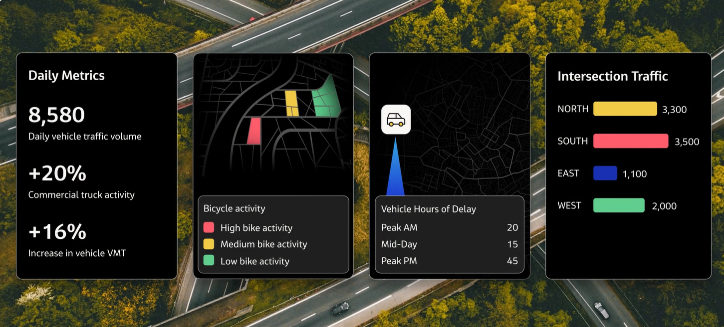
The most useful transportation planning software offers a wide range of metrics for thorough and detailed analysis. That involves much more than vehicle traffic count metrics like Annual Average Daily Traffic (AADT) and Turning Movement Counts (TMC), as vital as those metrics are for planners. Other critical data points include:
Origin-Destination (O-D) patterns, to help understand trip purpose, top routes, and source of travel demand
Vehicle Miles Traveled (VMT), to measure emissions, travel demand, and more
Vehicle Hours of Delay (VHD), to quantify the extent and impact of congestion
Vehicle Speed, to evaluate safety concerns and congestion impacts
Bike and Pedestrian Volumes, to understand where Vulnerable Road Users face the greatest safety risks and identify opportunities to encourage active transportation modes over vehicle travel
These are just a few examples of the types of metrics that drive informed decision-making. The best software solutions offer an array of validated metrics for commute planning, safety analyses, intersection studies, and more.
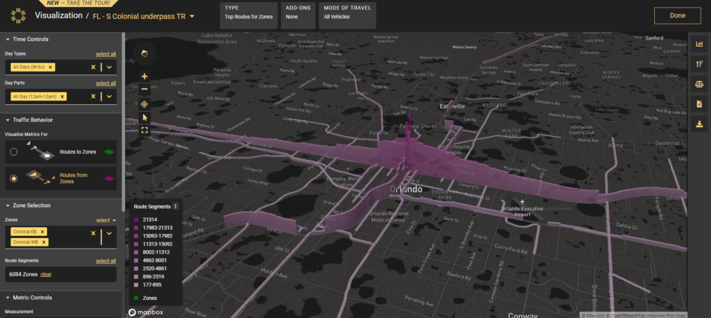
A Top Routes analysis in StreetLight InSight® highlights where drivers tend to go after they leave a particular location (in this case, an underpass along Colonial Drive in Orlando, FL).
4. Detailed Mobility Insights
The greater the breadth and scope of data at planners’ fingertips, the more insights they have access to. But perhaps even more important for deeper analysis and understanding is the level of granularity in the numbers — and the interplay between those various data points.
In other words, planners frequently need more than a regional or high-level overview of traffic patterns. They must see mobility numbers for precise time periods and specific road segments. And they must understand how metrics like VHD and TMC relate to driving patterns and decisions.
To provide this level of precision, StreetLight delivers data for any road, any mode, and any time period. Transportation activity can be broken down into 15-minute bins, and multiple metrics can be overlayed for deeper insights. This empowers more informed, impactful decisions. As planners zero in on precise times and locations where issues occur, they can better anticipate the impact of potential changes, weigh the pros and cons of project proposals, and monitor roadway conditions that are developing, even in real time, as the demo below explores.
5. Built for Transportation Studies
The primary goal of using Big Data in transportation is, of course, to support better transportation studies and enable data-driven decisions. Rather than merely producing a complicated data library, transportation software should offer purpose-built analytics catered to the types of projects planners routinely encounter, from safety studies to corridor planning. Whichever transportation analytics software you consider, the test is the same: Does their data simplify the process of studying traffic patterns and evaluating proposed changes?
For example, in the video below, a Senior Regional Planner for the Southern California Association of Governments (SCAG) explains how his team uses StreetLight’s Safety Prioritize tool to prioritize the most urgent road improvements and evaluate the impact of their projects.
6. User-Friendly Formats
Yet another trademark of the best transportation analytics software is its ability to translate and repurpose data for use in a myriad of different formats. It should be easy for users to move from a graphical overview with city-wide data summaries to a CSV with tabulated data for detailed reports.
When analytics are quickly convertible, it’s that much easier to leverage traffic data for the next important project and share information with stakeholders. Grant proposals, for instance, rely on clear, powerful data presentations to secure funding and project buy-in. Tools like StreetLight InSight® allow planners to toggle between 3D visualizations, Esri ArcGIS maps, spreadsheets, and more in order to make the most compelling case possible for their traffic solutions.
7. Privacy Protection
Privacy is a growing concern in the expanding world of Big Data. As companies collect more information, consumers and citizens are increasingly worried about just what info they have and how they’ll use it. Transportation planners and other stakeholders in this arena should be eager to show that their decisions are data-driven without being powered by privacy violations.
That makes extensive privacy protections a critical feature of any transportation analytics software you consider. The data collected and provided by these companies must be based on composite groups of people and aggregate traffic patterns — never on specific individuals. It goes without saying that transportation data analytics companies should not receive or use personally identifiable information, but instead employ multi-layered technical safeguards to prevent any exposure of personal information.
As a leader in transportation analytics, StreetLight takes its commitment to privacy very seriously. The data available in the StreetLight InSight® platform is aggregated and anonymized so that individuals can’t be identified. You can learn more about StreetLight’s data privacy principles here.
Your Hub for Big Transportation Data
Accurate, detailed, and informative data is integral to meeting today’s transportation challenges — and building a more effective, sustainable transportation infrastructure for tomorrow. Whether you’re conducting a high-level transportation network analysis for your region or digging into the metrics for one problematic corridor, you need numbers that empower intelligent, strategic planning.
Fortunately, you can find these insights and more in one easy-to-use platform. StreetLight InSight® is built on Big Data and advanced machine learning algorithms to provide the most robust, comprehensive set of mobility insights available to transportation planners today. With this set of tools, you can access the analytics you need for effective planning and decision-making.
StreetLight draws together data from a vast array of sources, including census results, GPS data, location-based services, road and vehicle sensors, and Connected Vehicle Data. More importantly, it presents information in easily digestible formats planners can use for project planning, grant writing, and in-depth analysis. With access to this much information, you can be confident in each study you conduct or project you plan.
Ready to explore for yourself? Get started with StreetLight today.
Transportation Leaders, Beware. For Urban and Rural Hotspots, AADT Shows Traffic Is Back and Rising Fast.
Transportation Leaders, Beware. For Urban and Rural Hotspots, AADT Shows Traffic Is Back and Rising Fast.
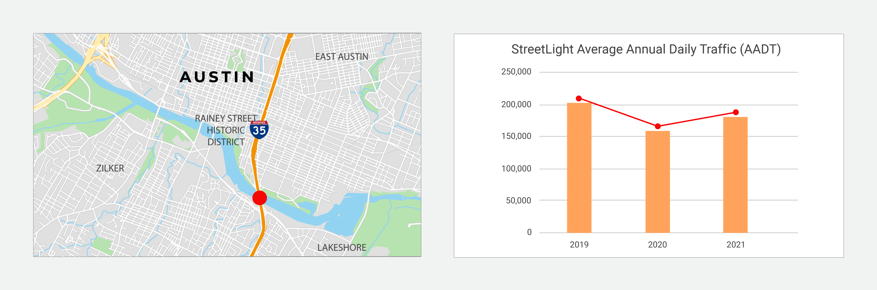
In Austin, StreetLight’s Annual Average Daily Traffic (AADT) U.S. Metrics show that traffic on a notoriously congested interstate is already nearing pre-pandemic levels. In Jackson Hole, the story on an unpaved access road is even more dramatic.
Austin’s I-35 corridor sees Annual Average Daily Traffic (AADT) leap back in 2021
The pandemic put Austin at the center of headlines profiling cities seeing a population boom as remote workers relocated.
But the impact of this population growth on traffic was subdued for some time, as the pandemic also kept many people off the roads for typical daily activities. Moreover, jurisdictions’ means of collecting data on traffic to inform planning, congestion mitigation, and federal reporting was also limited during the pandemic, making it difficult to see what was really going on with traffic.
“With 2021 behind us, StreetLight’s enhanced AADT algorithms, which help to fill in the data gaps for those that only have counters on a few roads, allow us to see the dramatic changes in average daily vehicle volumes over the past two years – and compare those volumes to prior years.”
StreetLight InSight® analysis of I-35 indicates a steep rise in traffic in 2021
StreetLight ran an analysis on I-35, a crucial corridor that runs through the center of Austin and one of the most congested highways in Texas. Results from StreetLight InSight® platform indicate a 2019 volume of approximately 200,000 average daily vehicles.
But then the pandemic hit and many people limited their movements in 2020. StreetLight’s AADT Metrics show this depressed average daily vehicle volume substantially.
Simultaneously, Austin’s population continued to boom. Median home prices in the city went up by 31% in 2020, compared to 15.7% statewide, according to Texas Realtors. Austin was the second-fastest-growing city in Texas between 2010 to 2020, according to the U.S. Census Bureau.
What does that mean for traffic?
AADT volumes took a jump of 14% in 2021, despite the pandemic still depressing some amount of travel.
The trend suggested that as life returned to relative normalcy in 2022, I-35 would see its AADT volumes near or above 2019 levels. While factors like high gas prices could keep some traffic at bay, there is no question that given the increase in population, the city is poised to see congestion rise in the future.
To mitigate these trends, planners will need to make data-driven decisions about what infrastructure can lessen traffic and support a growing population.
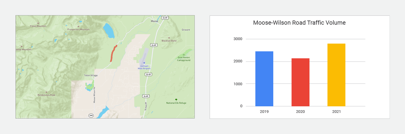
In Jackson Hole, Wyoming, dramatic AADT growth on an unpaved road shows critical services are needed
Popular cities weren’t the only places that saw population and driving behavior change during the pandemic. Rural locations all over, especially those with popular national parks, saw a major influx of short- and long-term visitors and new residents arrive over the last two years.
For these areas, where it’s difficult to supply and maintain sufficient traffic counters on roads, it can be particularly challenging to see how trends are changing in real-time. And impossible to compare against historical trends, if the data wasn’t collected previously.
StreetLight ran an analysis on an unpaved section of Moose-Wilson Road in Jackson Hole, Wyoming using our AADT metrics, which cover all roads, both low and high volume, and can be compared with historical roadway volumes to understand year-over-year trends.
AADT counts for Moose-Wilson Road from StreetLight suggest 2021 traffic volume already exceeded 2019.
The road, which provides an access point to Grand Teton National Park, saw a dip in AADT in 2020, consistent with national trends. But in 2021, AADT had already surpassed 2019 by 8%.
The analysis confirms the unpaved road is a high priority for investment to keep up with traffic, which bumped up again in the first half of 2022.
StreetLight’s 2022 U.S. AADT Metric offers comprehensive coverage, time trend comparisons, and accuracy on par with industry benchmarks
StreetLight has released the AADT metric every year for the past few years, continuously updating it yearly. The latest AADT 2022 U.S. metric is now available. Read the AADT white paper that dives into:
Comparing trends across recent and historical 2019 – 2022 AADT metrics
Evaluating StreetLight’s AADT estimates against industry accuracy targets
How the Monthly Average Daily Traffic (MADT) model utilizes 2020 U.S. Census population and OpenStreetMap (OSM) data, resulting in improved estimated traffic volumes
To access StreetLight’s Annual Average Daily Traffic (AADT) Metrics and the StreetLight InSight® platform, which includes traffic counts, origin-destination, multimodal volumes, and other transportation metrics for any time period, get started here.
1 We used the “BESTMILE” statistic in NHTS. This is the best-available estimate of each household’s mileage, based on odometer readings,
 self-reported VMT, and/or travel miles on a given day.
2 There are additional outliers which exist beyond the range of the y-axis on this graph. They are not shown due to space constraints.
Traffic Management, Solved. Pinpointing Congestion Without Wasting Time Or Resources
Traffic Management, Solved. Pinpointing Congestion Without Wasting Time Or Resources
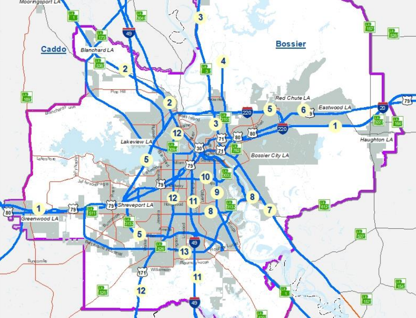
Planners in Louisiana found that only 3.8% of roadspace accounted for most congestion — allowing them to mitigate in key trouble spots.
The Shreveport, Louisiana metro in the state’s northwest corner embodies the complexity of many regional hubs. Near the Texas and Arkansas borders, it also encompasses three interstates, four parishes, as well as a major military site, Barksdale Airforce Base. Roadways must bridge two significant waterways, Cross Lake and Red River.
To plan transportation, the region relies on the NLCOG (Northwest Louisiana Council of Governments), a Metropolitan Planning Organization or MPO.
Like planning bodies everywhere, NLCOG must battle traffic congestion. It’s not just a matter of responding to citizens’ frustrations. Traffic issues cause real economic damage through unproductive time, increased fuel spending, environmental impacts, and road-safety issues.
But when planners at NLCOG set out to draw up their 2021 Congestion Management Process study or CMP, which is federally mandated, they faced a real obstacle.
To pinpoint the exact traffic management trouble spots and causes of congestion, they needed robust and comprehensive data and reliable insights across their study area.
The planners used StreetLight to access in-depth data insights across all the study area’s roadways. NLCOG utilized the StreetLight InSight® platform for traffic flow data, including traffic volume, speed, travel time and other metrics as well.
More granularity and refreshable insights
Specifically, StreetLight’s traffic Metrics helped the planners calculate a key metric: Speed Reduction Factor or SRF, which is a standard ratio for measuring congestion.
SRF numbers quickly pinpointed the specific trouble spots responsible for most traffic congestion.
‘Without StreetLight Data, calculating the Speed Reduction Factor would have been monumental … in terms of staff time and resources,” says Chris Petro, deputy director and transportation manager at NLCOG.
What did planners find?
Using SRF results, the planners discovered that 96% of the mileage in the 13 study corridors showed no congestion or only “Moderate” congestion levels. Only six out of the 158 miles examined were found to be “Severely Congested.”
The results also pinpointed that three corridors out of the 13 had over a mile of severely congested traffic, and showed the exact location of these priority segments.
For example, the Airline Dr. corridor was found to contain 1.55 miles of “Severely Congested” segments during peak-PM. Airline Dr., east of Red River in Bossier City, runs under both interstates 20 and 220 and stretches south into the neighborhood of the Airforce base.
Further analysis revealed the worst delays were not occurring on freeways or interstates, but instead at intersections and on road sections with inadequately spaced signals near interstate on-ramps.
The CMP study, adopted by NLCOG earlier this year, made new recommendations and endorsed various in-flight plans and projects. These included investments in new highway on-ramp signaling, intersection signage, and improved capacity in certain corridors.
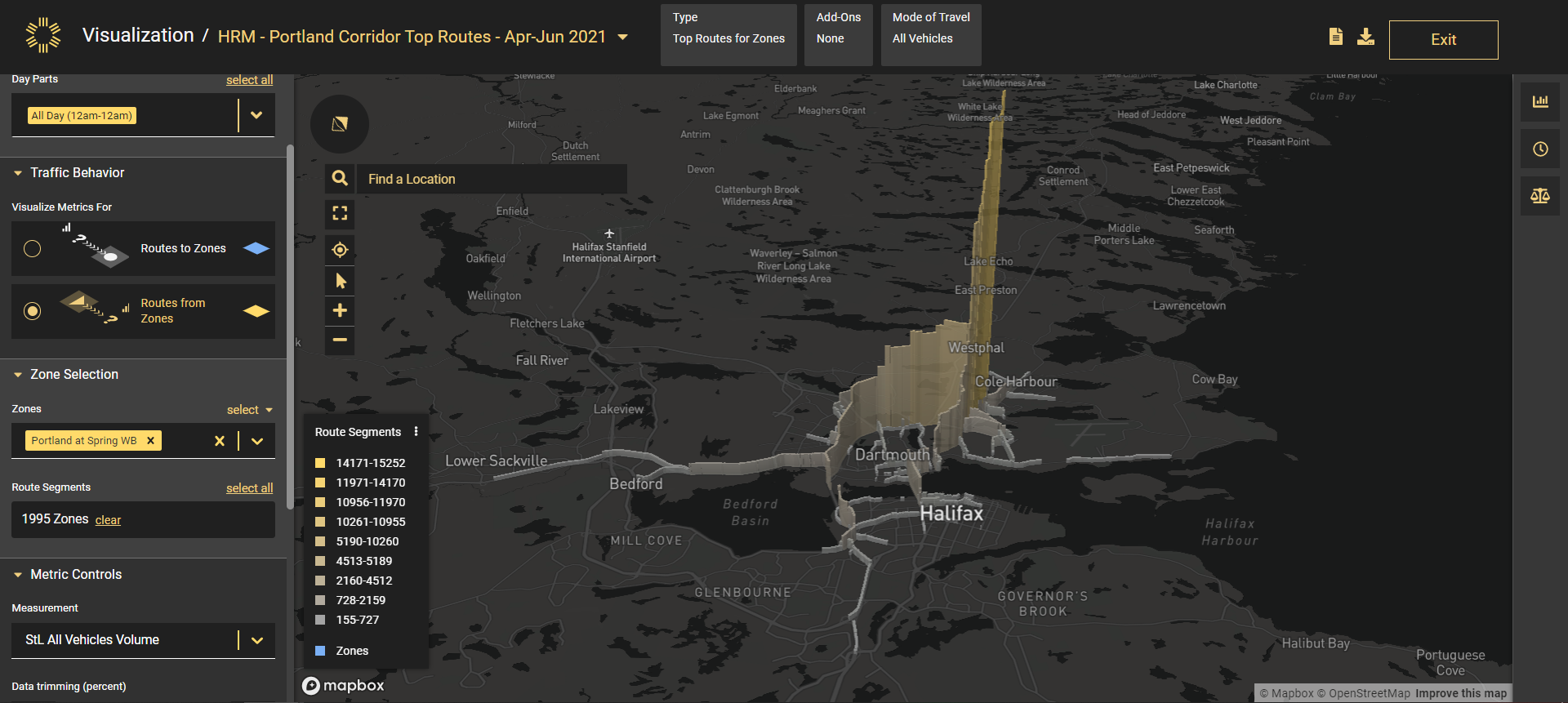
A closer look at how other regions can generate traffic insights with StreetLight’s platform
A video demonstration focused on a Portland Road in Halifax, Canada, highlights how StreetLight’s platform visualizes traffic metrics and flows.
To calculate and visualize travel speeds in the 13 study corridors, NLCOG planners relied heavily on StreetLight InSight®.
Planners and agencies all over North America are utilizing StreetLight’s Metrics to perform Corridor Studies, and more. The platform allows for analyses of specific segments through a user-friendly graphical interface and intuitive visualizations, as well as downloadable CSV files. With a few clicks, planners can zero in on one road segment and quickly visualize changes in travel speed and volume over time, and also understand how traffic moves through a larger road system.
The platform’s Segment Analysis tool examines key traffic metrics on a selected roadway. The features include a distribution chart that reveals when travel peaks within corridors, as well as a speed distribution chart that measures how traffic speeds fluctuate throughout the day.
Other tools include Origin-Destination Analysis, which examines how vehicle and bicycle travelers disperse within the road system. Manual replication of the analysis in this demonstration video would have required 90-day monitoring of multiple transportation modes at 36 locations with traditional methods.
Finally, the Top Routes Analysis examines the origin of traffic flow entering a corridor and where it disperses once passing through a corridor.
A video demonstration focused on a portion of Portland Street in Halifax, Nova Scotia shows how planners can utilize three of the platform’s analytical tools for their own needs: the Origin-Destination Analysis, the Segment Analysis, and the Top Routes Analysis.
The platform allows planners access to historical and updated Metrics across multiple transportation modes for nearly every roadway in North America in a few clicks.
“The government should look for solutions that not only mitigate the gas tax shortfall but also create an equitable fee structure that doesn’t overburden drivers in disadvantaged communities.”
StreetLight looked at public data and our own metrics for VMT by county and income band in order to analyze a road usage tax in Colorado, which is considered one alternative to gas taxes, to see how it could impact people across two demographics groupings — income and geography.
We used data from the most recent National Household Travel Survey (NHTS) and StreetLight’s own Metrics in order to determine how a shift to VMT tax may affect drivers in Colorado. We analyzed these results by income level and geography in order to investigate whether any groups would be disproportionately affected.
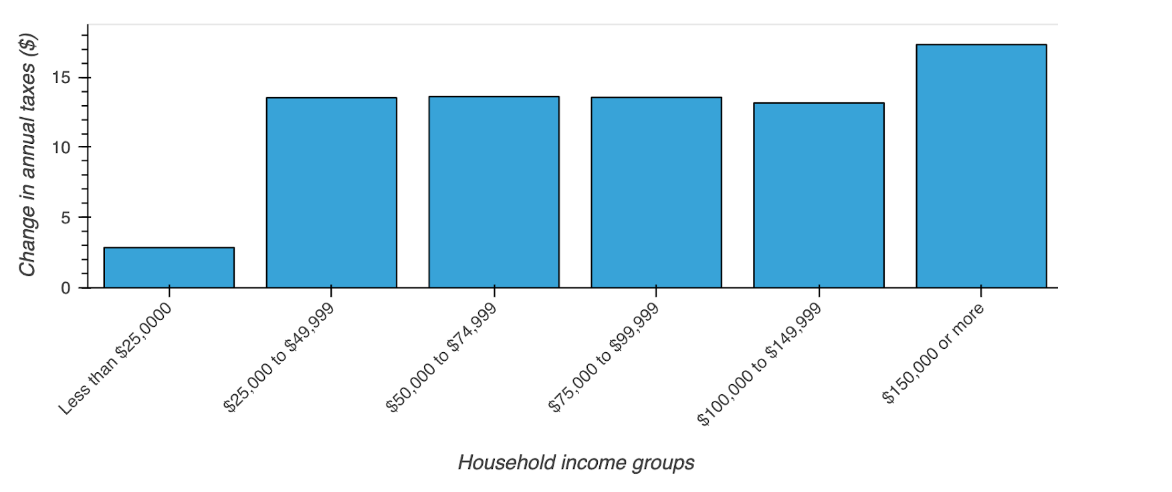
First, we calculated the amount that drivers pay under the gas tax, versus how much they would pay under a VMT tax. For costs, we used the current state gas tax for Colorado ($0.22 per gallon) and the VMT rate used in Colorado’s Road User Charge pilot program ($0.012 per mile). To turn this into household-level expenditures, we used 2017 NHTS data about individuals’ vehicle type, fuel efficiency, annual mileage1, and income. Results are shown below:
StreetLight InSight® lets you visualize your results on the flyWithin each income category, the average household would pay $3-17 more under a VMT tax than they currently do under the state gas tax. This is a relatively small increase; the state gas tax amounts to $142 on average, with half of all households paying between $127 and $208.
Lower income households would see a smaller average increase under a VMT tax, with households earning less than $25k experiencing a $2.80 average annual increase.
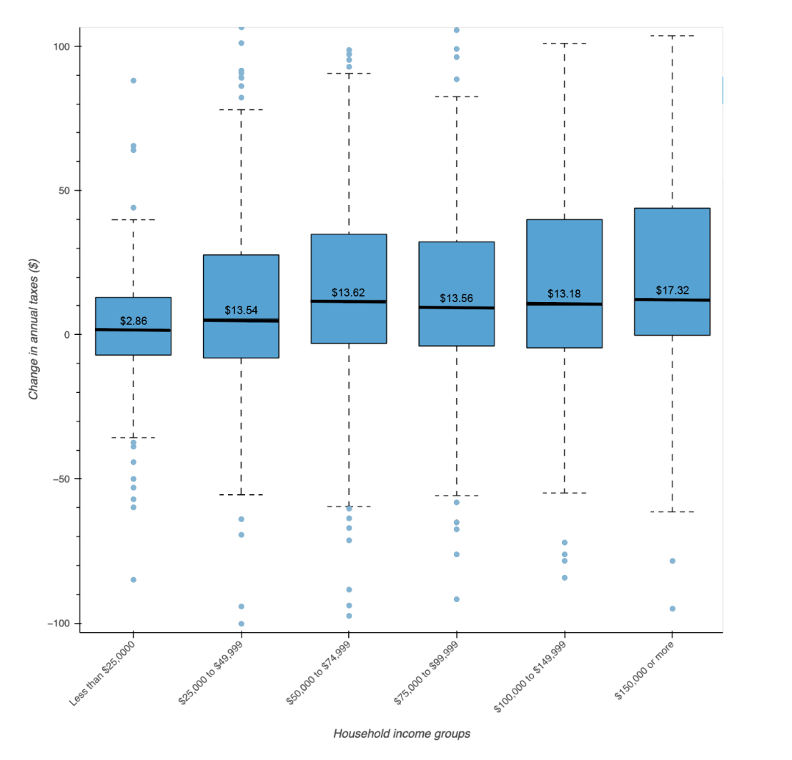
We also analyzed the variation within each income bracket, to see how households across the dataset were affected. Below is a box plot showing the change in annual costs under a VMT tax. The bold line and label shows the average change for each income bracket. The blue box is the range that contains half of the sample households. The dashed lines are where the remainder of households fall, and the blue dots are outliers2.
1 We used the “BESTMILE” statistic in NHTS. This is the best-available estimate of each household’s mileage, based on odometer readings,
 self-reported VMT, and/or travel miles on a given day.
2 There are additional outliers which exist beyond the range of the y-axis on this graph. They are not shown due to space constraints.
This figure shows that, in the lowest income band, annual expenditures for most households do not vary by more than $10 in either direction. Higher income brackets show more variation, with households paying $10 less or up to $30 more.
To understand these results, we examined fuel economy, vehicle age, and annual mileage trends for each income band. We found that households in lower income brackets tend to own older vehicles whose fuel economy is somewhat lower (~2 mpg on average) than those in other income brackets. People in these households drive lower annual distances (about 1000-1500 miles) than those in higher income bands, lowering the impact of a VMT tax.
Those in lower income brackets also showed much less variation than those in high income brackets. This suggests that people in higher income brackets may have more choice about what type of vehicle they drive, including larger trucks as well as hybrids. Those in lower brackets may have less choice, but tend to own vehicles that are not as impacted by a switch to VMT fees; some pay a little less per mile, some pay a little more, and their lower annual mileage reduces the magnitude of the impacts.
Overall, we find that the increase under a VMT tax is quite low for all income groups, and those in the lower bands do not appear disproportionately impacted. Trends in EV adoption since 2017, which show faster adoption in higher income brackets, would likely increase the difference slightly for those groups. However, EV adoption is still so low that any changes would be very small.
How a VMT tax would impact drivers, by geography
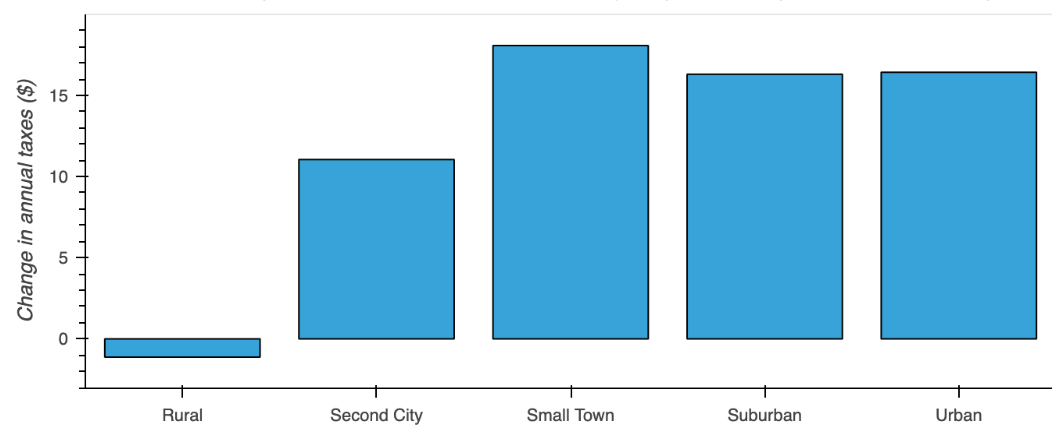
We also examined potential changes based on geography. First, we looked at home locations based on NHTS community characterizations. We found that those in rural areas would pay a few dollars less on average under a VMT tax. Those in small towns ($18/year) and more urban areas would experience larger increases, potentially due to commuting patterns. This is a somewhat unexpected finding, as it seems intuitive that rural communities drive longer distances and thus would have a higher burden. It seems a VMT tax may be offset by the gains in no longer paying a gas tax to fuel a lower efficiency vehicle.
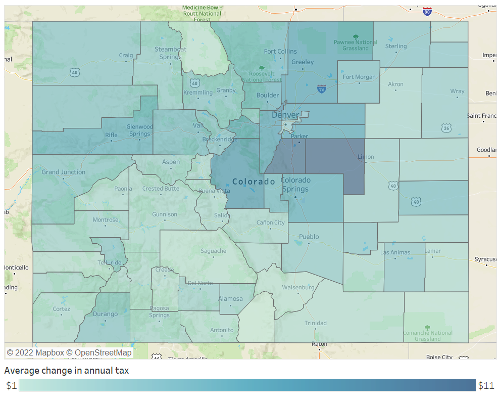
Finally, we mapped these changes to examine them visually across the state. This is where StreetLight’s data and Metrics come in. While the NHTS data provided a rich set of characteristics, the sample size isn’t large enough to extrapolate to local areas across the state. We took fuel economy distributions for each income band and applied it to Streetlight’s VMT by income band and county to estimate the overall impacts for each county in Colorado. Results are shown below.JTNDZGl2JTIwY2xhc3MlM0QlMjd0YWJsZWF1UGxhY2Vob2xkZXIlMjclMjBpZCUzRCUyN3ZpejE2NTIxMzMyMTUyNzMlMjclMjBzdHlsZSUzRCUyN3Bvc2l0aW9uJTNBJTIwcmVsYXRpdmUlMjclM0UlM0Nub3NjcmlwdCUzRSUzQ2ElMjBocmVmJTNEJTI3JTIzJTI3JTNFJTNDaW1nJTIwYWx0JTNEJTI3RGFzaGJvYXJkJTIwMSUyMCUyNyUyMHNyYyUzRCUyN2h0dHBzJTNBJTI2JTIzNDclM0IlMjYlMjM0NyUzQnB1YmxpYy50YWJsZWF1LmNvbSUyNiUyMzQ3JTNCc3RhdGljJTI2JTIzNDclM0JpbWFnZXMlMjYlMjM0NyUzQkRKJTI2JTIzNDclM0JESldaMzdGQ0slMjYlMjM0NyUzQjFfcnNzLnBuZyUyNyUyMHN0eWxlJTNEJTI3Ym9yZGVyJTNBJTIwbm9uZSUyNyUyMCUyRiUzRSUzQyUyRmElM0UlM0MlMkZub3NjcmlwdCUzRSUzQ29iamVjdCUyMGNsYXNzJTNEJTI3dGFibGVhdVZpeiUyNyUyMHN0eWxlJTNEJTI3ZGlzcGxheSUzQW5vbmUlM0IlMjclM0UlM0NwYXJhbSUyMG5hbWUlM0QlMjdob3N0X3VybCUyNyUyMHZhbHVlJTNEJTI3aHR0cHMlMjUzQSUyNTJGJTI1MkZwdWJsaWMudGFibGVhdS5jb20lMjUyRiUyNyUyMCUyRiUzRSUyMCUzQ3BhcmFtJTIwbmFtZSUzRCUyN2VtYmVkX2NvZGVfdmVyc2lvbiUyNyUyMHZhbHVlJTNEJTI3MyUyNyUyMCUyRiUzRSUyMCUzQ3BhcmFtJTIwbmFtZSUzRCUyN3BhdGglMjclMjB2YWx1ZSUzRCUyN3NoYXJlZCUyNiUyMzQ3JTNCREpXWjM3RkNLJTI3JTIwJTJGJTNFJTIwJTNDcGFyYW0lMjBuYW1lJTNEJTI3dG9vbGJhciUyNyUyMHZhbHVlJTNEJTI3eWVzJTI3JTIwJTJGJTNFJTNDcGFyYW0lMjBuYW1lJTNEJTI3c3RhdGljX2ltYWdlJTI3JTIwdmFsdWUlM0QlMjdodHRwcyUzQSUyNiUyMzQ3JTNCJTI2JTIzNDclM0JwdWJsaWMudGFibGVhdS5jb20lMjYlMjM0NyUzQnN0YXRpYyUyNiUyMzQ3JTNCaW1hZ2VzJTI2JTIzNDclM0JESiUyNiUyMzQ3JTNCREpXWjM3RkNLJTI2JTIzNDclM0IxLnBuZyUyNyUyMCUyRiUzRSUyMCUzQ3BhcmFtJTIwbmFtZSUzRCUyN2FuaW1hdGVfdHJhbnNpdGlvbiUyNyUyMHZhbHVlJTNEJTI3eWVzJTI3JTIwJTJGJTNFJTNDcGFyYW0lMjBuYW1lJTNEJTI3ZGlzcGxheV9zdGF0aWNfaW1hZ2UlMjclMjB2YWx1ZSUzRCUyN3llcyUyNyUyMCUyRiUzRSUzQ3BhcmFtJTIwbmFtZSUzRCUyN2Rpc3BsYXlfc3Bpbm5lciUyNyUyMHZhbHVlJTNEJTI3eWVzJTI3JTIwJTJGJTNFJTNDcGFyYW0lMjBuYW1lJTNEJTI3ZGlzcGxheV9vdmVybGF5JTI3JTIwdmFsdWUlM0QlMjd5ZXMlMjclMjAlMkYlM0UlM0NwYXJhbSUyMG5hbWUlM0QlMjdkaXNwbGF5X2NvdW50JTI3JTIwdmFsdWUlM0QlMjd5ZXMlMjclMjAlMkYlM0UlM0NwYXJhbSUyMG5hbWUlM0QlMjdsYW5ndWFnZSUyNyUyMHZhbHVlJTNEJTI3ZW4tVVMlMjclMjAlMkYlM0UlM0NwYXJhbSUyMG5hbWUlM0QlMjdmaWx0ZXIlMjclMjB2YWx1ZSUzRCUyN3B1Ymxpc2glM0R5ZXMlMjclMjAlMkYlM0UlM0MlMkZvYmplY3QlM0UlM0MlMkZkaXYlM0UlMjAlM0NzY3JpcHQlMjB0eXBlJTNEJTI3dGV4dCUyRmphdmFzY3JpcHQlMjclM0UlMjB2YXIlMjBkaXZFbGVtZW50JTIwJTNEJTIwZG9jdW1lbnQuZ2V0RWxlbWVudEJ5SWQlMjglMjd2aXoxNjUyMTMzMjE1MjczJTI3JTI5JTNCJTIwdmFyJTIwdml6RWxlbWVudCUyMCUzRCUyMGRpdkVsZW1lbnQuZ2V0RWxlbWVudHNCeVRhZ05hbWUlMjglMjdvYmplY3QlMjclMjklNUIwJTVEJTNCJTIwaWYlMjAlMjglMjBkaXZFbGVtZW50Lm9mZnNldFdpZHRoJTIwJTNFJTIwODAwJTIwJTI5JTIwJTdCJUUyJTgwJThCJTIwdml6RWxlbWVudC5zdHlsZS53aWR0aCUzRCUyNzEwMDBweCUyNyUzQnZpekVsZW1lbnQuc3R5bGUuaGVpZ2h0JTNEJTI3ODI3cHglMjclM0IlN0QlMjBlbHNlJTIwaWYlMjAlMjglMjBkaXZFbGVtZW50Lm9mZnNldFdpZHRoJTIwJTNFJTIwNTAwJTIwJTI5JTIwJTdCJUUyJTgwJThCJTIwdml6RWxlbWVudC5zdHlsZS53aWR0aCUzRCUyNzEwMDBweCUyNyUzQnZpekVsZW1lbnQuc3R5bGUuaGVpZ2h0JTNEJTI3ODI3cHglMjclM0IlN0QlMjBlbHNlJTIwJTdCJUUyJTgwJThCJTIwdml6RWxlbWVudC5zdHlsZS53aWR0aCUzRCUyNzEwMCUyNSUyNyUzQnZpekVsZW1lbnQuc3R5bGUuaGVpZ2h0JTNEJTI3NzI3cHglMjclM0IlN0QlMjB2YXIlMjBzY3JpcHRFbGVtZW50JTIwJTNEJTIwZG9jdW1lbnQuY3JlYXRlRWxlbWVudCUyOCUyN3NjcmlwdCUyNyUyOSUzQiUyMHNjcmlwdEVsZW1lbnQuc3JjJTIwJTNEJTIwJTI3aHR0cHMlM0ElMkYlMkZwdWJsaWMudGFibGVhdS5jb20lMkZqYXZhc2NyaXB0cyUyRmFwaSUyRnZpel92MS5qcyUyNyUzQiUyMHZpekVsZW1lbnQucGFyZW50Tm9kZS5pbnNlcnRCZWZvcmUlMjhzY3JpcHRFbGVtZW50JTJDJTIwdml6RWxlbWVudCUyOSUzQiUyMCUzQyUyRnNjcmlwdCUzRQ==
Again, we see slight increases in annual taxes across all areas, ranging from $1 to $11. The most urban (Denver) and most rural counties are some of the least affected, with average drivers paying only $1-4 more under a VMT tax. The more affected areas are between Denver and Colorado Springs, in counties with relatively high average annual mileage. These may be areas with higher numbers of long-distance commuters who own relatively fuel-efficient vehicles.
Grant applicants have used StreetLight for everything from highlighting commuting metrics to show a project’s economic value to using bike and pedestrian metrics to give the full mobility picture to origin-destination analysis to show regional benefit.
In Ohio, for example, the state DOT embarked on a project to revamp Interstates 70 and 71, which would improve corridors of the National Primary Highway Freight System and help reconnect communities adversely affected by redlining and the construction of those interstates.
To fund Phase 4 of the development, Ohio DOT applied for a federal Infrastructure for Rebuilding America (INFRA) grant and used StreetLight to make their case.
Using the platform, planners separated out passenger vehicles from commercial truck volume, proving the significant percentage of traffic on the corridor from freight movement. They used StreetLight’s visualization tools to show truck congestion in the existing corridor and make the case for how a new truck route would ease the national supply chain.
Findings
Overall, we found that a VMT tax in Colorado would cause a slight increase in annual expenditures for all income brackets, but that those in the lowest income bracket saw a smaller increase with less variation across households. Those in higher income brackets tend to own a wider range of vehicle types that are more efficient on average, and they drove longer distances. This leads to a higher average increase per year, with some households more affected than others due to vehicle choice and driving patterns.
Geographically, we found that those in rural areas would save a few dollars per year, and that those in more urban areas would pay about $15-18 more. When we extrapolated out findings to all counties in the state, we did not see strong trends or differences across counties. Again, every area saw a slight increase, with the biggest increase ($11) occurring in counties likely to contain long-distance commuters.
Our findings suggest that very low-income populations and rural counties would not be disproportionately impacted by a shift from gas taxes to mileage-based user fees.
Traffic ReLAXed: The Effects of COVID-19 on Car Travel at Los Angeles International Airport
Traffic ReLAXed: The Effects of COVID-19 on Car Travel at Los Angeles International Airport
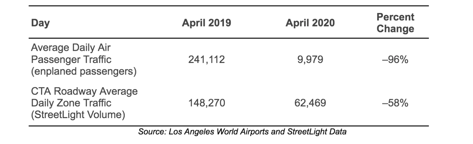
When the COVID-19 pandemic upended the world’s travel activity in 2020, no transportation systems felt the effects more acutely than airports and airlines. Los Angeles International Airport (LAX), which ranked as the busiest origin-destination airport in the world prior to the pandemic, saw a staggering 96% drop in passengers in April 2020 as compared with the year prior.
The drop in traffic (both airplane and vehicle) came amid the airport’s efforts to modernize its landside-access offerings for the first time in decades. Pre-pandemic congestion in the central horseshoe roadway—a two-level structure that connects the airport’s eight terminal buildings in an oval around the Central Terminal Area (CTA) known officially as World Way—was legendary, but COVID-related shutdowns and passenger decreases caused that congestion to evaporate. What remained told a different story: that of baseline operations needed to keep the airport operational.
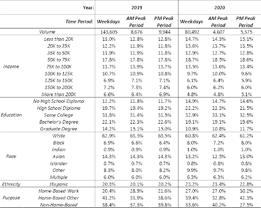
As part of the Travel Survey Design and Data Collection Methods course taught by Professor Giovanni Circella at UC Davis, visiting students Samuel Speroni and Fariba Siddiq of UCLA used StreetLight Data to examine the vehicular traffic that accessed LAX before the COVID-19 pandemic (April 2019) and during the pandemic-related stay-at-home orders (April 2020).During each time period, the team conducted a Zone Activity analysis within a pass-through zone polygon to capture all entering and re-entering vehicle volumes on both decks of the World Way roadway. They used this data to analyze the differences in overall composition of trip attributes and traveler characteristics between 2019 and 2020, and the changes in how these varied based on day of the week in both time periods.
Goodbye to LAX’s Notorious Vehicle Gridlock
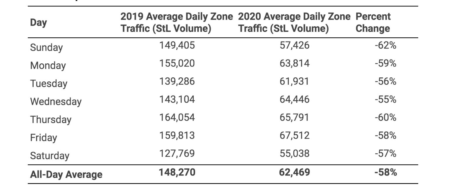
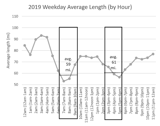
Using StreetLight’s Zone Activity analysis, the team found overall vehicle traffic entering the LAX Central Terminal Area dropped by 58% between April 2019 and April 2020. On all days of the week, the vehicle volumes entering the CTA decreased dramatically (as shown in Exhibit 1), while variation across the days of the week was minimal.
Exhibit 1: Average Vehicle Traffic at LAX Central Terminal Area by Day of Week, April 2019 versus April 2020
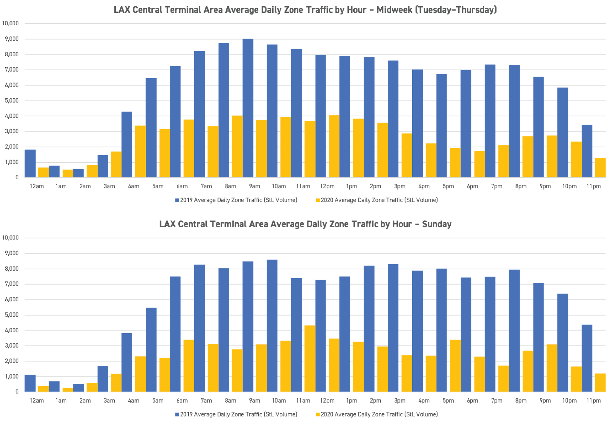
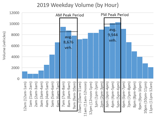
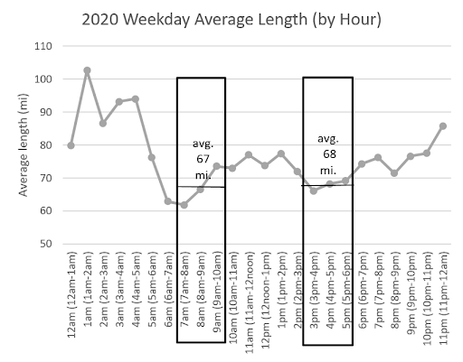
The variability in traffic volumes across the hours also leveled off. While April 2019 volumes typically peaked at 9 AM with around 9,000 vehicles, there were no discernible peaks in April 2020. (Exhibit 2 shows how these hourly volumes are distributed throughout the day.)Exhibit 2: Hourly Distribution of CTA Average Daily Vehicle Volumes via StreetLight, April 2020
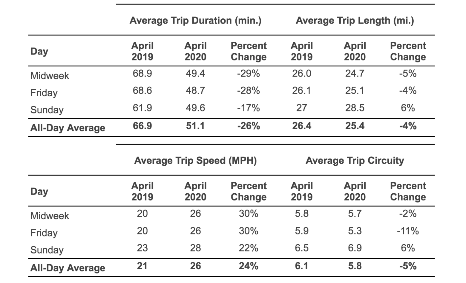
Trip characteristics generally fall in line with prevailing logic in comparing the pre-pandemic and early-pandemic periods: trip durations dropped dramatically, trip distances trended slightly down, trip speeds went up substantially, and trip circuity generally went down.Most of the results, including increased peak-hour speeds and shorter travel times, were as expected, though StreetLight helped uncover the surprising conclusion that average trip length actually increased during COVID-19, despite drops in traffic congestion.
Analysis 2: Destination Zone
For the second part of this study, researchers analyzed traffic conditions on the UC Davis campus during high traffic periods (fall 2019) and lower traffic periods (summer 2019) to understand how traffic demands change during the academic year. Notably, a large portion of campus visitors travel by bike, so researchers compared bicycle traffic to car traffic.
The analysis found mostly predictable results — for example, the largest average daily volume (ADV) for bikes and cars occurred on weekdays midday–and the overall ADV of bikes and cars was higher in the fall than the summer due to a larger share of workers and students on campus. The average trip lengths (ATL) of bike trips in the summer and in the fall were found to be nearly the same, while the ATL of car trips was higher in the summer than the fall, and generally higher for visitors than residents and workers.
However, these characteristics trend differently when they compare weekday data with Sunday data, as detailed in Exhibit 3. While trip duration dropped by nearly 30% on most days of the week, it dropped by an average of only 17% on Sundays. Trip speed dovetails with trip duration: weekday speeds jumped up by about 30%, while Sunday speeds saw only a 22% jump. Trip length and trip circuity tended to change rather analogously, for the most part, though circuity saw a much more pronounced reduction on Fridays. The UC Davis team hypothesizes that this is the result of intense pre-pandemic traffic congestion on Fridays from both worker commutes and weekend social activities, leading to more (although still relatively few) drivers diverting onto local streets.Exhibit 3: Comparison of Trip Characteristics, 2019 to 2020
“Since obtaining accurate traffic counts was no longer feasible during COVID-19, StreetLight became the perfect tool to retroactively find traffic turning volumes.”
Nada Naffakh, Hanson Professional Services
Identifying the COVID-era Traveler
While these changes in CTA roadway volumes between April 2019 and April 2020 were undoubtedly dramatic, they notably paled in comparison to the changes in air passenger traffic volume at LAX over that same time period. LAX experienced a 96% decrease across all passenger types in April 2020 compared with April 2019, as less than 10,000 passengers per day boarded airplanes at LAX in April 2020.
By comparing this figure with the daily averages for the StreetLight analyses over these same time periods, they discovered that the roadway saw approximately six times the amount of vehicles in April 2020 as the airport had passengers (Exhibit 4).Exhibit 4: Comparison of Average Daily Air Traffic and Roadway Traffic at LAX, 2019 to 2020
There are three potential explanations that could contribute to this striking difference. First, it is possible that many of these vehicles entering the CTA are driven by employees. Second, fixed-route vehicles including hotel or rental car shuttles continued to operate amid the pandemic, thus StreetLight counted those vehicles despite the possible absence of any passengers. Third, the reduced traffic volumes allow for more free-flowing traffic, which would no longer impede drivers from circling the CTA while waiting for passengers to exit the airport for pick up, resulting in repeated counts by our gateway polygon as they circled.
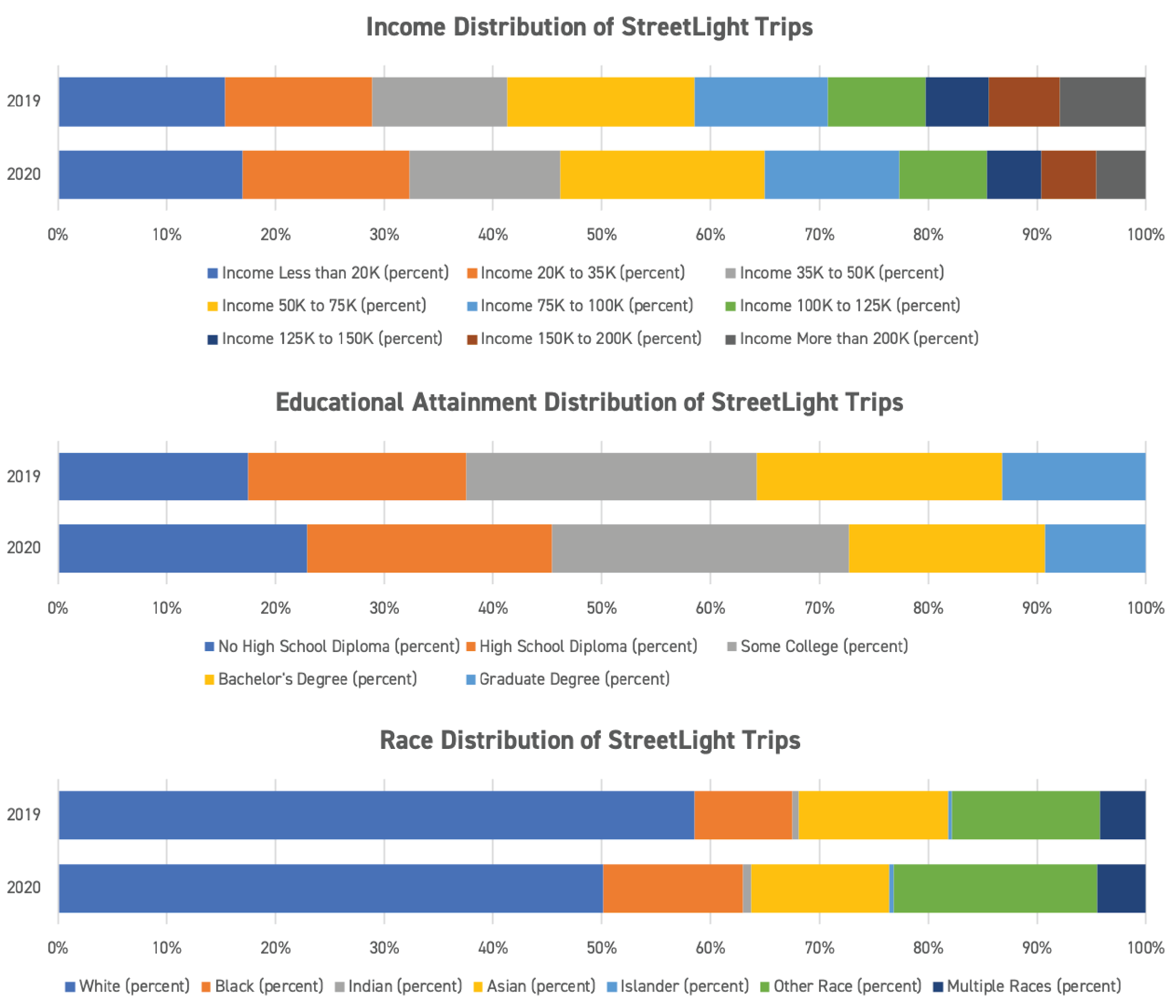
StreetLight Data also helped to uncover interesting insights on traveler demographics. Through their analysis, the UC Davis team found the CTA drew fewer wealthy people, fewer white people, and fewer highly-educated people in April 2020 as compared with a year prior. While none of these variables showed dramatic or striking differences year-over-year, all showed a clear skew. This finding generally aligns with other analyses regarding access to remote work opportunities. Those who work from home tend to be wealthier, whiter, and more educated — the very people traveling relatively less into the LAX CTA (see Exhibit 5).Exhibit 5: Traveler Socio-demographic Traits by Percentage of Total Trips, April 2019 and April 2020
Lessons from LAX
Through the help of StreetLight Data, our team gained a better understanding of not only the analysis’ central research question—how have CTA traffic volumes and characteristics changed from April 2019 to April 2020—but also the trends that may have impacted broader airport and airline travel, such as behavioral disparities based on demographics.
It’s impossible to predict exactly what events may upend travel behaviors, but through data collection and thoughtful analysis, we can work toward shifting travel behaviors and preparing the solutions that can curb traffic challenges before they arise.
StreetLight is proud to offer numerous resources that support academic research in the areas of transportation planning, COVID impacts, climate change, health, and more. By introducing future transportation experts to the many applications of big data, we can strengthen the foundation of our work as a sector and continue driving meaningful change on our streets. Get in touch with us if you would like access to StreetLight for your classroom.
“Being an engineer I have always used Streetlight for turning movement counts. Your new feature makes it much easier! Streetlight saves painstaking data collection in the field.”
David Pulay, PE, Akron Metropolitan Area Transportation Study
Our TMC Metrics have been tested and validated, returning a very strong R2 correlation of .95 with physical sensors. Watch our short demo video to learn how StreetLight’s TMC Metric can support your transportation work.
What Transportation Studies Look Like at UC Davis
What Transportation Studies Look Like at UC Davis
Beyond offering critical transportation analytics to planners and traffic engineers, StreetLight Data plays a key role in empowering the next generation of transportation leaders and researchers within academic settings, including at the University of California, Davis.
As part of the Travel Survey Design and Data Collection Methods course taught by Prof. Giovanni Circella at UC Davis, two particular transportation trends were measured by Daniel Rivera and Sarah Dennis utilizing the StreetLight InSight® platform: 1) the effects of COVID-19 on commuter traffic over the nearby I-80 Causeway, and 2) the changes to on-campus traffic behaviors in the summer academic quarter vs. the fall quarter.
With the help of StreetLight, these researchers were able to analyze sociodemographic characteristics of travelers, changes in trip speed and duration data, and changes in traffic volume by mode to gain a comprehensive understanding of the traffic patterns in and around campus. Here, we republish their findings.
Analysis 1: Pass-Through Zone
The I-80 Causeway has long served as a critical stretch of California’s highway infrastructure, linking the cities of West Sacramento and Davis over the Yolo Basin wetlands. Due to the natural (and often flooded) habitat that exists beneath the Causeway, the 3.2-mile stretch is the only direct connector of these cities, lacking any freeway ramps or exits to alternative highways.
Table 1: Sociodemographic characteristics of I-80 Causeway travelers in 2019 and 2020.
Daily commuters, including those traveling to and from the UC Davis campus, largely make up the weekday traffic that exists along the I-80 Causeway. When stay-at-home orders were enacted amid the COVID-19 pandemic, prompting a widespread transition from commuting to work-from-home policies, researchers were interested in measuring exactly how much traffic volumes shifted, which drivers were most impacted, and the characteristics of trips taken both before and during the pandemic.Figure 1 Caption: Weekday traffic volume for 2019 (a) and 2020 (b).
Using StreetLight’s Zone Activity analysis, researchers compared trips from a pre-COVID quarter (spring 2019) to those during a quarter amid the COVID pandemic (spring 2020). From this analysis, data found around the volume, speed, trip duration, and length of trips all suggest that the spring 2019 quarter saw notably more congestion than spring 2020. Researchers also found that 2020 saw a greater proportion of travelers with lower incomes, less education, and from minority races and ethnicities. Finally, the proportion of travelers in this segment on a home-based work trip was higher in 2020 than in 2019.Figure 2 Caption:. Weekday traffic speed for 2019 (a) and 2020 (b).
Most of the results, including increased peak-hour speeds and shorter travel times, were as expected, though StreetLight helped uncover the surprising conclusion that average trip length actually increased during COVID-19, despite drops in traffic congestion.
Analysis 2: Destination Zone
For the second part of this study, researchers analyzed traffic conditions on the UC Davis campus during high traffic periods (fall 2019) and lower traffic periods (summer 2019) to understand how traffic demands change during the academic year. Notably, a large portion of campus visitors travel by bike, so researchers compared bicycle traffic to car traffic.
The analysis found mostly predictable results — for example, the largest average daily volume (ADV) for bikes and cars occurred on weekdays midday–and the overall ADV of bikes and cars was higher in the fall than the summer due to a larger share of workers and students on campus. The average trip lengths (ATL) of bike trips in the summer and in the fall were found to be nearly the same, while the ATL of car trips was higher in the summer than the fall, and generally higher for visitors than residents and workers.Figure 3 Caption: Weekday average trip duration for 2019 (a) and 2020 (b) and trip length for 2019 (c) and 2020 (d).
“Since obtaining accurate traffic counts was no longer feasible during COVID-19, StreetLight became the perfect tool to retroactively find traffic turning volumes.”
Nada Naffakh, Hanson Professional Services
Interestingly, StreetLight Metrics also helped to uncover that the larger share of trips to the UC Davis campus originate in Davis, despite the high costs of living in the area relative to surrounding towns and cities. The rest of the trips come from the cities of Sacramento, Winters, Dixon, and Woodland.
Conclusion
The findings collected in this UC Davis transportation survey course offered both a snapshot of important campus traffic trends and a valuable training in the use of Big Data within academic research. Oftentimes, college campuses can be leveraged as small-scale “testbeds” for research that can later be applied to larger cities and regions, making them a prime environment to explore tools like the StreetLight InSight® platform.
StreetLight is proud to offer numerous resources that support academic research in the areas of transportation planning, COVID impacts, climate change, health, and more. By introducing future transportation experts to the many applications of big data, we can strengthen the foundation of our work as a sector and continue driving meaningful change on our streets.
“Being an engineer I have always used Streetlight for turning movement counts. Your new feature makes it much easier! Streetlight saves painstaking data collection in the field.”
David Pulay, PE, Akron Metropolitan Area Transportation Study
Our TMC Metrics have been tested and validated, returning a very strong R2 correlation of .95 with physical sensors. Watch our short demo video to learn how StreetLight’s TMC Metric can support your transportation work.
Top 10 Ways Experts Are Measuring COVID-19’s Impact
Top 10 Ways Experts Are Measuring COVID-19’s Impact
COVID 19 RESPONSE PART 1
COVID 19 RESPONSE PART 1
COVID 19 RESPONSE PART 1
In this unprecedented moment in history, it feels like everyone wants to understand mobility — and, more importantly, the lack of it. We all want to know where people are traveling, where they aren’t, and how that moves the COVID-19 pandemic across the country.
Those of us in the transportation industry are mining the data to study how the past, present, and future are affected by the pandemic and our responses to it. In this two-part blog series, we’ll explore what StreetLight’s customers and other industry experts are studying about mobility today, what they’re benchmarking, and how they’re using the data to prepare for the gradual transition out of the near-nationwide lockdown.
There Is No “Normal”
Travel patterns are hardly “normal” right now. When data is being used for everything from traffic impacts about a new shopping development to 20-year long-range plans, you don’t want abnormal travel patterns underpinning that work.
And for measuring COVID-19 impacts, surveys take a long time to execute, and people don’t respond well especially during times of stress. And sensors? They are only where they are, which is usually across only a handful of high-volume roads.
Instead, detailed metrics based on LBS and GPS data show how and where people are actually moving at all locations across the country.
What to Study Now
Our customers are using data to continue work that they would normally do using traditional methods like fielding surveys or laying sensors over roadways to make sure they’re not using baseline travel patterns during a time that is very much “not normal”. Others are mining data for clues to the pandemic’s impact.
Here are ten examples of what customers are studying in StreetLight InSight®.
Vehicle Miles Traveled (VMT) to analyze car activity in your state or individual county. Did Americans “stay home” for Easter is a question many of us are asking right now.
Intersection turning movement counts to analyze peak hour intersection travel while traditional traffic counts are on hold during shelter-in-place orders.
Travel speeds to study speeding changes during a time of less road traffic.
Travel combined with Census data to analyze who is travelling and who is not.
Rural compared to urban traffic volume, to analyze travel in areas where local stores are shut down and trips to big box stores or metro areas further away might be necessary.
Origin-Destination data modelling community movements, useful for immediate public health needs to determine where risks of increased cases are arising, and to feed epidemiological forecasting models.
Home and Work Locations analysis for hospitals to understand where patients are coming from for treatment.
Home and Work Locations analysis to study whether or not residents are fleeing urban locations for more rural retreats, especially to other states.
Zone Analytics analyses to identify trip starts and stops for creating effective emergency pickup locations for pharmacies, restaurants, grocery stores, and other essential services.
VMT data to calibrate the degree of social distancing in epidemiological models, to inform ventilator redeployment models and to optimize timing for lifting restriction measures on schools, transit, and businesses.
Preparing for “Back to Normal”
In our next post we’ll share what important benchmarks planners are capturing, and what they’re analyzing to plan for post-pandemic. We know that travel will never be the same, and we’ve got some powerful ideas for how to prepare.
Subscribe to our blog to receive the second installment, and stay up to date on transportation news and ideas.
In this unprecedented moment in history, it feels like everyone wants to understand mobility — and, more importantly, the lack of it. We all want to know where people are traveling, where they aren’t, and how that moves the COVID-19 pandemic across the country.
Those of us in the transportation industry are mining the data to study how the past, present, and future are affected by the pandemic and our responses to it. In this two-part blog series, we’ll explore what StreetLight’s customers and other industry experts are studying about mobility today, what they’re benchmarking, and how they’re using the data to prepare for the gradual transition out of the near-nationwide lockdown.
There Is No “Normal”
Travel patterns are hardly “normal” right now. When data is being used for everything from traffic impacts about a new shopping development to 20-year long-range plans, you don’t want abnormal travel patterns underpinning that work.
And for measuring COVID-19 impacts, surveys take a long time to execute, and people don’t respond well especially during times of stress. And sensors? They are only where they are, which is usually across only a handful of high-volume roads.
Instead, accurate metrics based on LBS and GPS data show how and where people are actually moving at all locations across the country.
What to Study Now
Our customers are using data to continue work that they would normally do using traditional methods like fielding surveys or laying sensors over roadways to make sure they’re not using baseline travel patterns during a time that is very much “not normal”. Others are mining data for clues to the pandemic’s impact.
Here are ten examples of what customers are studying in StreetLight InSight®.
Vehicle Miles Traveled (VMT) to analyze car activity in your state or individual county. Did Americans “stay home” for Easter is a question many of us are asking right now.
Intersection turning movement counts to analyze peak hour intersection travel while traditional traffic counts are on hold during shelter-in-place orders.
Travel speeds to study speeding changes during a time of less road traffic.
Travel combined with Census data to analyze who is travelling and who is not.
Rural compared to urban traffic volume, to analyze travel in areas where local stores are shut down and trips to big box stores or metro areas further away might be necessary.
Origin-Destination data modelling community movements, useful for immediate public health needs to determine where risks of increased cases are arising, and to feed epidemiological forecasting models.
Home and Work Locations analysis for hospitals to understand where patients are coming from for treatment.
Home and Work Locations analysis to study whether or not residents are fleeing urban locations for more rural retreats, especially to other states.
Zone Analytics analyses to identify trip starts and stops for creating effective emergency pickup locations for pharmacies, restaurants, grocery stores, and other essential services.
VMT data to calibrate the degree of social distancing in epidemiological models, to inform ventilator redeployment models and to optimize timing for lifting restriction measures on schools, transit, and businesses.
Preparing for “Back to Normal”
In our next post we’ll share what important benchmarks planners are capturing, and what they’re analyzing to plan for post-pandemic. We know that travel will never be the same, and we’ve got some powerful ideas for how to prepare.
Subscribe to our blog to receive the second installment, and stay up to date on transportation news and ideas.
On the first weekend in October I flew across the country to Salem, Massachusetts — America’s hub for all things Halloween. Salem is the home of America’s witch trials in the 17th century, and rather than cloud themselves with this unfortunate history, the city dedicates much of their downtown to honoring the folks who suffered persecution.
Due to the nature of my job in the transportation industry, I couldn’t help but notice and wonder about the congestion I saw in downtown Salem. Was this transportation problem normal? Who was causing it, and how? Could it be mitigated? When I got home, I immediately hopped on StreetLight InSight® to run some analyses.
Studying Scary Congestion Issues
First, I wanted to know if Salem’s transportation problem was seasonal. Downtown Salem is a tourist destination all year round, but on my trip I learned that over 500,000 folks visit the town every October, so I assumed this traffic was not normal.
Then, I wanted to learn more details about how much worse October congestion was, and who was causing it. For this, I ran two analyses in StreetLight InSight: a Zone Activity analysis with Home and Work Locations and also a Segment analysis. With these two analyses, I was able to understand where visitors to downtown Salem were coming from, and also quantify several details about the increase in October.
Ghostly Visitor Details Come Into View
Using the Home and Work Locations analysis, I learned that travelers from all over the country visit Salem on an average weekend day in October (including myself, from San Francisco). This shows that Salem is not just a regional weekend activity, but rather a national attraction!
Heat map of home locations for visitors to Salem in October.
Zooming into Massachusetts, specifically, the analysis pinpoints that the highest percentage of trips come from areas around Salem, indicating that most visitors are probably driving in for the weekend. This regional transportation causes a lot more congestion and parking issues rather than people flying in and staying within walking distance to downtown.
A closer look at the heatmap for regional visitorship to Salem. More visitors travel from red and yellow blocks than green.
Trip attributes showed that most of Salem’s regional transportation is coming from 2-20 miles away, indicating that folks weren’t traveling too far. But the duration of the trips was anywhere from 20-60 minutes. The time/distance ratio indicates that there are some local trips taking a long time, more likely resulting from congestion than distance traveled.
Trip details show high circuity and low speeds for Salem’s short trips downtown.
Traffic Speeds Die a Slow Death
While on my trip, I saw cars waiting in traffic to get as close to downtown as possible or struggling to find parking. I used our Segment analysis to look into average segment speeds for this downtown congestion in March versus October.
Heat map shows slower speed travel downtown in red.
I created a zone set for the downtown roads and the main road into Salem. The average speed in March 2018 seemed pretty normal in the peak a.m., at about 22.6 mph on selected downtown roads. Without a lot of congestion, this makes sense for normal Salem transportation — the roads are narrow and there is a lot of pedestrian traffic.
A closer look at specific speeds on individual streets for an average March day.
When comparing these roads to the same weekend peak a.m. time frame in October 2018, the analysis shows a dramatic difference in average speeds. The average mph for every road fell, with the overall average speed dropping from 22.6 mph to 16.1 mph. The biggest drop was on Chestnut St., with traffic moving almost 20 mph slower!
October traffic is notably slower than March on Salem’s downtown streets.
Salem’s Transportation Can Rise From the Dead
The data quantified what my gut-feel suspected: Salem’s transportation issues get pretty scary in October. My analysis also revealed helpful details about who contributes to the increase, and how it affects travel through downtown.
While these results might seem spooky and daunting to Salem drivers, there is clearly room to fix the problem. Maybe there’s an opportunity to offer shuttles from the most popular home locations identified in the first analysis. I also noticed scooters in the area, so perhaps Salem could add more transportation mobility share in areas further from downtown to keep folks from driving in the area.
Salem is a gorgeous, funky, and historical town. With this powerful information from Big Data, future visitors to Salem could be scared by the haunted buildings and ghost tours, not by congestion.
Data for Temporary Traffic Control in Seattle
Data for Temporary Traffic Control in Seattle
It can happen at any time: A tanker truck hauling propane overturns on a major urban highway, completely closing it in both directions for eight hours and necessitating temporary traffic control. Vehicles and freight traffic are forced off the interstate and onto local roadways. Traffic is hampered for the remainder of the day as first responders work the accident, with the evening commute also severely impacted.
Wouldn’t it be great if traffic engineers had a data-driven plan in place for responding to emergency highway shutdowns with effective temporary traffic control? They can, with Big Data.
This propane truck accident actually happened one morning in February 2017, along I-5 southbound in Seattle (and there have been several other truck accidents since). We decided to analyze this real event to show how DOTs can plan for highway shutdowns, and why temporary traffic control based on data is more effective than ad-hoc rerouting.
Start With an Average Weekday Analysis
I-5 is an important north-south corridor through the downtown Seattle area, heavily used by both vehicle and freight traffic. To better understand where vehicles and trucks come from and go to, we ran an origin-destination (O-D) analysis in StreetLight InSight®.
We gathered traffic metrics for the average weekday morning, analyzing northbound and southbound trips during the peak commute period of 6:00 a.m. to 10:00 a.m.
Figure 1: Top origins and destinations of trips on I-5 northbound.
Figure 2: Destinations of southbound trips in the peak a.m. and midday periods.
The metrics showed that Seattle’s northbound streets, including the 99 corridor and 1st Street, are already heavily congested from 8:00 a.m. to 9:00 a.m. But other northbound corridors, including 4th Street, 15th Street and Martin Luther King, have capacity.
In contrast, southbound corridors are less congested during morning peak hours. Both I-5 and 99 south have less traffic than northbound, and parallel corridors through the city also have lighter levels of congestion compared to the northbound direction.
In our analysis we could see that 23% of all northbound trips end in downtown Seattle, 6% end in South Union Lake, and 7% end in the University of Washington area. Commercial destinations are mostly located north of Seattle, with the Boeing area as the destination for 3-5% of freight traffic.
StreetLight’s metrics also showed off-peak period average speeds from 11:00 a.m. to 4:00 p.m. Northbound congestion reduces during the midday period with speeds on local streets averaging 16-27 mph. I-5 at the incident location typically operates at an average speed of 31 mph.
Average local roadway speeds northbound ranged from 16 – 22 mph in the morning peak period, and 16 – 27 mph during midday (at time of incident). The average I-5 northbound speed at the incident location is 27 mph in the morning peak period and 42 mph in the midday period.
Measure an Emergency’s Effects on Traffic
StreetLight’s historical database allowed us to go back in time to analyze the day of the accident, and how that upset the normal traffic flow. Not surprisingly, the accident affected both highway and local streets substantially in both directions, and StreetLight’s metrics showed us exactly how.
First, drivers heading northbound began diverting several miles from the incident, taking various routes as indicated in Figure 4.
Figure 4: Focus on I-5 route choice at West Seattle bridge.
Southbound drivers beginning in downtown Seattle chose to reroute via I-99, 1st Street and 4th Street.
Figure 5: Route choice changes for southbound trips from downtown Seattle.
Of course the local roadways experienced a severe drop in speeds after the truck incident. Our report showed this drop particularly for Airport Way and 4th Street northbound. In addition, operational speeds on local roadways reduced by half in the northbound direction.
Data-Driven Temporary Traffic Control Options
For Seattle, there are several data-driven takeaways for morning I-5 temporary traffic control. First, for the higher congestion heading northbound, it makes sense to begin messaging about the incident further south, to Seattle Tacoma Airport. Many more alternative routes exist at this point.
Much of the southbound traffic (all day) is headed for the airport area where there is great transit alternative with the link light rail line. Martin Luther King is a potential reroute option if messaged early.
Truck reroutes are particularly challenging as most are traveling northbound to Boeing Field (3-5% of truck trips end at Boeing) and beyond. Perhaps 405 is a better alternative for long-haul truck trips.
When emergencies hit, first responders must act fast. Personnel on the scene are necessarily focused more on safety than on traffic optimization, but DOTs can support those efforts by stepping in with a solid plan. Big Data can inform data-driven temporary traffic control to enhance safety by rerouting more vehicles earlier, and keep traffic moving.